05-01-2015, 03:26 AM
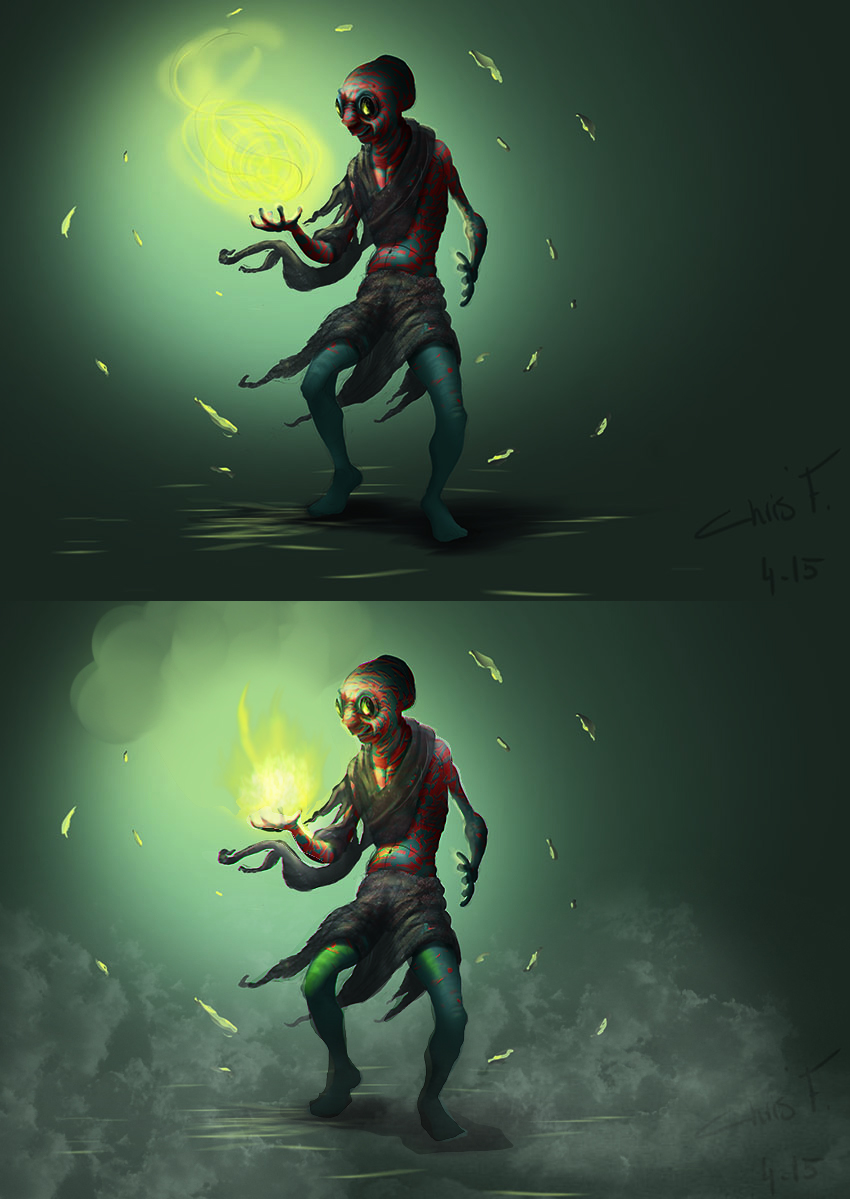
Did a paintover for ya, hope it helps. I can explain really quick what i did but its not a biggie. On your version you have drawn a crazy big lightsource, the yellowand it only consists of.... yellow... hahaha. A lightsource is really desaturated so goes from almost pure white to whatever color you pick - in this case yellow - I added that in... then i noticed you only painted a reflection of the fire/magic in the glasses-which doesn't really make sense, cause the character should be lit since it's really bright ( look at campfire images ) so all the areas that are in the line of the light should be lit. Since its mostly rounded forms the light is almost smudging away, you can do that with mixer brush or eraser. If you want to make the character pop out more i suggest you add some kind of ambient perspective. in this case there was not much to go from so I just added some mist with cloud brush - its all rushed but you get the idea. See that the feet immediatly stand out? :) same I did with the face but in reverse, made the character more '' round '' with highlights. Copy this file in photoshop and turn the image to black and white - you will see what i am talking about.
If you are gonna work on this more I suggest you work on the background, add in more colors instead of only green... look at swamp pictures or forests.. theres lots of colors like red, yellow, blue etc. Makes the image even better! I really like the concept you have. I hope this all makes a bit of sense... keep up the good work!

If you are gonna work on this more I suggest you work on the background, add in more colors instead of only green... look at swamp pictures or forests.. theres lots of colors like red, yellow, blue etc. Makes the image even better! I really like the concept you have. I hope this all makes a bit of sense... keep up the good work!


