07-30-2015, 08:18 PM
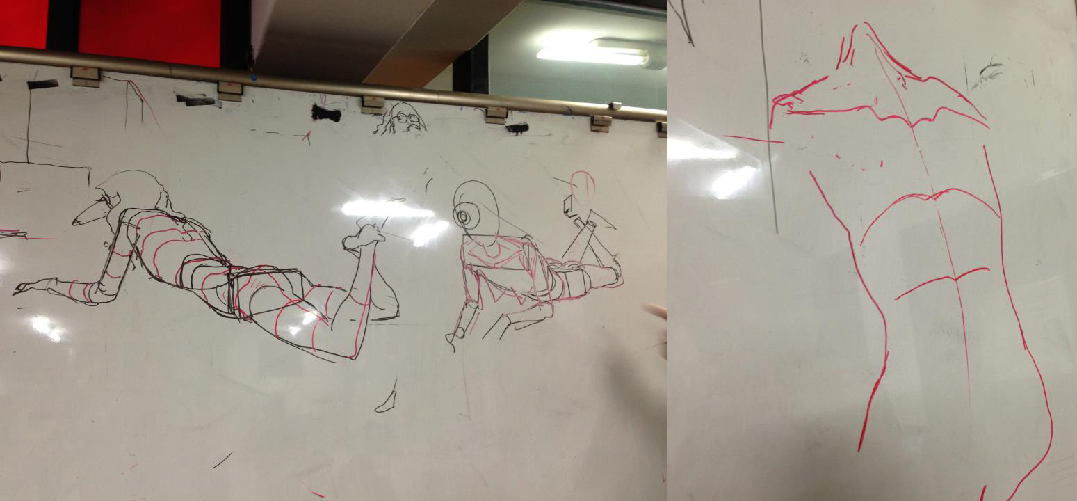
daaamn, those sketchbook pages on your tumblr are great. I like how you're experimenting with different line thickness and colours, they look like illustrations for fashion magazines. For structure, maybe try studying simple boxes and balls in perspective? I find that helps, so you can see "through" the drawing and around the contours of shapes, like in this Kim JungGi demo. looking forward to more updates :D
(I looked up joe the barbarian too, and i'll try to read some of it :) I didn't know about sean murphy's artwork, it's fantastic!)

(I looked up joe the barbarian too, and i'll try to read some of it :) I didn't know about sean murphy's artwork, it's fantastic!)


