08-12-2015, 12:03 PM
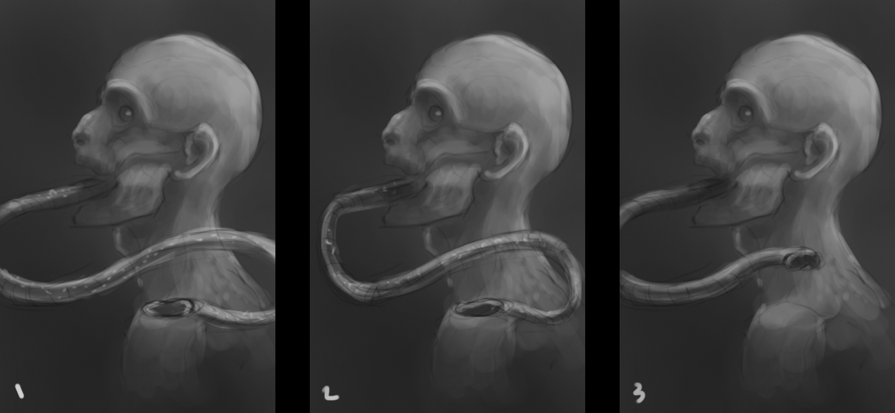
About the last image: i like the #1 but I'm not sure if it is a good option because his "tongue" goes out of the picture. If it is a compo problem I would take the #2 sketch.
Any tips please?


Any tips please?
