10-27-2015, 09:40 PM
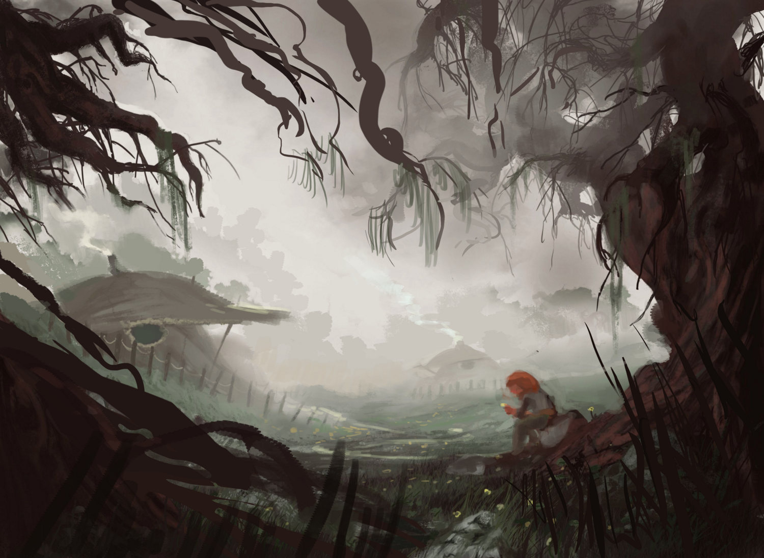
Hey man, I think the framing composition needed to be a bit tighter rather than the loose circle thing you had, and the figure placement tweaked to make it a bit more prominent. Some values simplified and tangents also removed. Here's a paintover, hope it helps! If you're not sold on the new branches covering the sky, you could substitute them for darker clouds that will do the same job of driving down to the figure


