03-02-2016, 10:01 AM
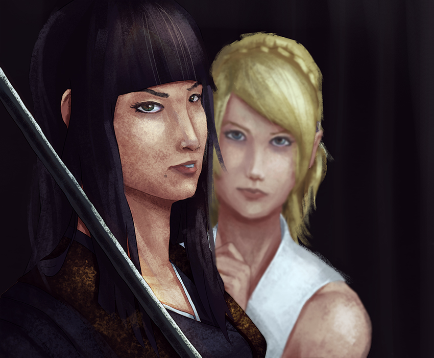
I believe I was high when I released this into the ether. I had so much trouble correcting the work further. From an illustration standpoint, why is this bad? I know that it is. But, I can't put my finger on it. How can I remedy this? Or from the looks of the final output, does the foundation look shaky in the first place?

Critiques are much appreciated! Be honest and harsh!

Critiques are much appreciated! Be honest and harsh!
If you are reading this, I most likely just gave you a crappy crit! What I'm basically trying to say is, don't give up!
----
IG: @thatpuddinhead
----
IG: @thatpuddinhead


