03-02-2016, 07:23 PM
Man, you are one lucky so-and-so today. 3 Paintovers :P
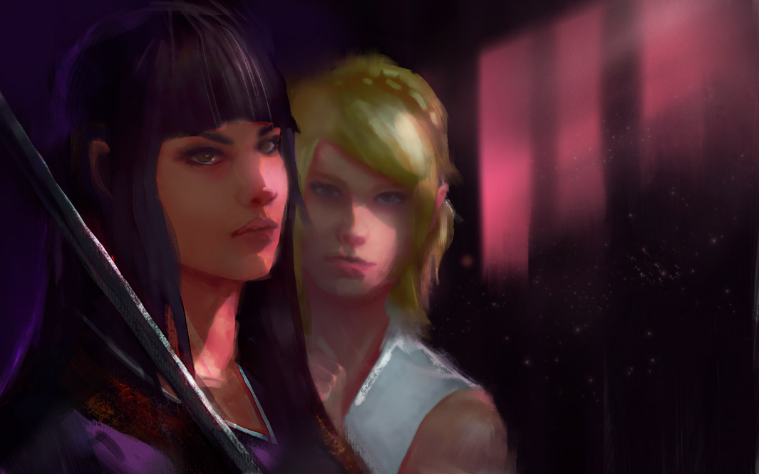
Taking the others feedback even further, and using Piotr's paintover because he already did the hard work on structure and proportion. :)
I extended the canvas because it felt a bit claustrophobic. Probably could do some interesting suggestion of shapes in the background even further to add some dynamic angles and shapes to your comp. (maybe a window or large screen or an interior where the scene is set.)
Bold interesting lighting and composition can take a mediocre piece and make it explode.
Don't go with an ambient lit flat lighting scheme if you want drama. Cinema stills can help you there.
Don't be afraid to use shadow and light shapes that may be originating from off-canvas to help the scene you are actually looking at. It creates the impression that something exists off the canvas, and helps storytelling.
Also smudged out some hard edges. Not very well, but to try and counteract that hard silhouette everywhere.


