03-11-2016, 05:28 PM
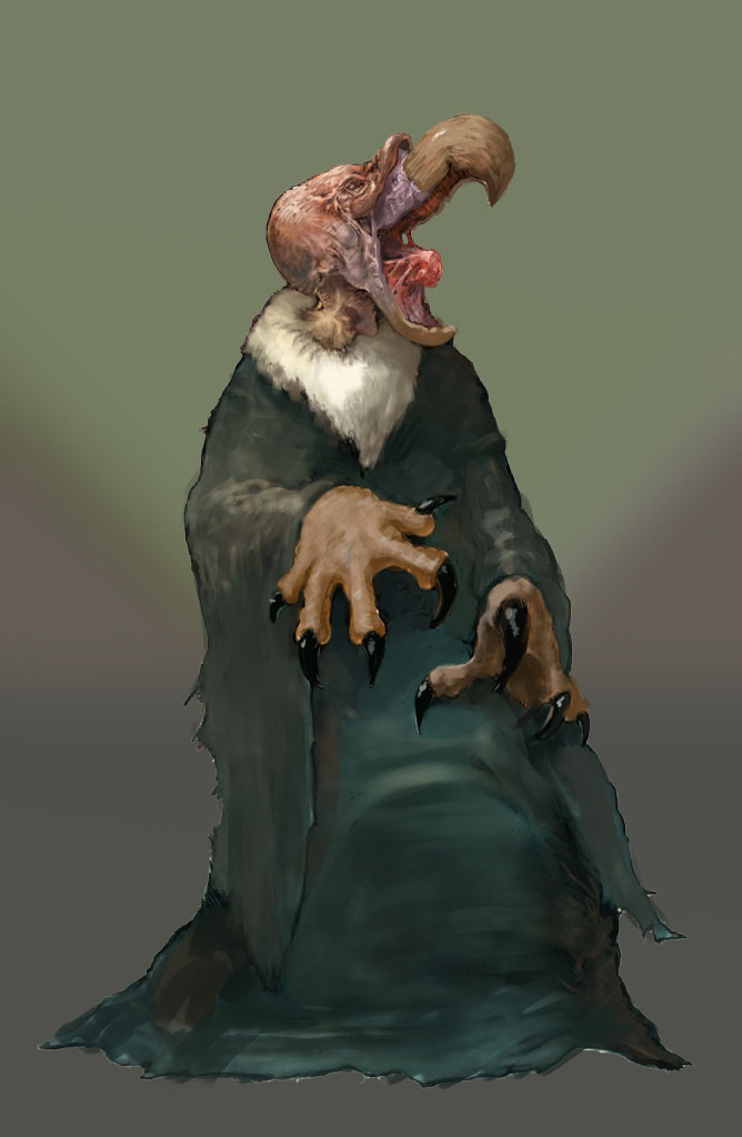
Hey there, I see you can render the forms well, now the only thing to fix is the lighting direction. In your image it is all over the place, there is like 3-4 different lightsources. Also you tend to go to blacks too fast, it is good to be subtler in your values, a lot of stuff is popping out too much, it makes it look overblown. Its better to make a character with 1 lightsource that looks correct then it is to make an incorrect character with 4 lightsources.
Also It is recommended that you do some sort of a background to figure out reflected lights and lighting in general.
Also check this out it has many pointers on various fundamentals and it is concise http://androidarts.com/art_tut.htm

Also It is recommended that you do some sort of a background to figure out reflected lights and lighting in general.
Also check this out it has many pointers on various fundamentals and it is concise http://androidarts.com/art_tut.htm


