06-12-2017, 11:12 PM
3 things you might want to look over:
1. Perspective. The buildings at the back looks like they serve two different vanishing points. Unless it was your intention that the left side is tipping over the other, you might want to recheck.
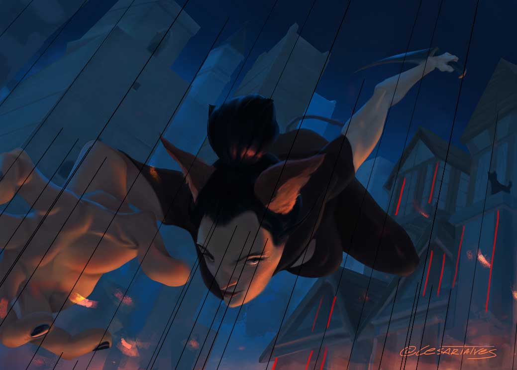
2. Anatomy. More specifically, foreshortening. Foreshortening isn't exactly easy to pull of because it is so easy to mess up the proportions. This is probably a tough thing to verbalize so I hope this paint over is sufficient.
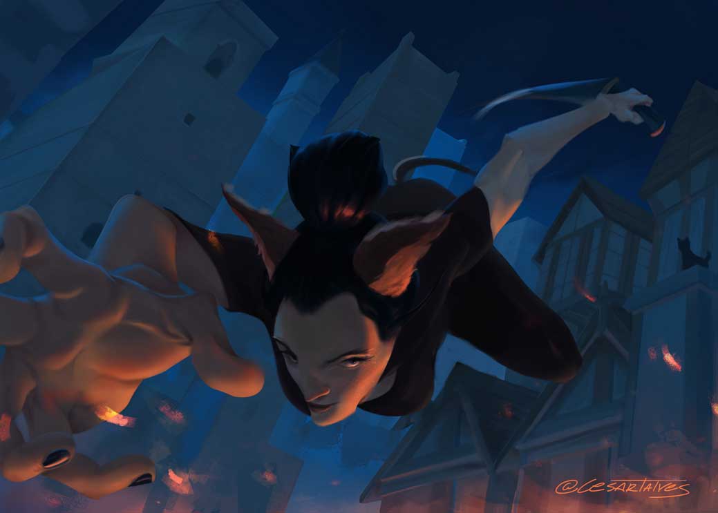
I adjusted the breast a bit. And foreshortening at the back.
I'd recheck how you painted in the shoulders. And the arm/hand that's coming towards the reader. That I don't have an immediate answer for.
3. Values (?) Your value variation (separating it to Shadow, around two half tones and a highlight) needs a bit of balancing. Or contrast. Or both.
Currently, running it through Posterize and B/W, it looks like this:
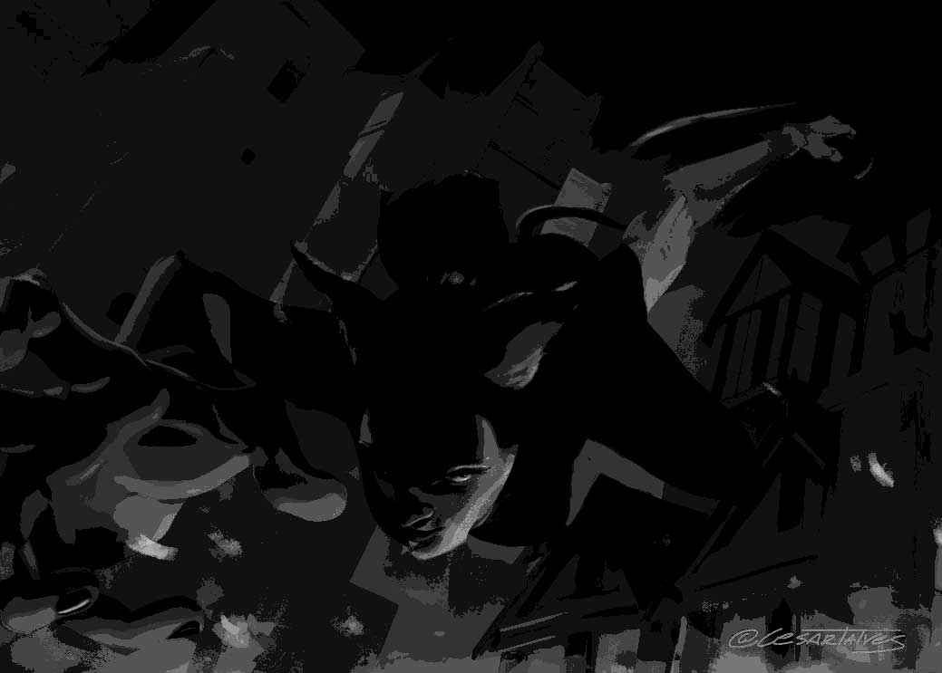
Maybe repaint some of the stuff you want the viewer to look at more by lightening up some of the values you want them to focus on. Or, simply adjust the levels of the painting.
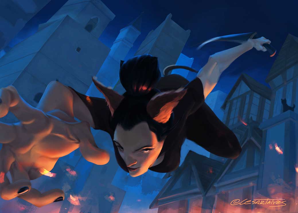
You're doing a good job so far. Keep it up!
1. Perspective. The buildings at the back looks like they serve two different vanishing points. Unless it was your intention that the left side is tipping over the other, you might want to recheck.

2. Anatomy. More specifically, foreshortening. Foreshortening isn't exactly easy to pull of because it is so easy to mess up the proportions. This is probably a tough thing to verbalize so I hope this paint over is sufficient.

I adjusted the breast a bit. And foreshortening at the back.
I'd recheck how you painted in the shoulders. And the arm/hand that's coming towards the reader. That I don't have an immediate answer for.
3. Values (?) Your value variation (separating it to Shadow, around two half tones and a highlight) needs a bit of balancing. Or contrast. Or both.
Currently, running it through Posterize and B/W, it looks like this:

Maybe repaint some of the stuff you want the viewer to look at more by lightening up some of the values you want them to focus on. Or, simply adjust the levels of the painting.

You're doing a good job so far. Keep it up!
If you are reading this, I most likely just gave you a crappy crit! What I'm basically trying to say is, don't give up!
----
IG: @thatpuddinhead
----
IG: @thatpuddinhead


