07-13-2012, 05:23 AM
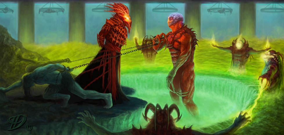
For the most part I am pleased with these, but the one with the slave creature, the creature should have had a more of an animated/struggling pose. Critiques are welcome.

|
2 of my most recent and wild pieces
|
|
07-13-2012, 05:23 AM
For the most part I am pleased with these, but the one with the slave creature, the creature should have had a more of an animated/struggling pose. Critiques are welcome.
07-13-2012, 05:41 AM
I like the second one a lot. very dramatic lighting and cool style. The composition in the first one lacks a bit.
good job :)
07-13-2012, 12:57 PM
Hey thanks for the feedback gumbi. I totally agree with your comment, the composition does lack. I would like to fix it, but I'm just going to move on and make sure to have a good composition in mind from the getgo, I just wasn't paying enough attention to what I should have been, but thanks again.
|
|
« Next Oldest | Next Newest »
|