08-12-2013, 06:05 AM
Yeeeesh, AND have some more hihihi :)
EDIT - some more work
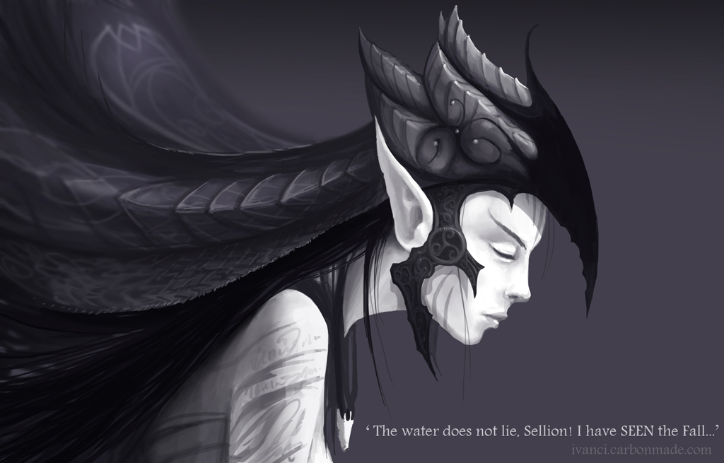
EDIT - some more work

| Poll: ELVES or SPACE MARINES? You do not have permission to vote in this poll. |
|||
| Elves | 28 | 51.85% | |
| Space marines | 26 | 48.15% | |
| Total | 54 vote(s) | 100% | |
| * You voted for this item. | [Show Results] |
|
Ivan Ći's sketchbook
|
|
08-12-2013, 06:05 AM
Yeeeesh, AND have some more hihihi :)
EDIT - some more work 
08-14-2013, 03:28 AM
So, I pulled some refs and refreshed my head so I can keep pushing this one, made pinterest profile, turns out it can be really useful :) There are a few boards I started besides the elven one, I might update those and add new as I go, help yourselves if you find anything useful http://pinterest.com/ivancirovicart/elven/
Spent around 8 hours trying to figure out the headpiece 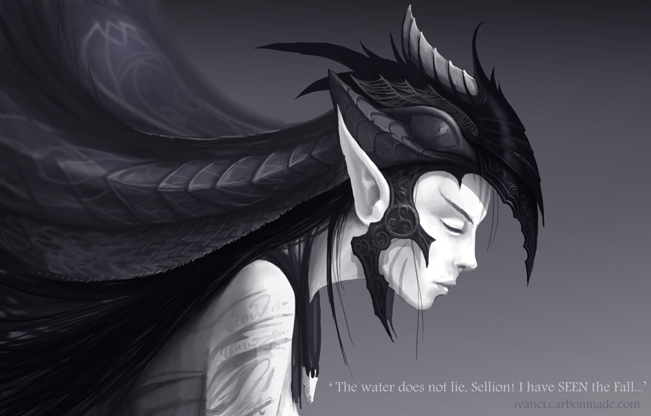
08-16-2013, 12:09 PM
taking a break
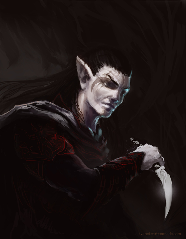 almost halftime and the elves are getting an ass whopping xD
08-17-2013, 03:38 AM
Tnx Rama, long time no see :)
Lol kinda got the Neverwinter Nights 1 portait feel xD so skewed 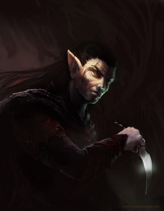
08-18-2013, 03:32 AM
messed up the pose....again :')
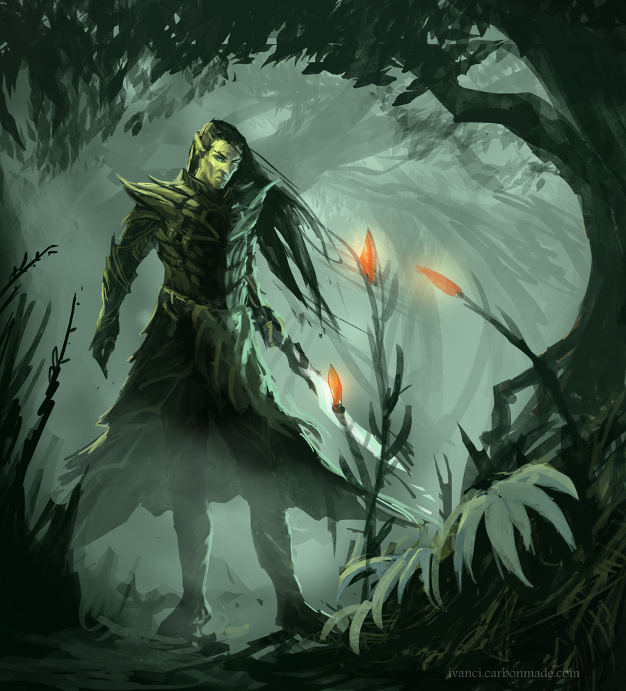
08-18-2013, 05:05 AM
Nice atmosphere on the newest piece ;) I like it xd
08-19-2013, 06:17 AM
yeaaa all the elves you can eat! :D and thanks, Rama-that one is ruined by the unnatural pose of the character :/ i suuuck at anatomy :)
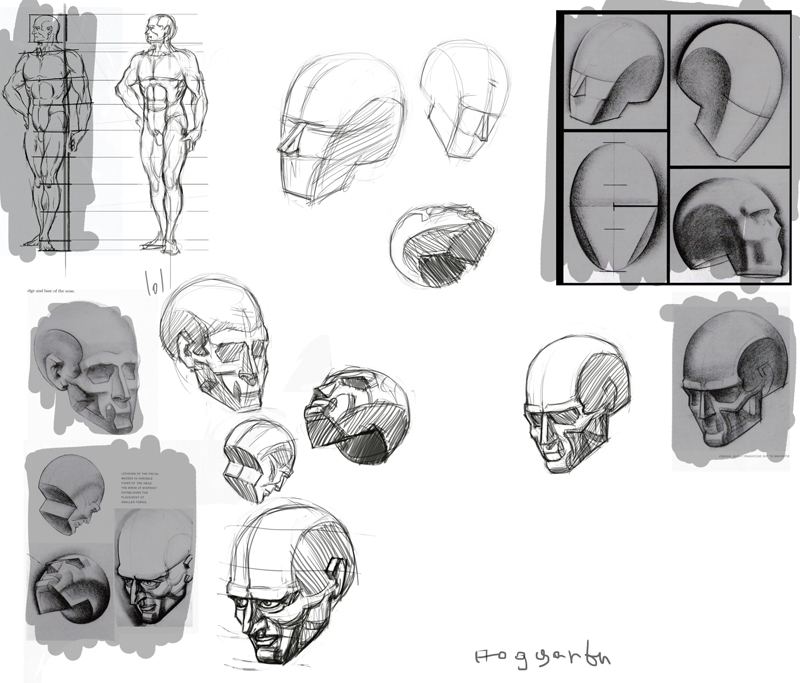 yea I know it hurts, it's supposed to 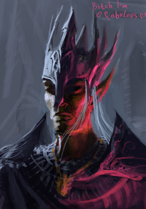
08-19-2013, 07:38 AM
Good studies. Knowing you aren't comfortable in an area is great, because now you can spend time working on it. The best way to succeed is to "fail" a bajillion times.
08-21-2013, 10:21 AM
08-28-2013, 12:09 PM
personal
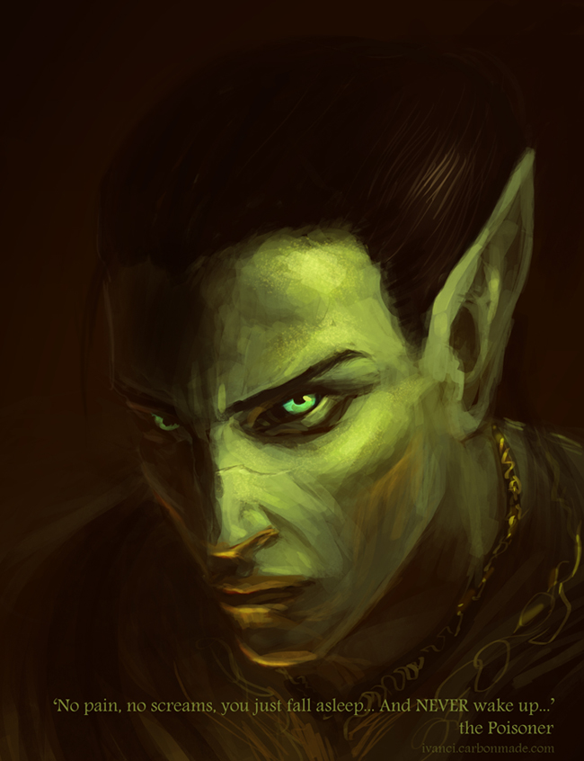 30min spitpaint 'jungle treetops' 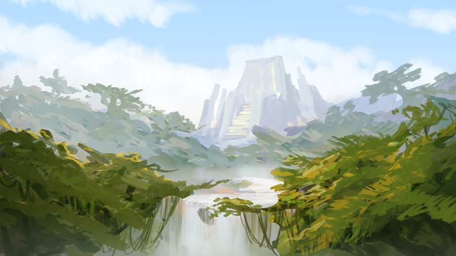 30 min sp 'hurricane' 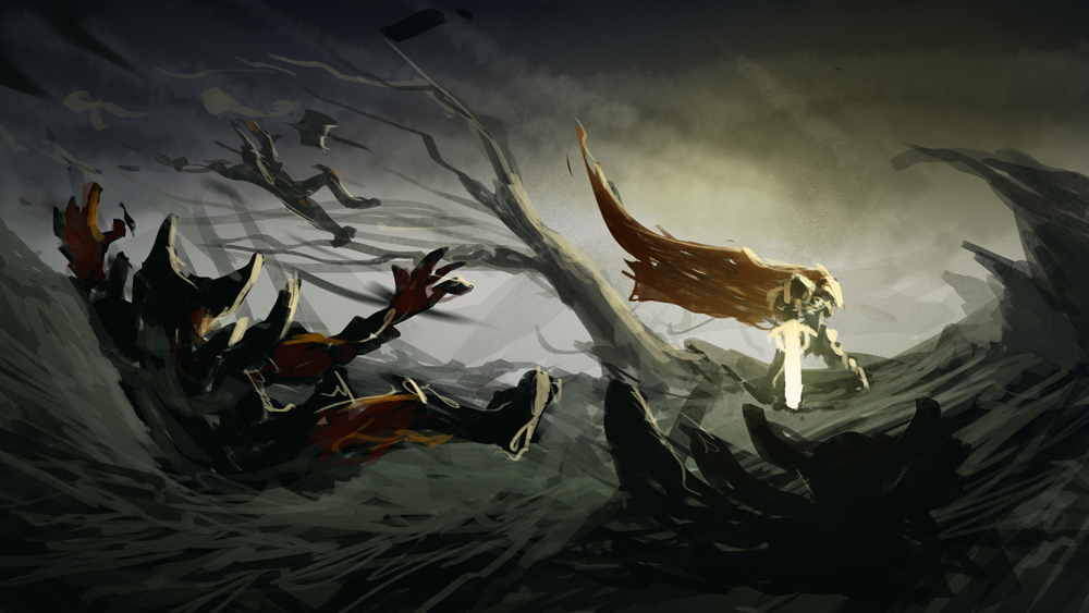
08-28-2013, 12:33 PM
Nice works man, you're working really hard! I liked that Poisoner piece, it really has a nice mood in it, also the hurricane speed painting has a nice composition, I think that you can even proceed and polish it to a finished piece!
Keep it up man!
08-29-2013, 11:03 AM
Tnx, wla, I thought about doing it :)
trying not to panic when starting a comp 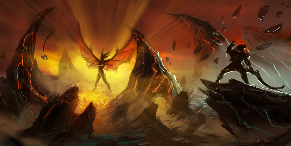
08-29-2013, 01:49 PM
Yay!
Look, I may have useful feedback for once! Lovely compositions on both the duels you posted. (Duels? Battles? Ass-kicking?) The guy with the glowing sword has a little more dynamic scene though, and I think I know why. On the scene where the demon is spreading wings, you sort of balanced the composition, and I don't think it was intentional. The three main spiky rocks have the same size and are evenly spaced - if you break that pattern it will add more movement to the scene. That being said, you still have two strong verticals on each paintings, the main character in each one. They are also acting as stabilizing agents. I don't know how much dynamism you want in each scene, but if you want more, this can help you. And great work man! Also, love the poisoner portrait, and another tip: dark yellow will most often than not read as green. You may want to vary up that green and work pretty close to yellow on the spectrum, it will give a more natural feel :) Remember, the key to painting skin is the actual color variation.
08-30-2013, 01:33 AM
Wow, Ursula, thank you :) Those are awesome pieces of advice, and I am using them already :D
some concepts from today P.S. Awwww, elves are on the spree lol...dayum almost halftime :P
09-01-2013, 07:46 AM
30 min spitpaints
armored dinosaur (fuck me if i ever tried to draw a dinosaur before) 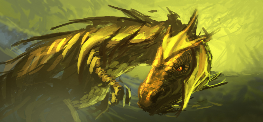 pumpkin dog 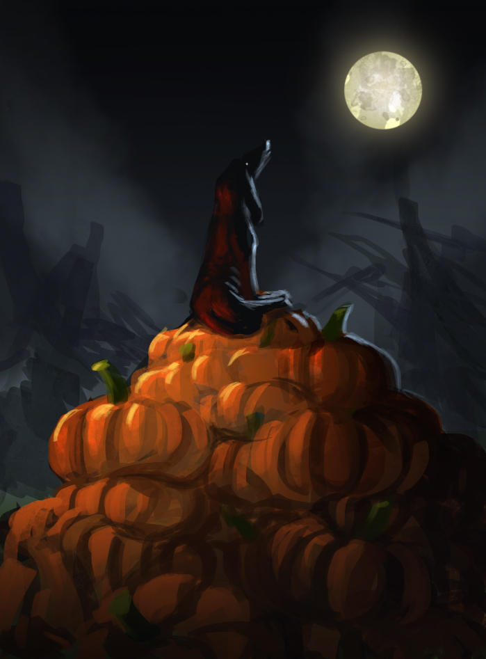 the hall of candles 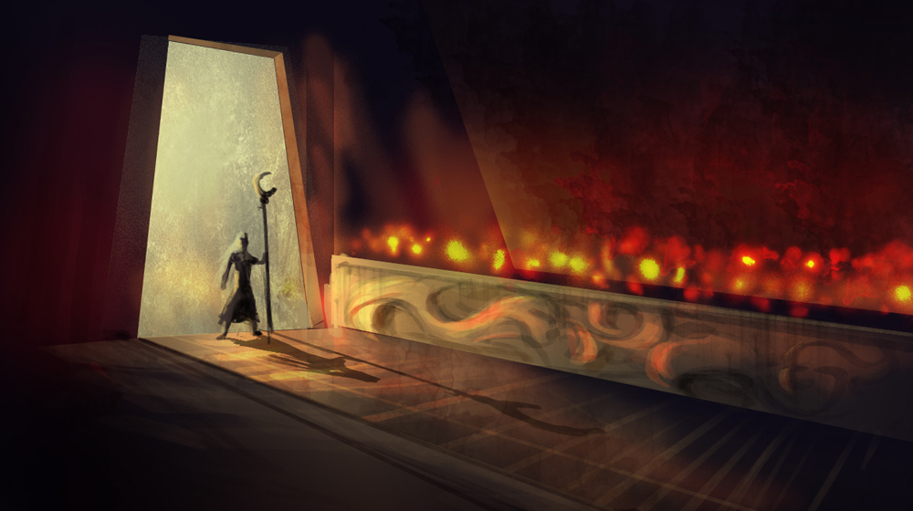 the shepherd 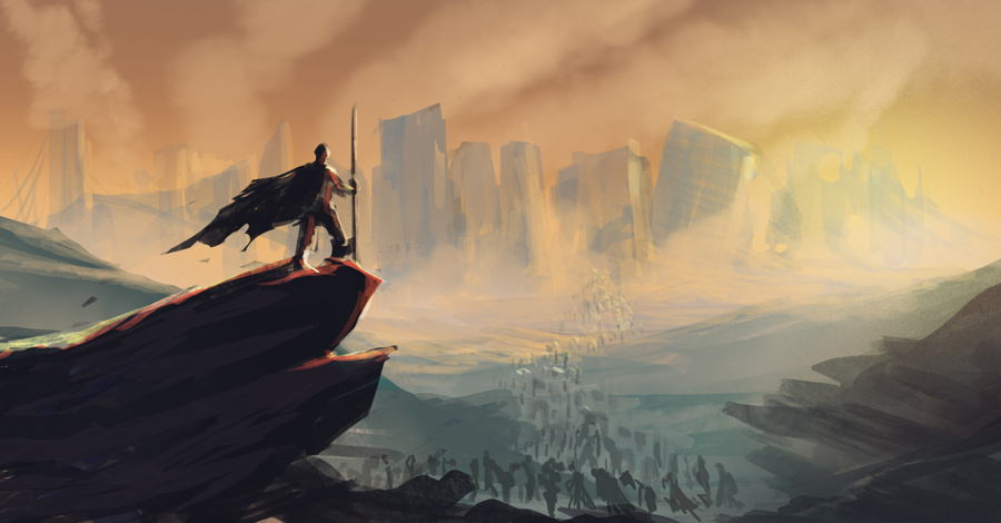 study 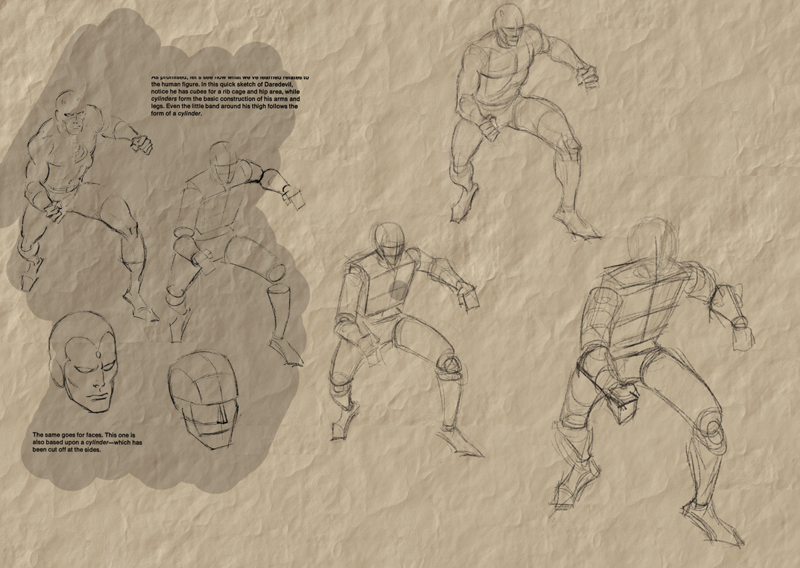 i now have officially three jobs at the same time , not much time to study, but i'll improve my management skills i guess -.-
09-02-2013, 10:56 AM
30 min spit 'candyland' lol
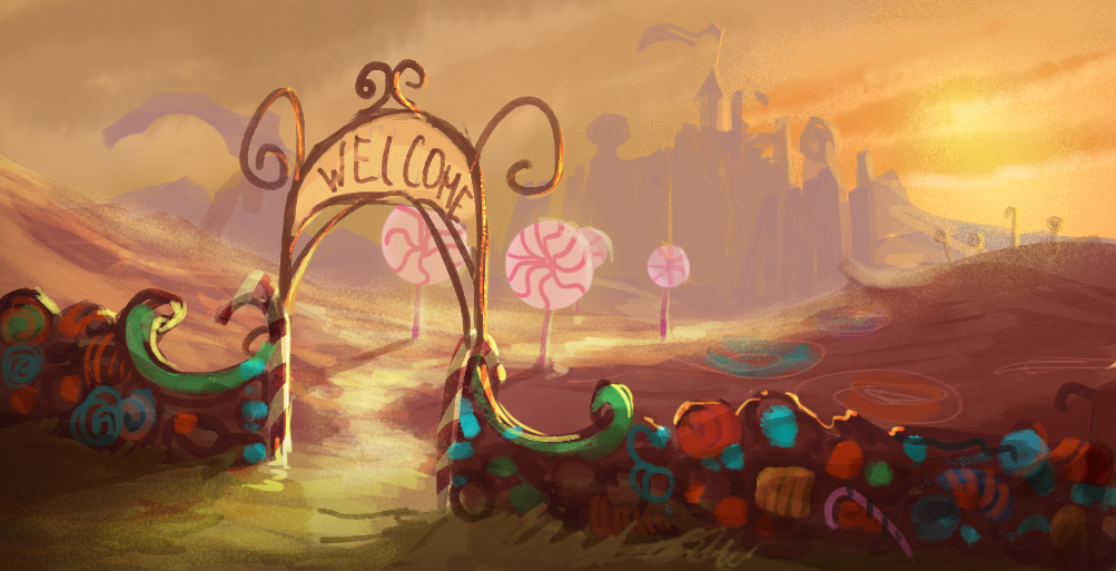 4h in 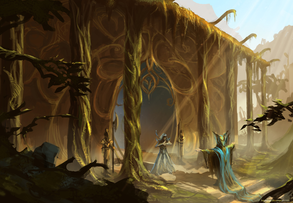
09-02-2013, 12:22 PM
Really nice sketchbook man, i especially like all the enviro work you've done, it beats me how stuff can look so good and be so loosely rendered at the same time, that's enviable. Keep it up!
|
|
« Next Oldest | Next Newest »
|