11-23-2012, 05:41 PM
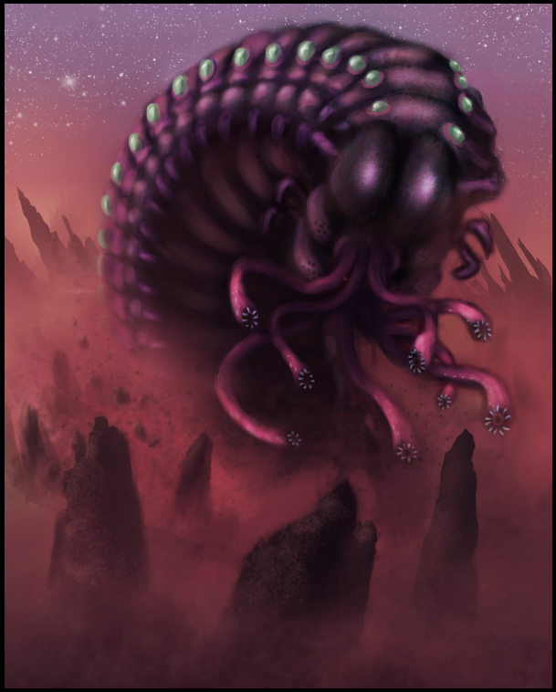
This is a work in progress i wanted to get some suggestions/critiques on before i go further with it.


|
Need some help!
|
|
11-23-2012, 05:41 PM
This is a work in progress i wanted to get some suggestions/critiques on before i go further with it.

Hey Ryan. First thing I think this is a really nice start; love the colours, setting and design.
I did a paintover, mostly because I thought it would be fun to play with this more than you needing help...and it was! :) I basically just tweaked everything to be "more" of what you already have in the image. The largest thing I tweaked was the comp...to make use of the diagonals you had in the background more and add a bit more depth with some additional foreground rocks. I pumped up the colour overall, and lightened the background to accentuate the critter silhouette and depth. I also tried to accentuate the silhouette of the critter in a few small place to curve and flow with the comp a bit more. Added a bit of bounce and reflective light on the critter as well... I did a gif anim. of the layers I used but because it's gif the colours come out a bit blocky so I included a final image below that. Hope that helps! The final ![[Image: crimsondaggers_ryanscott_by_m0nkeybread-d5m1zsh.jpg]](http://fc01.deviantart.net/fs71/f/2012/328/c/f/crimsondaggers_ryanscott_by_m0nkeybread-d5m1zsh.jpg) The anim: ![[Image: crimsondaggers_ryanscott_by_m0nkeybread-d5m1ztw.gif]](http://fc05.deviantart.net/fs70/f/2012/328/4/a/crimsondaggers_ryanscott_by_m0nkeybread-d5m1ztw.gif)
11-24-2012, 12:36 PM
(11-24-2012, 12:21 PM)monkeybread Wrote: Hey Ryan. First thing I think this is a really nice start; love the colours, setting and design. Thanks man I appreciate you taking the time to do that.It did help a lot. I like composition change that you did,and adding the depth. Now lets see what i can do with the advice, i'm gonna try and spend a lot of time on this one.
11-24-2012, 01:31 PM
Sweet. Glad it helped..Post the final when it's done...so we can come full circle :)
11-25-2012, 06:53 AM
hey.. i did a quick over painting...
its just my opinions what you should push more.. try to push the shape more withe the red light from the ground.. also put some highlights on the top of the guy. and push the color on some places more. and maybe make some clouds or something in front the stars. i think i over painted the overpainting from monkeybread sorry for that.. i hope it helps its what i would do. sorry if it didn't helped^^
11-25-2012, 07:07 AM
(11-25-2012, 06:53 AM)Nimao Wrote: i think i over painted the overpainting from monkeybread sorry for that.. You made the lighting much more dramatic than mine, and much better. Are you trying to make me look bad? :P Lol
11-25-2012, 08:03 AM
nooo actually i did not want to do a over painting just want to try something but could't stop then sooooorrrry ;O ;(((
11-25-2012, 08:10 AM
Haha I'm just kidding mate. It looks good!
11-25-2012, 04:15 PM
(11-25-2012, 08:03 AM)Nimao Wrote: nooo actually i did not want to do a over painting just want to try something but could't stop then sooooorrrry ;O ;((( Thanks for taking the time man! I like what you did adding the clouds and highlights. I've already changed up a lot in the painting and I will be sure to incorporate your suggestions. When you see it again its going to look way different! |
|
« Next Oldest | Next Newest »
|