Superhero pin up page
#1

Hi everybody,

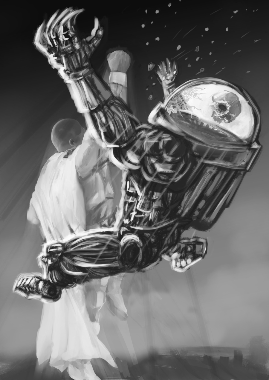
First post on the forums, but put away those kid gloves. I need some opinions/suggestions for this superhero image. It's for a pin up in a friends comic, and I was trying for a painterly, action-oriented feel. The final needs to be greyscale.

Let me know what will make it better, technically or just in terms of sizzle. Thanks in advance for your time.

In case the attachment isn't working, here's a link:
http://nathandrawsdaily.tumblr.com/image/43397933229

Sketchbook/art blog: nathandrawsdaily.tumblr.com

My mini comics: atomic mini comics
Reply
#2
You need to go back to the thumbnail phase. Do very simple thumbnails with just a few tones.

To help you, read these first: Composition Basics: Value Structure
Composition Basics: Sketching Thumbnails
The Thumbnail! (by Jon Foster)

In the second article, Dan says:"You can stop here" and this is what you should do. You want very fast thumbs, no bigger than a business card (mine are usually even smaller.) You can do them digitally, but I thumb in pencil in a sketchbook.

If an image works when it's very small, 92.6% of the time it will work when it's bigger. The few times it won't will be because you borked the anatomy/perspective and the thumb was too small for you to notice. But that small percentage is not a reason to not do thumbnails. Everyone who is good does thumbnails for finished pieces, and it's not because it's hip, it's because it works.

The specific problems with your image is that the figure in white is completely straight, it doesn't look like it has any momentum. If the darker stuff at the bottom is the ground, then his legs are way too short. He has a cool rendered head and ear but the rest of him is not legible. The robot thing flying away looks like it was straddling the guy in white before being punched. If he's overlapping because he was in front of him and his now flying away, the angle of the punch, the perspective on the guy and the amount of overlap don't fit. Now, overlap is good. Overlap is dynamic, we want overlap, but the elements all have to work together to make the image stronger. If the overlap doesn't fit the perspective, something has to give.

This is why thumbnails are important. I'd say you need to do at least 12 of them for each image. Some art schools have their students do 50 thumbs for each illustration, it forces you to think really hard about what is important in the image and find new interesting angles.
Reply
#3


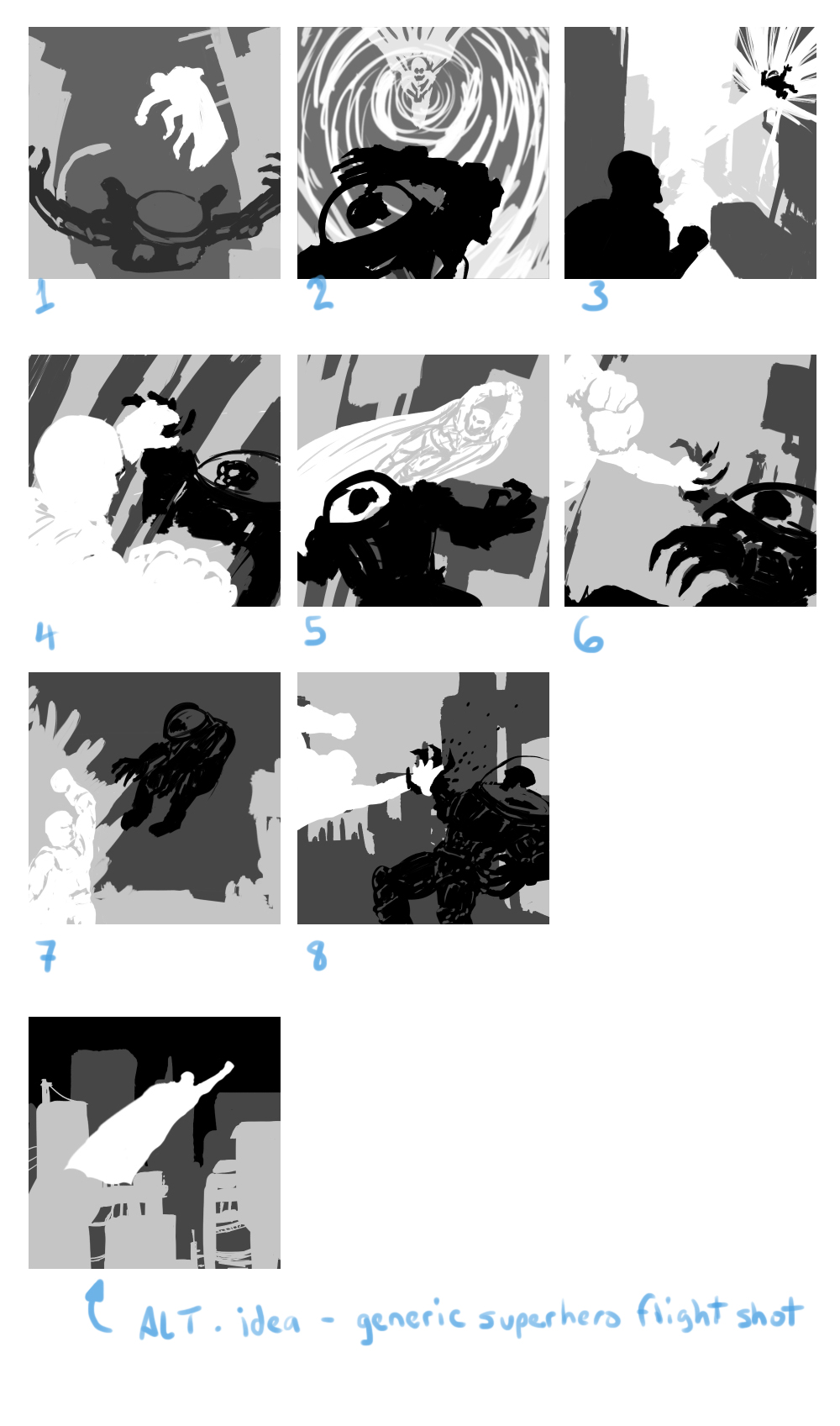
Thanks for the advice and the links, Chantal! I especially enjoyed the article on value thumbnailing, and I tried to incorporate that into some new thumbnails. It was difficult with what amounted to 3 elements (Hero, Villain, background) to figure out how to use the 4 shades of tone, so I don't mind telling you I struggled a bit with these. They took a lot longer than my previous round of thumbnails did also-although in this case, that might be a good sign.

I've done several new thumbs for this image, so now I feel like maybe I need to find the strongest composition and proceed from there.

What's everybody think?

Sketchbook/art blog: nathandrawsdaily.tumblr.com

My mini comics: atomic mini comics
Reply
#4
Well, the 4th shade can be used as an extreme foreground element, in a city it can be a trash can, a lamp post, whatever you feel should be super close to the viewer if the heroes are in the middle ground.

That said, they are great thumbnails. I especially like 3, 4 and 5. With 4, you would have to be extra careful about tangents and about making the right hand understandable. With 5, I would make sure that the guy in white's head would be in front of a darker spot of bg so the outline would stand out.

Reply
#5
Your thumbnails are perfect squares, make sure the thumbs match the final image aspect ratio.
Reply
#6
Hi everybody! Just a quick post to say 'thank you' again to everyone watching and/or commenting. This project was back-burnered for a little while but is due to return soon. I'll be posting some other stuff in the meantime.

Back with the superheroes and the punching soon!

Sketchbook/art blog: nathandrawsdaily.tumblr.com

My mini comics: atomic mini comics
Reply


Forum Jump:


Users browsing this thread: 1 Guest(s)