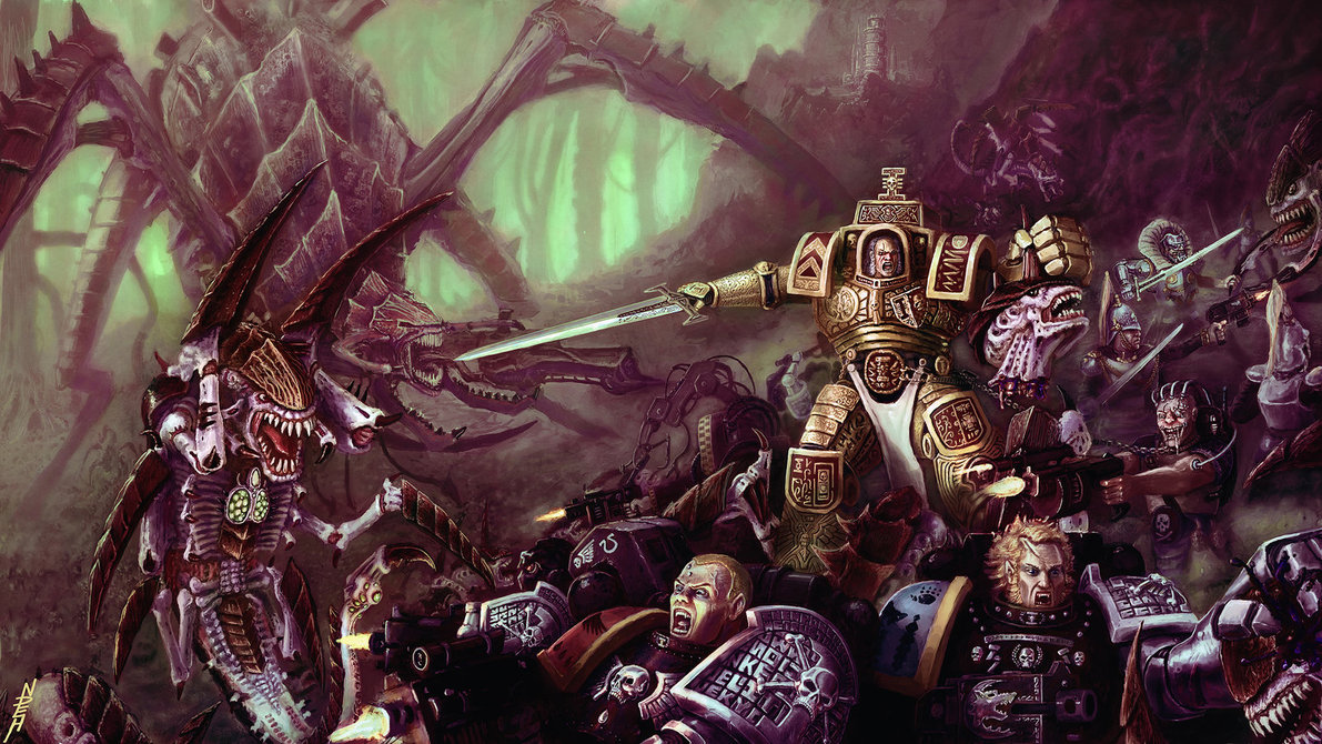
Hey dude, I had a quick look, and I think I may even do a quick paintover on one or two of your pieces. In general though, I actually think the battle scene is one of your weaker pieces, because while individual things are rendered quite tightly, overall as a comp it is lacking a bit of dynamism to it. There is a lot of stuff going on but it doesn't feel like there is movement. The other thing about it is that it is rendered tightly almost everywhere except the background, which does make a lot of things compete with eachother. I'd probably take it down if it were my folio.
Actually I just saw something come through on my facebook feed by KJ Kallio, that really highlights what large battle comps should look like! This is his rough, but it already has everything in there, just no rendering yet. Every single shape and line that make up character is for a specific purpose in the comp, and he's really implied movement.
![[Image: 884492_4729548524877_4892330_o.jpg]](https://fbcdn-sphotos-b-a.akamaihd.net/hphotos-ak-frc1/884492_4729548524877_4892330_o.jpg)
I think your strongest piece is the clown portrait by leaps and bounds. It shows subtlety in lighting edge control, detail variation, expression and all sorts of good things. The only thing I can see is the top of his head could be shown to "wrap around" a bit more to show the volume. Just softer edges to imply a bit of depth I guess.
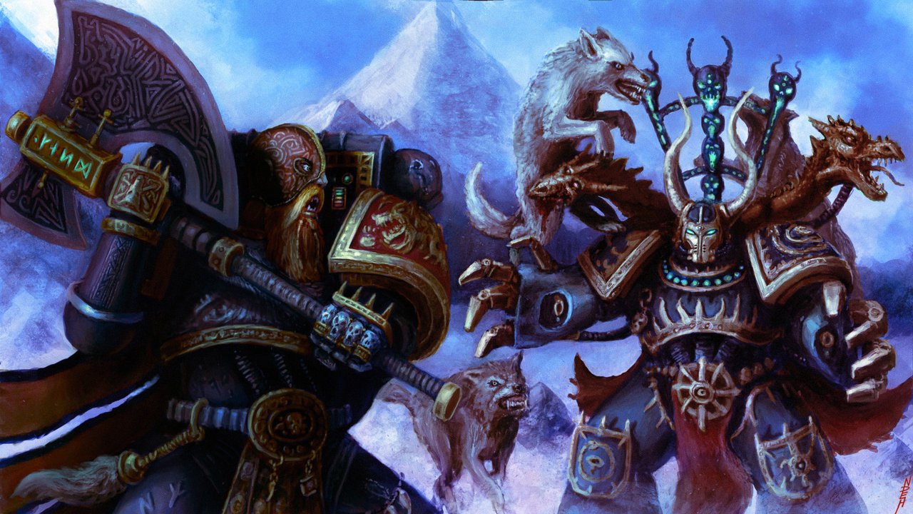
I actually like the left side of Fenrisian smile a lot. As a composition however it doesn't work because you have basically created two separate illustrations and plonked them side by side on a canvas. You could cut this straight down the middle and get two separate pieces. In fact I'd actually suggest you do this, and only work on the left figure as a standalone. Maybe extend the canvas a bit to add some context or zoom right in but do a nice beauty pass of highlights and make sure perspective is right etc. This could be a cool piece. The other figure is flat on, not in a dynamic pose, I'd leave that by the wayside.
I may see if I can paintover to show you what I mean for some fun. Also who cares what's on your cv..your folio is all that counts!! Hope that's useful :)
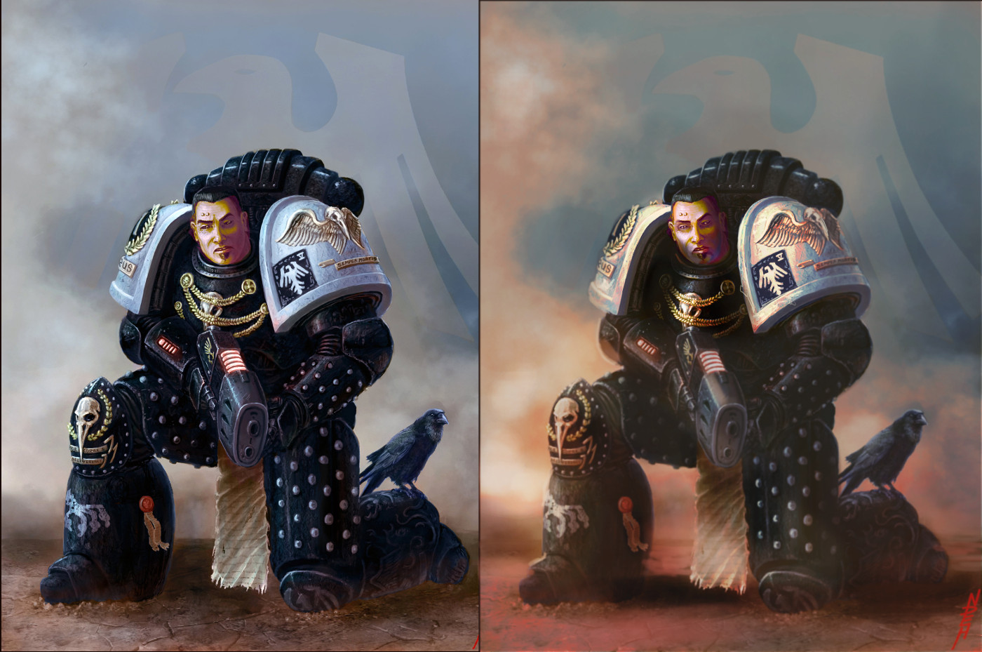
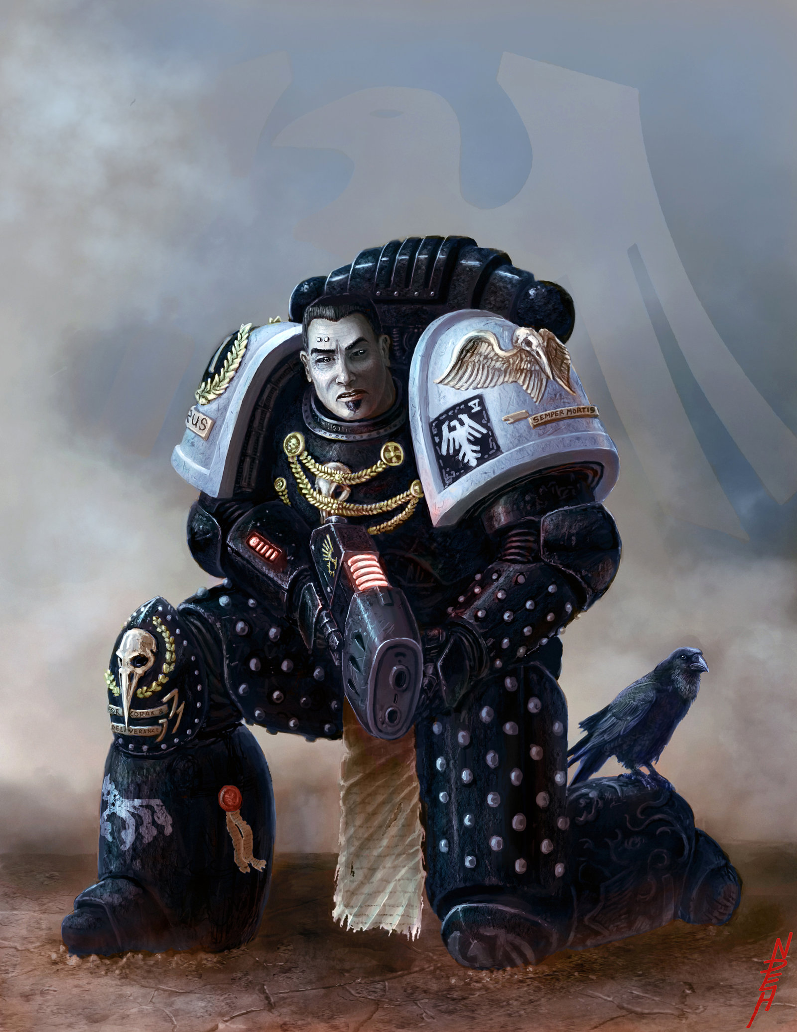
ok did that paintover...but for your marine kneeling piece. I lowered contrast and saturation in the shadow areas first, then did a colour balance to make the fire/smoke warm to counteract all the blue. The face was a bit too graphic and needed some form and some colour variation. You used predominantly blue so I warmed him up a bit but accentuated the cool shadows. The eyes were a bit strange, I didn't fix them as I wanted, but maybe a bit more realistic. To counteract your tendency to detail absolutely everywhere, I lowered the contrast and blurred everything outside the chest and face area, to give it some focus and depth of field, may have gone a little far but you can play with that as you like. I shadowed his figure on the ground as well as cast shadows from the shoulder pieces on his face and chest (though went a bit far and lost his neck area) I also upped the saturation in the focal area. Could do with some poppy highlights here and there but I think those are quick things to do and I painted almost nothing. :)


![[Image: 884492_4729548524877_4892330_o.jpg]](https://fbcdn-sphotos-b-a.akamaihd.net/hphotos-ak-frc1/884492_4729548524877_4892330_o.jpg)
