Seeking advice for Cthulhu
#1
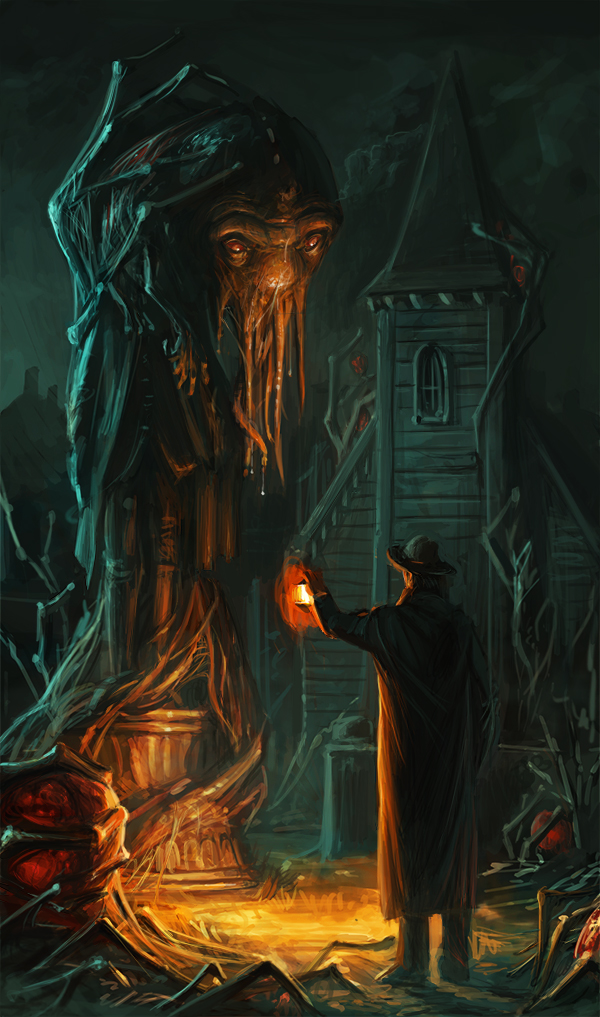
This is a WIP for the concepart.org challenge, designing Cthulhu's garden somewhere in a town. I don't know if it is the rim light in the buildings, but it seems very flat, also wondering if I should give the man a shovel, I want him to be some kind of gardener.
Reply
#2
The flatness of your image or any image is completely dependant on value. Darker things to the front, lighter things to the back. Try and use a lighten layer and paint using a lighter value of the greenish moonlight that is in the background back over the background only. It will decrease the contrast and increase the depth, especially in the church. The pose of they guy could be a bit more interesting so adding a shovel and some design elements to him might add some narrative and interest.

 YouTube free learnin! | DeviantArt | Old Folio | Insta
Reply
#3
(05-22-2013, 11:51 PM)monkeybread Wrote: The flatness of your image or any image is completely dependant on value. Darker things to the front, lighter things to the back. Try and use a lighten layer and paint using a lighter value of the greenish moonlight that is in the background back over the background only. It will decrease the contrast and increase the depth, especially in the church. The pose of they guy could be a bit more interesting so adding a shovel and some design elements to him might add some narrative and interest.

Thank you very much, the lighten layer worked really nice.
Reply


Forum Jump:


Users browsing this thread: 6 Guest(s)