Posts: 94
Threads: 8
Joined: Jan 2013
Reputation:
1
I've been painting allot as most of you guys, doing the best to improve my kills. Aldo my journey as an artist has just began I think it is time to make my first portfolio. I want to work as a freelance illustrator. My main focus and my biggest wish is to work for card games and tabletop games, but I would be happy to work on any kind of fantasy, sci-fi, etc... My biggest dream is to work for Legend of the Criptides because their art influenced and inspired me the most.
I will post paintings I consider putting in my portfolio here and I would really appreciate that you guys give me some feedback on what you think of my stuff, what should I focus on improving, and If you think I should remove a painting from the portfolio.
![[Image: Come-and-get-it-small.jpg]](https://dl.dropboxusercontent.com/u/57723134/Come-and-get-it-small.jpg)
![[Image: ork-shaman.jpg]](https://dl.dropboxusercontent.com/u/57723134/ork-shaman.jpg)
Posts: 140
Threads: 7
Joined: Aug 2012
Reputation:
6
Hey Igor, I think you render very well, some of your stuff almost looks 3D, it's cool!
In my opinion what you should focus on is composition and thinking about what you are showing in your images, like what does the viewer see when he/she opens it up? The orc painting for example, it looks nice, but it strikes me as awkward how he's kneeling on the ground rather than standing up in a powerful pose. He's large and powerful, so his pose should reflect that. The sci-fi image as well, it's very well rendered, but the poses of the two soldiers with helmets are a bit awkward, the one to the right especially, why is he looking up? Why is he holding the gun like that?
So try to make very rough sketches, make the sketch look cool first, make the poses make sense and only then render it out :-) No matter how well you do the light and render the shapes, the image will never be fantastic unless the underlying idea and composition were strong to begin with!
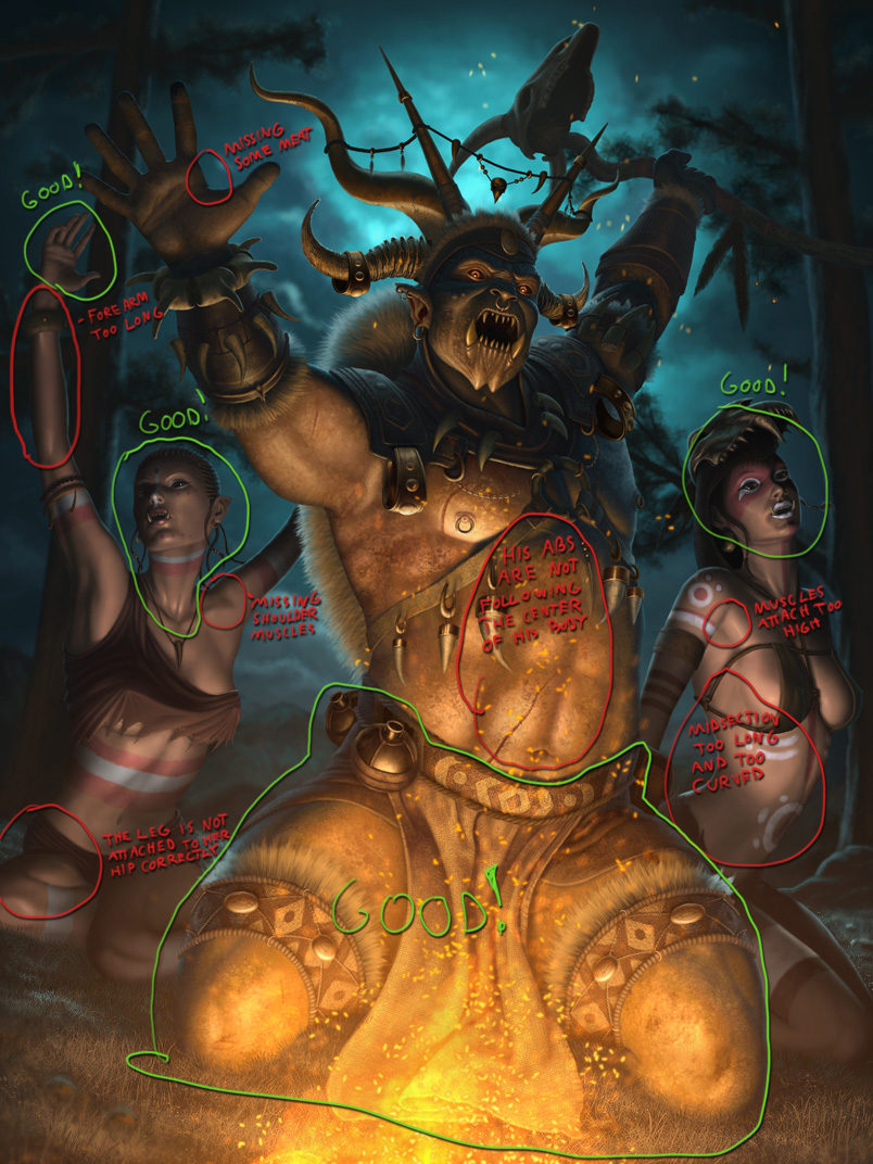
Other than that I think you should also work on anatomy, the bodies of the two women in the orc piece especially stand out as problem areas.
To sum it up; you render very well, focus your efforts on composition, poses and anatomy :-D
Posts: 99
Threads: 1
Joined: Mar 2013
Reputation:
5
I agree with Simonarpalmer. The orc shaman's face suggests he's towering over you, dominating you but then you see he's kneeling down in supplication like he's chanting/praying. I think it would be a stronger piece if they where standing/dancing around the fire.
Posts: 94
Threads: 8
Joined: Jan 2013
Reputation:
1
THX guys!!! Really appreciate this! Yea, you are completely right. Btw the Orc is supposed to be chanting and siting around the fire, but I figured he is an orc so he has to have a mean face always... As for the police man, I guess I did those poses because I took a video of my self to see how I would act in that situation... :) But yea the pose of the right cop is a bit awkward...
Could you be a bit more specific about the anatomy? I am looking but I cant figure out what is wrong...
This really helped... I will focus more on the story and composition... I will also try to make the poses have more connection to what I wanna show and I will try to make them less awkward. I just dont know how to force getting better in that stuff but i will try. :)
Posts: 140
Threads: 7
Joined: Aug 2012
Reputation:
6
Sure Igor, no problem! I pointed out some stuff here, some of it is nitpicking really, but I thought I might as well point it out while I was at it :-) I promise you'll see all this when you go back and look at your image again in a month or two, when you've had time to detach from it!

Posts: 94
Threads: 8
Joined: Jan 2013
Reputation:
1
Simon I cant tell you how much I appreciate that you took the time to do this... Thank you! Now I see it all! Thx really cant wait to hear more from you in the future... I hope I will be able to fix allot of this stuff in my next paintings...
Posts: 389
Threads: 2
Joined: Jan 2013
Reputation:
13
Simon, I love the fact that you circle both the negatives and the positives. That's cool.
Posts: 94
Threads: 8
Joined: Jan 2013
Reputation:
1
Here is one more painting...
![[Image: Dragon-Slayer-1600x1200.jpg]](https://dl.dropboxusercontent.com/u/57723134/Dragon-Slayer-1600x1200.jpg)
JasonClarkDesign22
Unregistered
Beautiful work and attention to detail man, how long does it take you per piece.
Posts: 94
Threads: 8
Joined: Jan 2013
Reputation:
1
Thx Jason! Well this one took me more then two weeks, but i was slacking a bit (8h-10h a day). But usually it takes me from 10 to 12 days... But Now I am changing my work flow because I want to lose the stiffness of the rendering and to get faster...
Posts: 25
Threads: 1
Joined: Mar 2013
Reputation:
1
Beautiful pieces, so tight, tons of details for eyes to enjoy:-) Love the last one, especially the dragon. As for some critique, the only thing for me here is the guy on the right in the first image, I wish you showed/did his entire head in the frame, but hey, that's just me:-).
Posts: 94
Threads: 8
Joined: Jan 2013
Reputation:
1
Hvala Nenade! (Thank you Nenad)
Yea that first image will not be in my portfolio because while painting the newer ones I improved and now I don't think that painting is good enough... Especially when I compare it to the new one I'm working on right now... But yea... That guy is compositionally really bad... I cheated a bit and made him crouch so he can fit even like this... If he was standing and if the perspective was correct his head wouldn't be visible... :)
Posts: 94
Threads: 8
Joined: Jan 2013
Reputation:
1
Here is a new painting I did... I don't know if I am just in a faze of feeling down but I am not sure if my portfolio is going in the right direction for the jobs I am aiming for... Any help and suggestions are really appreciated.
![[Image: Gatekeeper900.jpg]](https://dl.dropboxusercontent.com/u/57723134/Gatekeeper900.jpg)
Posts: 307
Threads: 8
Joined: Apr 2013
Reputation:
33
(07-24-2013, 04:33 PM)IgorIv Wrote: Here is a new painting I did... I don't know if I am just in a faze of feeling down but I am not sure if my portfolio is going in the right direction for the jobs I am aiming for... Any help and suggestions are really appreciated.
I think you're on a much better track with this latest piece than with the others honestly.
I can legitimately see this being in a card game... you really nailed it here, just keep up this kind of quality in your future pieces !
The only problem I have with this picture is that the neck feels like it didnt get the same amount of attention as the rest of the figure. It kinda just feels like a cylinder tacked on to his body
Posts: 94
Threads: 8
Joined: Jan 2013
Reputation:
1
Thank you Beardley! Your comment calmed me down a bit... I guess all of us go trough this when we think everything we paint sucks... And the neck... Yea, fuck.... I totally forgot to work on it... Just skipped it totally...
Posts: 94
Threads: 8
Joined: Jan 2013
Reputation:
1
Here is one more painting for my portfolio. Some feedback would really be appreciated. The main company I am shooting for is Applibot so plz give some advice on how I can make my portfolio better and more suited for them. Also just a blunt "I don't think this work is good enough for Applibot" would also be helpful.
![[Image: River-Styx.jpg]](https://dl.dropboxusercontent.com/u/57723134/River-Styx.jpg)
Posts: 1,970
Threads: 22
Joined: Apr 2012
Reputation:
243
Hey dude, it's been a while since I've seen your stuff and you have made huge leaps forward in rendering. So tight...it's not a surprise it takes over 80 hours a piece (If my math is correct). Seems like a lot to put into one image, but hey if you can do it go for it.
I think the most successful piece so far is the warrior in post #13 Really great everything (except dat neck) but I actually think the figures in the background don't fit very well. Their design doesn't quite gel with the rest of the scene...a very cliche wizard hat and a dude that looks like he's wearing a santa claus hat. Don't mean to sound rude, they just seem off a bit, and they also throw off the scale of the castle, making it less impressive than it could be. I'd consider maybe seeing what it looks like without them, and perhaps just having the castle instead. The figure is enough to hold our attention because it is so beautifully rendered.
With the last post #16, I think the composition could do with a bit of work as the ghost lady is really cramped up in the corner. Again I think it's an extra element that could be safely taken out. The boat, the figure and the background is probably enough to hold our interest. As others have said, some issues with anatomy still...with the boat guy, the twist of his torso and the slightly rubbery arms are what are off for me, and those are a woman's curves, but the face looks male.
I think nailing composition, pose and anatomy is crucial if you want to work for someone like Applibot so really concentrate on nailing those before you spend 80 hours on a piece. Hope that is useful.
Posts: 94
Threads: 8
Joined: Jan 2013
Reputation:
1
Thank you monkey this means allot to me and it helps allot. You are right... I guess I am trying to make these paintings interesting and to tell a story and that is why I cram up a bunch of stuff in it and destroy the composition... When I look at all the pro LOTC and MTG cards they are kinda boring... It is always just a character standing with a boring camera angles and boring poses... Even my number one hero Brad Rigney does it... I try to have a bunch of stuff happening in a painting but those formats are really tricky to work with and then I fail... Plus its really hard for me to get better at composition and design... In my head it's like: HOW!? But I know I will try and do my best... Your advice really helped as always... Now I know where to concentrate next... And btw you think that these paintings are not good enough for Applibot right? Be honest plz...
Posts: 307
Threads: 8
Joined: Apr 2013
Reputation:
33
Dude you got a DD on your dragonslayer piece :)
Congraats!
Also I think that if you keep up the quality that was in the pic with the knight with wings on his helmet (minus the neck and the dudes in the BG) I think you're on the right track for LotC quality. Just my opinion, but I think its valid
Posts: 94
Threads: 8
Joined: Jan 2013
Reputation:
1
Yea I saw the DD lol... Page views skyrocketed... Thx man, I will try my best!
|
![[Image: Come-and-get-it-small.jpg]](https://dl.dropboxusercontent.com/u/57723134/Come-and-get-it-small.jpg)
![[Image: ork-shaman.jpg]](https://dl.dropboxusercontent.com/u/57723134/ork-shaman.jpg)
![[Image: Come-and-get-it-small.jpg]](https://dl.dropboxusercontent.com/u/57723134/Come-and-get-it-small.jpg)
![[Image: ork-shaman.jpg]](https://dl.dropboxusercontent.com/u/57723134/ork-shaman.jpg)


![[Image: Dragon-Slayer-1600x1200.jpg]](https://dl.dropboxusercontent.com/u/57723134/Dragon-Slayer-1600x1200.jpg)
![[Image: Gatekeeper900.jpg]](https://dl.dropboxusercontent.com/u/57723134/Gatekeeper900.jpg)
![[Image: River-Styx.jpg]](https://dl.dropboxusercontent.com/u/57723134/River-Styx.jpg)