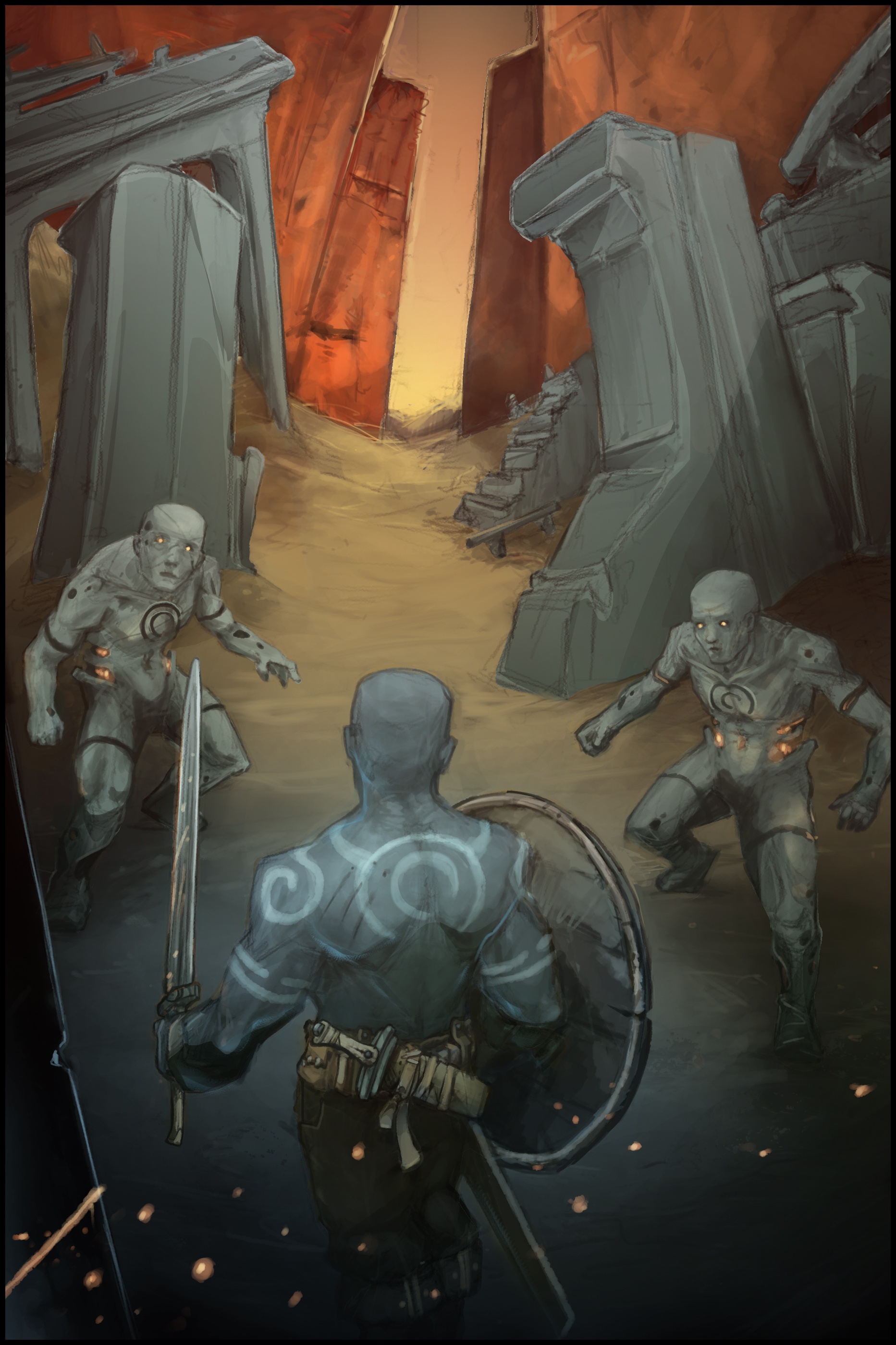
Artefact anathema
#1
Hey guys,
Crit maybe?

Was going for a trading card game look (mtg) or for a book cover.
Any advice to get the image closer to either of those is much appreciated.

It's suppose to be some magically endowed warrior that is unbound from ancient ruins, and has to pass through a couple of artifact guardians in order to get to the world outside (think destroy target artifact or artifact creature when a. anathema enters the battlefield). Magical sword cuts/melts stone or other artifact material.


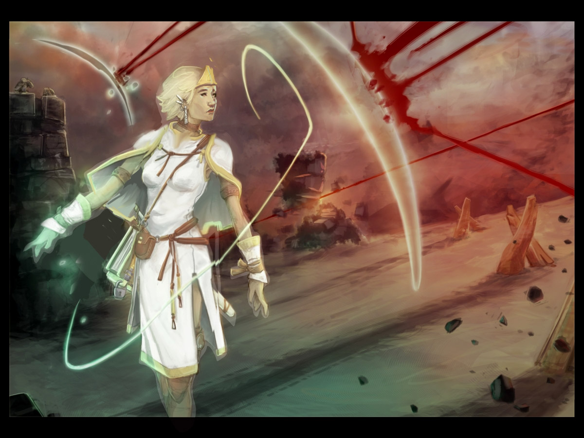
Again aimed for the card game look.
Protection magic specialist.
Tap to negate spell effects on defending (untapped) creatures.
As far as style or design goes I'd rather it looked more like Magic The Gathering stuff than like Legend of the Cryptids.


Alright, thanks for the time and rock on!
Reply
#2
first of all, nice work man, i like both concepts and i can see you put a lot of love and effort so far.

if you want these illustrations to look like a magic card, then you need to paint them in that format. the first painting would not fit in a magic card without massive cropping.

i think the first illustration fails to push your concepts far enough.

1) body language

i can't tell what's really going on in the scene from the body language. the pose of the central figure is way too relaxed. if he's under attack, his body should show it. it would be much more effective if you had him striking one of the figures or blocking an attack. since the card destroys an artifact, i would go for him slashing one of the figures in half or something.

2) magic sword

the sword doesn't look magical at all. maybe you haven't worked on that part yet, but just keep in mind that if an object has some special property, it should be clearly evident in the painting. maybe add some orange or blue glow to it.

3) guardians

i would add the patterns you gave the guardians to the ruins around them. it's fine right now, but it would enhance the 'feel' that these guardians are a part of the ruins around them if they have the same patterns and stuff. you know, repeating stuff. i also can't tell if the warrior is supposed to be of the same race/origin to them. i think they look very similar, is that what you were going for?

the second illustration is much more in shape with the mtg format. the style and action is very good

1) body language

again, i think she looks a little stiff, i get the impression you want to make her look graceful and on top of her game, but it looks a little blocky right now, give her more flow, think ballerinas or gymnast.

2) horizon line

she is standing in a vertical line while the background is angled. i get you want to give the piece movement and it works, but she looks a little off since she doesn't respect the angle of the background. this is just nit-picking, it looks fine right now.

3) anatomy

i might be wrong, but her head feels a little too big.

again, these are all my humble opinions, but i hope they provide some help. keep up the great work!

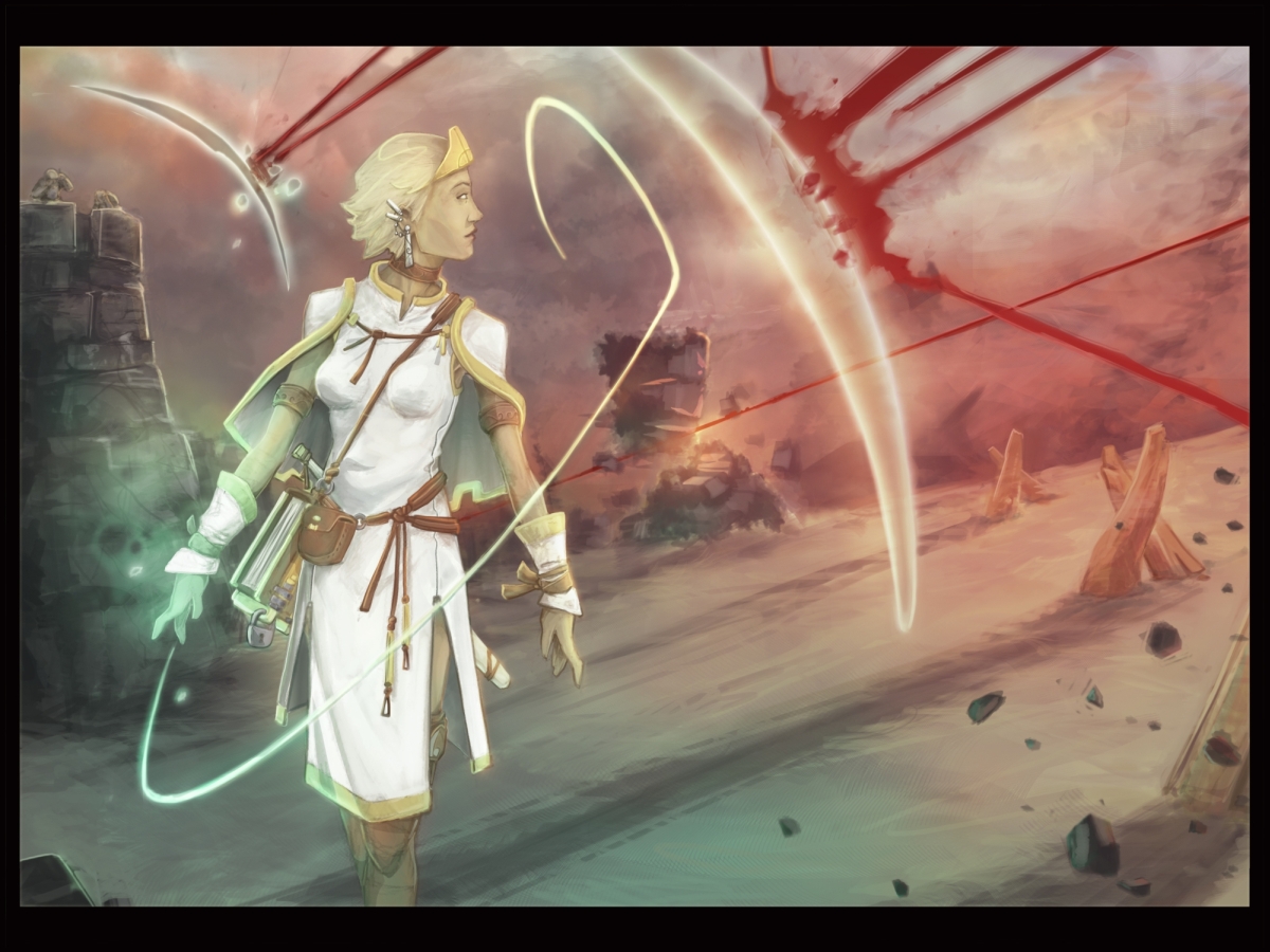
i did a quick paint-over with some minor suggestions


Reply
#3
Thanks dude. Much obliged.
Especially for taking the time with the paint over on the second image.
Great call on the symbol showing up somewhere on the ruins too. I should have thought about that. A tad afraid it might be too much as the same symbol is on the dude's back, but maybe partially weathered out on some block of stone might work out better than anything.

Ow yeah, the dude coming out of the ruins is same "culture" as the guardians. The guardians are artifact creatures molded after the warrior caste there. So they are related (also the same symbol on the guardians is tattooed on his back). He's like some ex warrior sort of secret weapon (to put it in stereotypical terms) that's been kept leashed all the time and manages to make his way to the surface after the downfall of the city and the failings of the wards keeping him in check. Artifacts being his specialty I was going for the relaxed look.

Again, thanks a lot. I really appreciate it.
In my head everything is crystal clear but it's only by asking you people that I can figure out how things read. After all, I'm just as interested in how art is interpreted as I am on how it is created.
Reply


Forum Jump:


Users browsing this thread: 3 Guest(s)