06-28-2013, 05:10 PM
Hey guys,
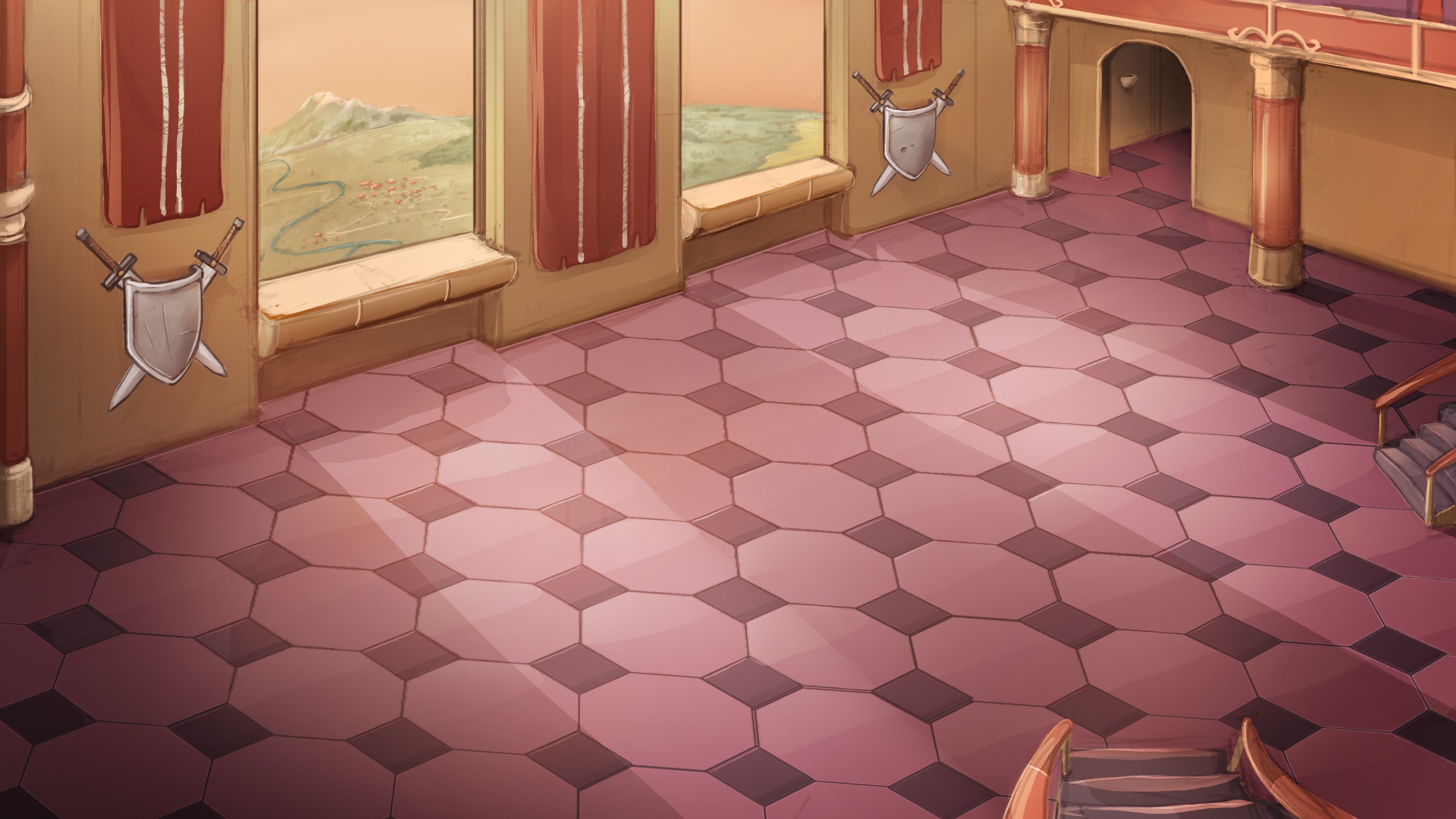
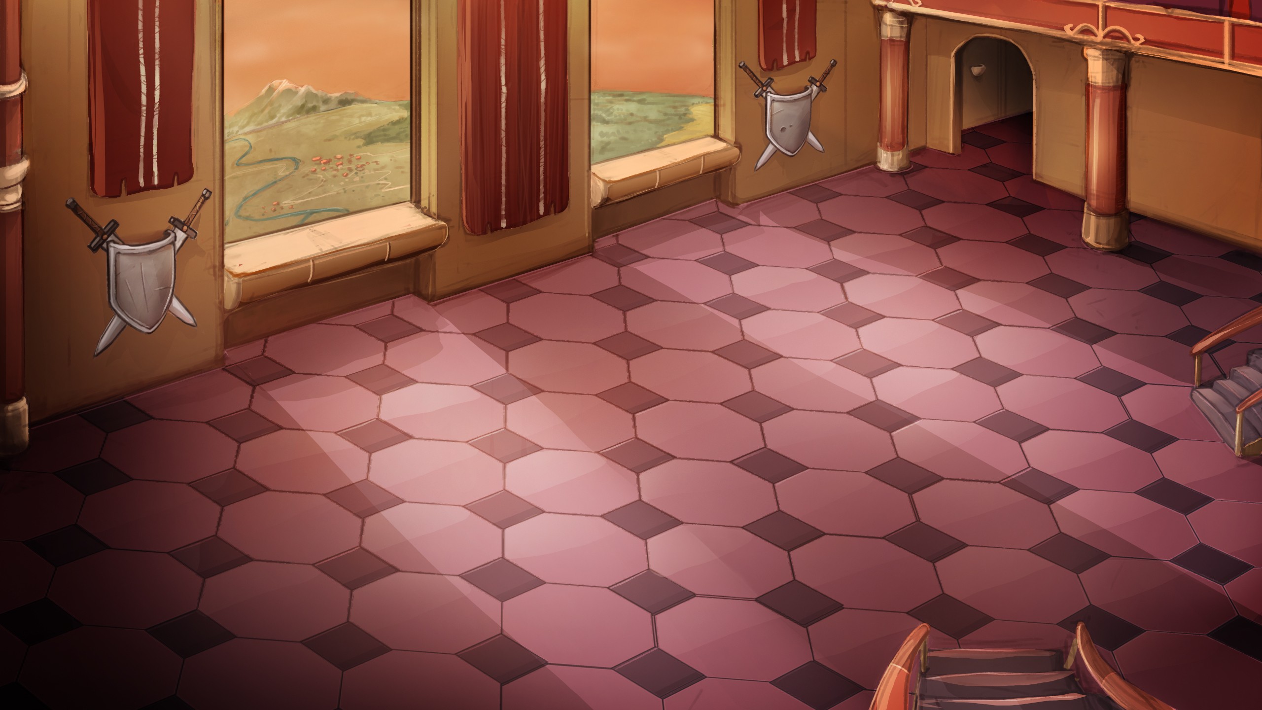
Which version is better?
Supposed to be a game background (like a disciples 2 battleground background but for a younger age range).
Of course any and ALL crit is very much appreciated, but I'm mainly interested in light and color matters over design.
Bunch of thanks.
Everybody rock on!
P.S.
In the crit section are we supposed to create new threads or just update the old ones? Thanks again.


