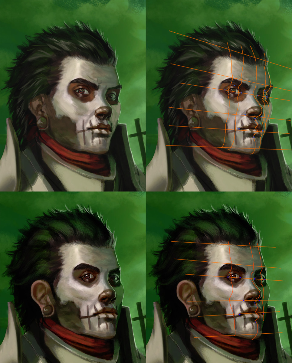
Heyo!
Grabbed your piece and did a face paintover for you, then read you were looking for help with the armor. So, sorry for not addressing your question, but here's a face construction crit:

Faces are hard. You are really close but not quite close enough, it only takes a bit of inaccuracy. Remember the eye is a sphere and the lid is skin laying on that sphere, so sometimes we will not see the far crease on the eye becasue it rolls beyond where we can see it. I used liquefy to fix most of the issues on construction I saw then went in and made the light sources more obvious (which sells or doesnt sell your construction). You have a diagonal light that cannot decide its frontal or side so I set is as side (the highlight will be on the turning edge of the face like you have it but the side or front has to be dominant or the face looks flat. I went over the front of the cheek and gave it a bit of dark to get the planes of the face reading a little better, the skull is honestly really boxy. Went through and fixed some color issues, especially on the far eye. Red in a green light is going to turn gray. A colorful gray, but a gray all the same. I pushed the ear back and picked a highlight to run through the hair which is the same sort of logic you should use on the armor. Check out this book for a few pages of some dope eye anatomy:
http://www.amazon.com/Human-Figure-Dover...0486204324 He has some tiny little drawings that you should copy and the text is great if you learn by reading.
Painting armor is also hard, Pick a solid light (and a secondary, and remember internal bounce) source and use reference to get the feel. The harder a form turns the more focused the reflection, keep in mind this is for both concave and convex surfaces. All you need to do is organize your values narrowly (without contrast but with really clear shapes) and you can make something really shiny without using a ton of values and wrecking your pieces contrast.
Hope this helps and good luck!


