Baffled by light.
#1
So this composition is bad. And I'm completely confused by how to make it interesting! I tried using the light, and placing the sun behind the tower, my values are terrible and I have no idea how to resolve them! Color? Detail? Clueless.


Attached Files Image(s)


Reply
#2
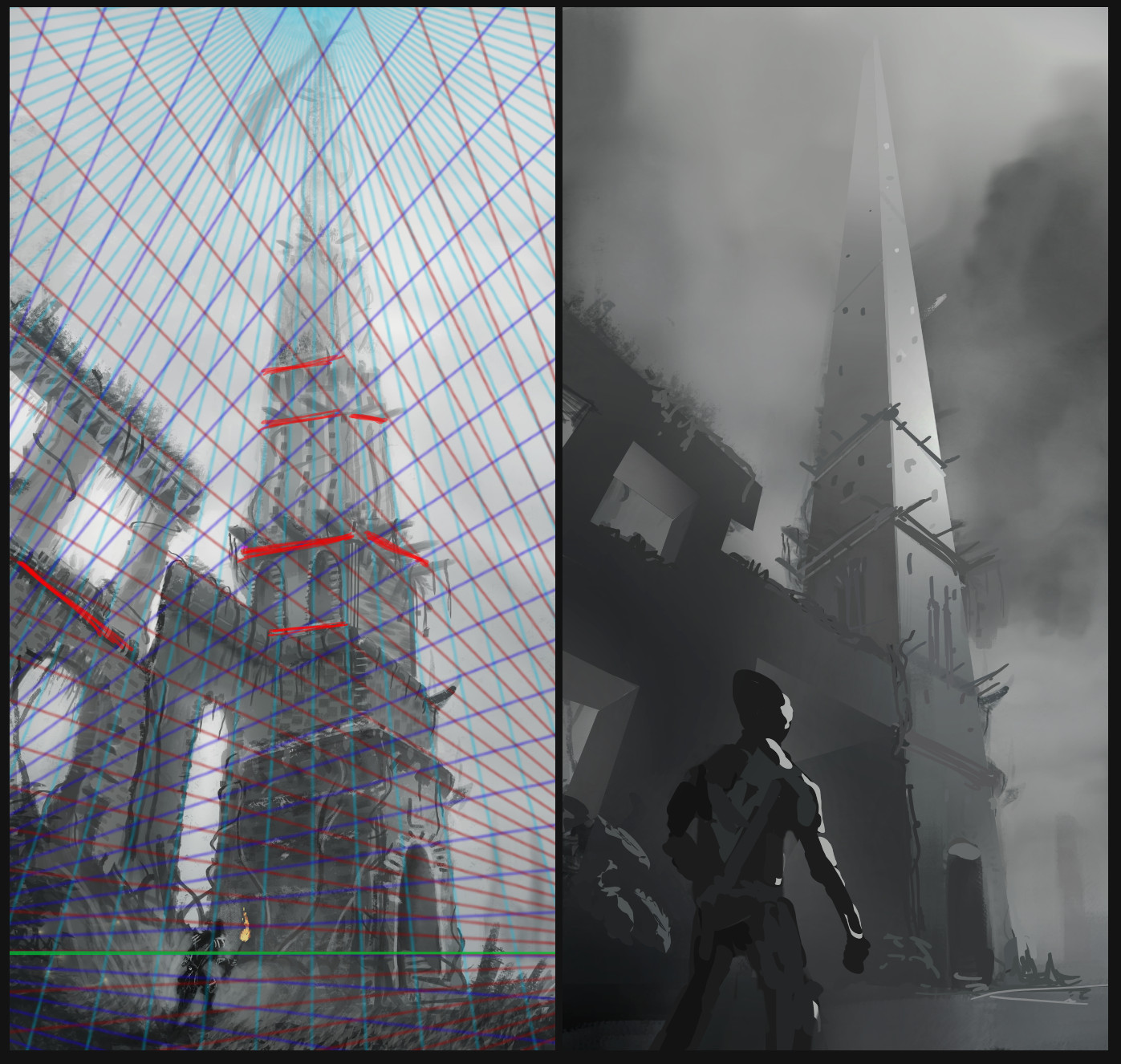
First things first. Your perspective is out of whack. Did a paintover to show the lines and sketched in red where you went off grid.

Adjusted values to show highest contrasts and most detail at focal points. Created a focal point on the tower using rule of thirds. Moved guy to a secondary focal point. Tried to make the lighting scheme a bit more directional so it seemed to be coming from somewhere consistent. A good way to build up a value scheme for an architectural thing like this is to work at lighting primitives first. ie I constructed the tower thinking about basic rectangular shapes and applied values to different faces, then used a soft brush to get the transitions. It's easy to add detail in for rendering once you have the basic shapes nailed.

Hope that helps


 YouTube free learnin! | DeviantArt | Old Folio | Insta
Reply


Forum Jump:


Users browsing this thread: 1 Guest(s)