I'm getting really angry with myself and my lack of understanding of light.
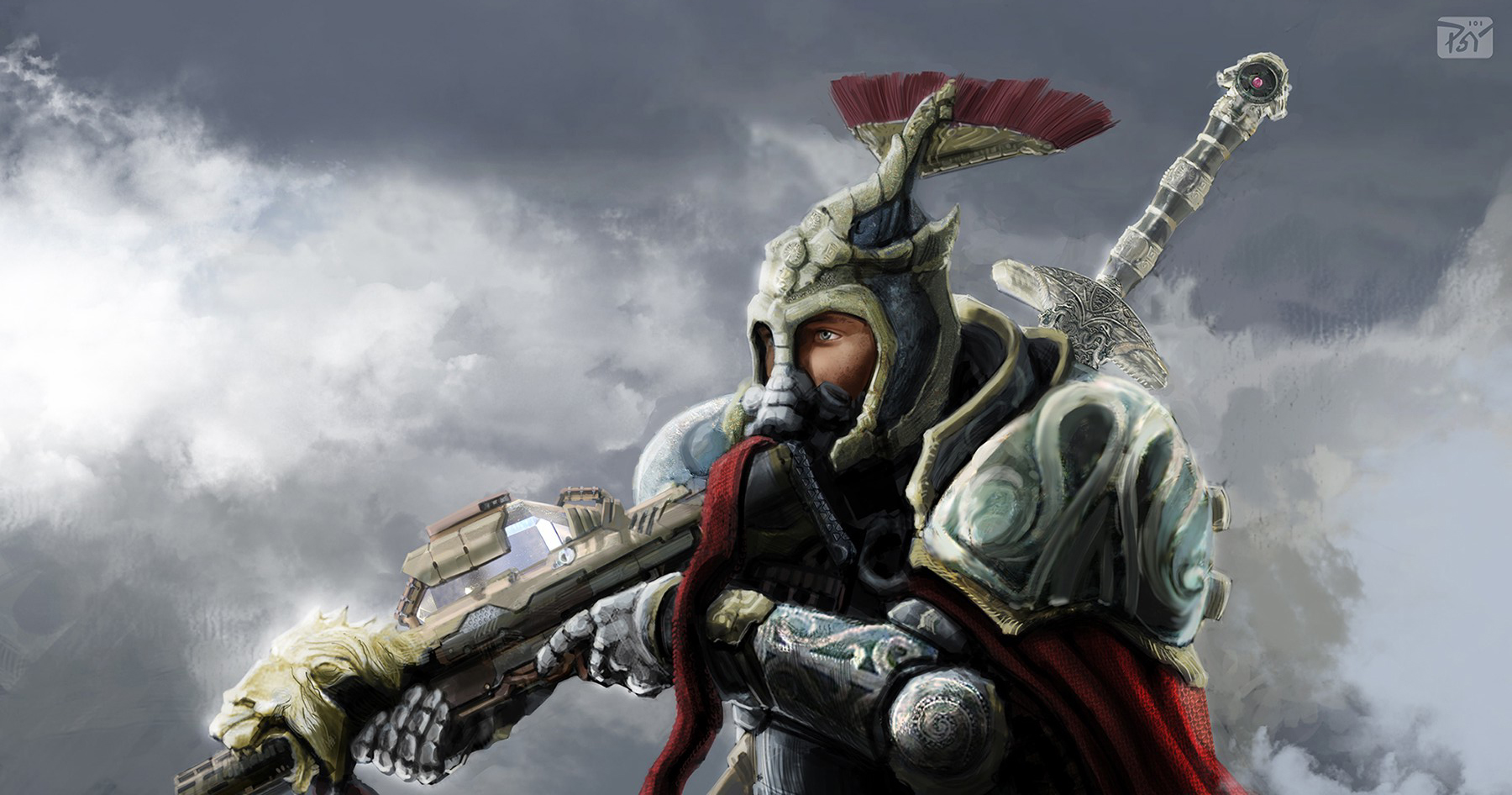
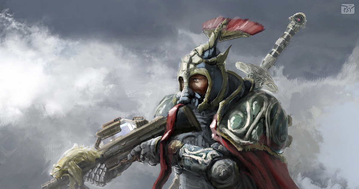
This pic was just some practice. It wasn't supposed to take long, but after 3 days... Well yeah, here it is. The style is intentionally loose, but something is off about it. When I pull out to see it in thumbnail it doesn't read as well as it should.
Do I need to spend time carving out some accurate geometry in the armor? Should I throw in some perspective lines and try to forshorten it? I don't know. Please help.

Michael Syrigos
Unregistered
OK, on one hand you say you don't understand light, but you feel the image doesn't read well, and you have the feeling there's errors with the perspective or geometry. Lack on confidence is what I sense.
On the the image. Light is a problem for me too when I try to wing it without some sort of reference as to the light's quality. Rendering of form isn't the problem, it's consistency with the quality of light. What I mean by this is the type of light and the halftones, shadows and reflected light it produces. For instance, a very intense spot light will create, say, 3 tone difference between light and shadow. So from 10 tones you have 4 tones to render the light and 3 for the shadow. Also let's say that the reflected light produced is fairly light, maybe a tone darker than the darkest halftones. Now, these relationships (at least this is how I have understood this so far) must be consistent and true in the whole image, so as to convince the viewer that they are looking at something being hit by the same light source. Of course, local color and atmosphere must be taken into account. Some reference would help.
Now here what seems confusing is the way you've rendered the planes of the character. There's times when light affects a plane more than others of the same angle, without these differences seeming to be compositional decisions. Also, the contrast isn't clear, you're going for a diffused light and the backlight (your light coming from the right) is the same intensity as your main light, so tonal differences go down and come closer together, no wonder it looks confusing to you, but you've followed your decisions pretty well, if they have any interesting effect or not is another discussion.
However, I'm thinking that maybe you were aiming for something different, in which case, go back to the beginning and make a small rough thumbnail, thinking of contrast, readability and quality of light, and when you get to what you want, redo this based on the thumb.
Posts: 3,357
Threads: 37
Joined: Aug 2013
Reputation:
234
the only thing i dont like about this image is the front shoulder. I can clearly see you didnt put effort there for the rest i can't help am such a noob
(08-05-2013, 07:09 AM)Michael Syrigos Wrote: OK, on one hand you say you don't understand light, but you feel the image doesn't read well, and you have the feeling there's errors with the perspective or geometry. Lack on confidence is what I sense.
On the the image. Light is a problem for me too when I try to wing it without some sort of reference as to the light's quality. Rendering of form isn't the problem, it's consistency with the quality of light. What I mean by this is the type of light and the halftones, shadows and reflected light it produces. For instance, a very intense spot light will create, say, 3 tone difference between light and shadow. So from 10 tones you have 4 tones to render the light and 3 for the shadow. Also let's say that the reflected light produced is fairly light, maybe a tone darker than the darkest halftones. Now, these relationships (at least this is how I have understood this so far) must be consistent and true in the whole image, so as to convince the viewer that they are looking at something being hit by the same light source. Of course, local color and atmosphere must be taken into account. Some reference would help.
Now here what seems confusing is the way you've rendered the planes of the character. There's times when light affects a plane more than others of the same angle, without these differences seeming to be compositional decisions. Also, the contrast isn't clear, you're going for a diffused light and the backlight (your light coming from the right) is the same intensity as your main light, so tonal differences go down and come closer together, no wonder it looks confusing to you, but you've followed your decisions pretty well, if they have any interesting effect or not is another discussion.
However, I'm thinking that maybe you were aiming for something different, in which case, go back to the beginning and make a small rough thumbnail, thinking of contrast, readability and quality of light, and when you get to what you want, redo this based on the thumb.
I see what you mean about the planes not being consistently lit. Now, when I look closely I can see that left shoulder is considerably more lit than the sword or the helm and they share similar planes. I'll try that thumbnail and see what I come to. Perhaps I can salvage this with a confident paint over, keep the same colors and what not.
I agree, the biggest issue here is lighting. The lighting is inconsistent and inaccurate, a problem I had for quite a while in my paintings. I like to think of lighting as if Im sculpting with light. As im painting I imagine the light as particles with laser accuracy hitting things and bouncing off them.

1. First thing I did was remove the dark values because when a subject is surrounded by white clouds the bounce light off the clouds will lighten the shadows.
2. Next I Started fixing the light a bit, taking into account where shadows will fall and various forms should be defined. Really define exactly where your light is coming from early on and stick strictly to it. I also removed the bright light source from behind as its competing with the main front light source. I replaced it with some defuse bounce light from the clouds. Also the chest area was crazy dark even though light would definitely be hitting that area.
3. I fixed some perspective issues with the fuzzy hat feathers and the right shoulder armor.
4. I added some atmosphere, looks kinda like fog. This effect will really pull your subject into the scene. I usually color sample a sorta bright color off the background and with a soft brush apply it to parts of the subject I want to push back or be in fog for composition reasons.
Further suggestions I have for you but didn't have time to fix would be to get rid of the red ribbon on the gun, or put it somewhere else, it looks like a tongue, hehe. Also balance out your detail so that the focal points in the scene have the most detail. For example that sword should not be near as detailed as the helmet and shoulder. Also go easy on the photo textures. I use them often but I always paint over them after so it blends in.
This piece has great potential! Keep up the good work!
|
