Posts: 51
Threads: 7
Joined: Jun 2013
Reputation:
1
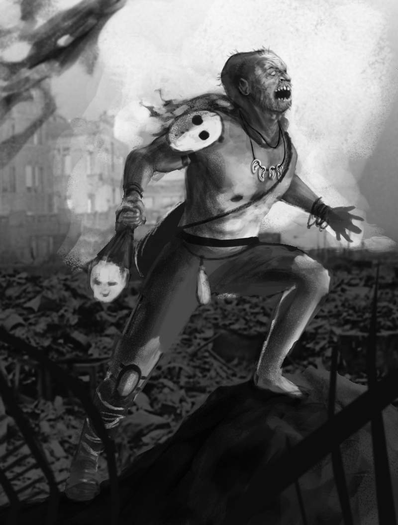
Definitely some anatomy issues stemming from the placement of the arm and the musculature. Both the tricep and bicep look to be flexed at the same time. The use of light is not working either. If your light source is present on the page, it -should- be the brightest object in the picture. Rules can be bent of course, but in this case its a bit too much and is flattening out your piece.
A clear sky with a massive full moon would be quite bright. The contrast of your figure would be much stronger and darker. I would suggest backing the moon up and adding some atmosphere in front of it such as clouds/mist.
There are a couple of 'wolfman' nude male poses on Deviantart in the Resource/Stock section which would really help push this into greatness. Right now the stiffness of the figure is adding to that feeling of 'wrong' you are getting.
Posts: 44
Threads: 4
Joined: Jul 2013
Reputation:
0
Hey star eater. Thanks for the feedback, it's VERY helpful. I hadn't picked up at all on the bicep/tricep issue. The light source is going to change so the huge moon is going. Do you by any chance have a link for those wolf man poses. Or is it easily searchable?
The stiffness of the character is another thing all of my characters have, if you have any tips as to how i could improve that they would be very much appreciated.
Posts: 42
Threads: 4
Joined: Jan 2013
Reputation:
1
Saying all of this without any hint of shame.
As you pointed out, the loin cloth is a bit off. In their-wave like flow of bending the cloth comes off as too symetrical, flattening the depth of the picture a bit between his legs. Due to the amount of folds, too, it gives off the idea that the loin cloth itself is rather thin and easily shaped like a silky sleeve (and to that end, we'd probably see his penis). Lastly, because neither leg fades into the background we have now way of telling which leg is closer to us/the viewer.
To fix all of these all you'd need to do is change the outline of one of the legs (or redraw parts of it) while either redoing the lointh's design in a more natural look (in a comic book hero-esque sense, where it drapes and hides all while whipping a bit, like a cock cape) or go for a different, flatter, stronger material (what Frank Frazetta often did). Either way, it's that itself is very fixable.
Aside from the oddites that Star Eater pointed out, too, the picture isn't bad. Completed, this should look marvelous.
Posts: 63
Threads: 7
Joined: Oct 2012
Reputation:
1
It's good that you showed the reference! I can see that the limbs in your sketch are a bit flattened, as Stareater pointed out, not enouth "3D" This might sound a bit counter intuitive (after all, aren't we doing 2D here?) but have a long look at the model and see how shadows transition in certain points to medium tone and then light areas.
Something I do to get the lighting better is imagine "planes" as I squint at the reference. Basically imagine a "low" poly version of that render, or a very simple simple one. Once you have a stark contrast between the two (using 3-4 values at most!), and the squint gives you roughly the same look on both the reference and your piece, you can start rendering it further. Not earlier!
Hope it helps ;)
Posts: 42
Threads: 4
Joined: Jan 2013
Reputation:
1
Thanks for showing the reference. It makes sense, now. (And I hope what I said earlier was of some use).
What you could ALSO do is use those basic pose and modify it to your liking. Make a couple features more dynamic/interesting instead of following the boring model you see right now. Following planes even in a basic sense (like JBZ says~) you can retain the lighting from the figure easily.
Tis where the reference stops and your creation begins.
Posts: 44
Threads: 4
Joined: Jul 2013
Reputation:
0
Thanks for the paintover Mike, I haven't been able to watch the whole live stream yet as my internet connection keeps cutting out on me. But there were some really useful ideas in there so far, especially in regards to the composition and what to use as a better background/environment.
I probably should have pointed out in the initial post that this was still very much a rough idea. It also started life as a completely different painting which wasn't meant to be part of the world that it now is part of. The only reason I posted it so early in the process was because there were some things which really didn't look right. And I think the composition/inexplicable missing leg was a huge part of that. As were the anatomy issues.
Thanks once again to everyone who's commented so far, your comments have been really helpful. I've not had a chance to work on this any more today as I've been feeling really run down today (one of the side effects of week day drinking)
![[Image: Creature_WiP_zps301a3f64.jpg]](http://i1317.photobucket.com/albums/t622/Simon_Callaghan/Creature_WiP_zps301a3f64.jpg)
![[Image: Creature_WiP_zps301a3f64.jpg]](http://i1317.photobucket.com/albums/t622/Simon_Callaghan/Creature_WiP_zps301a3f64.jpg)


![[Image: Pose_Lighting_Ref_CD_zps406118e9.jpg]](http://i1317.photobucket.com/albums/t622/Simon_Callaghan/Pose_Lighting_Ref_CD_zps406118e9.jpg)
