Hey dude,
Now this is just personal opinion and personal preference so keep in mind I could be talking nonsense without me realizing it.
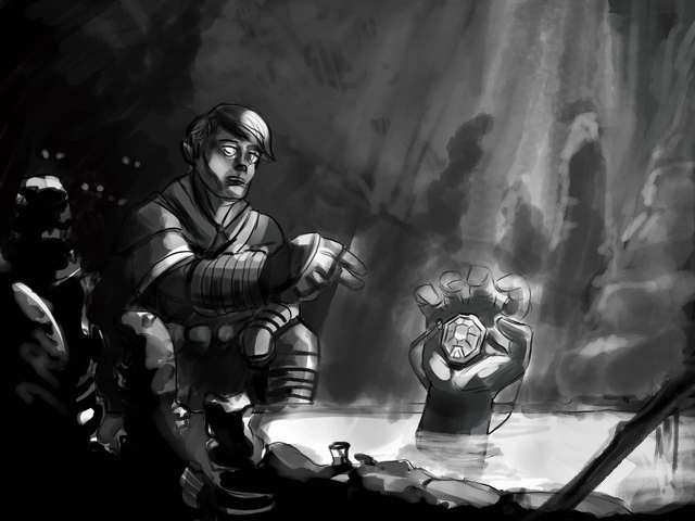
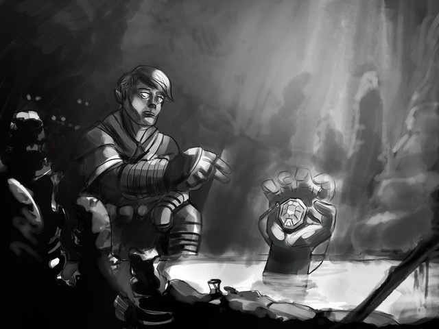
But for what it's worth here is the advice for the image applied to the attached paintover.
Seemed to me that:
1. The perspective of the dude was different from the perspective of the water. (The camera is looking directly at the dude, but it's looking at the water from a point higher up)
2. A sense of scale. We might make the rock formations (or stalactites or whatchama call them) be bigger than him. The bigger the difference between the size of the character and that of the enviorement, the more epic, daunting, strong, etc is the one that is largest.
3. Contrast, atmosphere and distance.
A- When we have a strong contrast it's harder to create atmosphere (that is how light and colors are filtered through the air). The only difference between paintover 01 and 02 are 3 light touches of that fuzzy default brush.
[The way I see it it's a good thing how the light makes a transition to the dark part where the eyes are lurking in the shadows (by the way, love those) You might even barely suggest the silhouette of one of them, only the top of the head or something subtle.]
B- Also having more planes inside the image will create the illusion of distance, so darker elements closer to the camera and less saturated and grayer elements the farther away they are.
4. Painterly effect and focus.
Now left to my own devices I would clearly pencil every little line in an entire image, but apparently drawing every detail will take away from the image more than it will add. The palaces of focus in the image can be drawn as detailed as you want (detail, rendering, sharp edges, the works), but as we move away from them they are best suggested rather than drawn in detail (more opacity to the brush and careless strokes, or at least make them look careless-ish as if to say to the viewer "move along, nothing to see in this area".
Think this might be related to how we focus the stuff we look at in real life. I mean when I look at someone on the street and I look at their head, I stop noticing the detail on their torso.
So having an image perfectly clear, perfectly detailed, although cool, it might have an unnatural feel to it if we consider a picture "a captured moment from the act of seeing".
All depends on how you look at the image. I have to constantly kick myself not to do over detailed pencil drawings in the sketch phase.
5. Look at plenty of reference for the environment. What kind of rocks are those? (is it a smooth, is it a cracked surface?) What is the flora like there? Mushrooms? Muss? etc Suggest those environment "details" but don't paint/render them in detail as long as you don't want them to take away from, or be the focus of the image. It's pretty quick work as you don't have to render it, and it will add lots to the image.
Okay, have fun with the drawing.
And remember, I can only be subjective, so take everything I said with a grain of salt.
Rock on!


![[Image: IyLlssjl.jpg]](http://i.imgur.com/IyLlssjl.jpg) [/img]
[/img]
![[Image: IyLlssjl.jpg]](http://i.imgur.com/IyLlssjl.jpg) [/img]
[/img]


![[Image: 4J5NbxH.jpg]](http://i.imgur.com/4J5NbxH.jpg)