09-23-2013, 06:36 AM
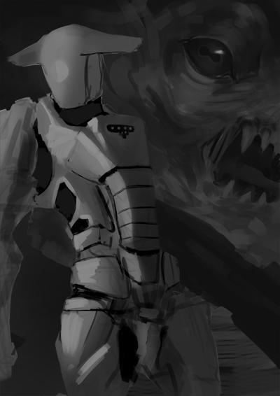
Hey guys I have been busy working on this image and am just requesting a critique or paintover for compostion/values and I eventually want to turn this into a portfolio piece for illustration


|
Requesting Critique/paintover
|
|
09-23-2013, 06:36 AM
Hey guys I have been busy working on this image and am just requesting a critique or paintover for compostion/values and I eventually want to turn this into a portfolio piece for illustration

09-24-2013, 12:38 PM
What is going on in this piece? It looks like it's just a beauty shot, some humanoid in front of a big monster. The humanoid is leaning back a lot, it feels like it's going to fall over. The monster is neat, I like it. I'm wary about cutting the humanoid's arm in half and about the diagonal that almost touches the lower right corner, is it part of the humanoid or the monster?
I think there should be a bigger value contrast between the foreground and background. The darkest dark of the foreground should be lighter than the lightest light of the background to make sure that it sits in front of the background. Here is an example: http://muddycolors.blogspot.ca/2012/10/c...nails.html I hope this helps:)
Fine art www.qitsune.com
Illustration www.chantalfournier.com Blog qitsune.wordpress.com
09-25-2013, 05:06 AM
Livestream Crits/Paintovers: www.twitch.tv/mike086
Loomis Study videos: http://www.youtube.com/user/mike086 My Facebook page: MCIII
09-28-2013, 05:33 AM
Thanks for the critiques working on fixing the values
|
|
« Next Oldest | Next Newest »
|