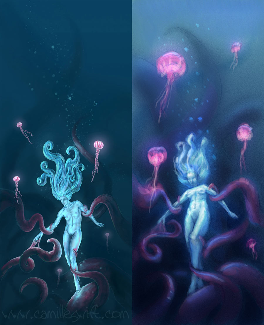
I don't think there is enough interest in the top portion of the tall one to merit the taller composition, the second composition is just fine maybe a little more on top if anything? Try posting PNGs instead of JPGs and see if that helps? Don't have much else to add, pretty solid piece.
Posts: 60
Threads: 15
Joined: Feb 2012
Reputation:
0
Thanks a bunch! I'll definitely try PNG's! What do you mean by "more on top"? Bubbles? Jellyfish? Rendering?
Ah sorry space, just bump the top of the frame up a bit so that there is a bit of empty blue so it's not so wall to wall action.
Posts: 1,970
Threads: 22
Joined: Apr 2012
Reputation:
243
The Aerosmith song, "Dude (looks like a lady)" comes to mind for some reason. Female forms, have less angles, more curves, less defined musculature, wider hips, narrower shoulders etc etc. As the person is the focus, you really want to nail this. I agree the composition if it had more interest in the upper portions would justify the height. I actually like the extended height so instead of cropping maybe add a secondary focal point at one of the tentacles at the top?
Hope it helps!
Posts: 60
Threads: 15
Joined: Feb 2012
Reputation:
0
Thanks, guys! As far as musculature goes, I often use my (female) trapeze friends as models. As aerialists, we have much more defined musculature than the average woman. I prefer this, a bit à la Julie Bell.
Posts: 1,970
Threads: 22
Joined: Apr 2012
Reputation:
243
Ah I see, well that is fair enough. The one thing about Julie Bell's characters though is that while they are pretty well muscled, they are also undeniably feminine. What I think your character exhibits is more androgenous than anything. If this is what you are going for then it's all good, but if not, you might want to look at pushing some things back a bit more to the feminine side. As a quick diagnostic I'd say maybe softening up the face and making that less masculine might go a long way. Anyway it's up to you what you want to portray, so the balls in your court. :)
Posts: 60
Threads: 15
Joined: Feb 2012
Reputation:
0
Thanks! Yeah, maybe I'll give her softer cheeks, wider hips, or something...
Posts: 60
Threads: 15
Joined: Feb 2012
Reputation:
0
Wow, thank you, Javier! I can see exactly what you mean! That is a MUCH more dynamic perspective. Your sketch is ten times more effective than my finished piece!
![[Image: Welcome-Home_sig.jpg~original]](http://i1072.photobucket.com/albums/w373/CamilleonSwift/Welcome-Home_sig.jpg~original)
![[Image: Welcome-Home_2_sig.jpg~original]](http://i1072.photobucket.com/albums/w373/CamilleonSwift/Welcome-Home_2_sig.jpg~original)
![[Image: Welcome-Home_sig.jpg~original]](http://i1072.photobucket.com/albums/w373/CamilleonSwift/Welcome-Home_sig.jpg~original)
![[Image: Welcome-Home_2_sig.jpg~original]](http://i1072.photobucket.com/albums/w373/CamilleonSwift/Welcome-Home_2_sig.jpg~original)


