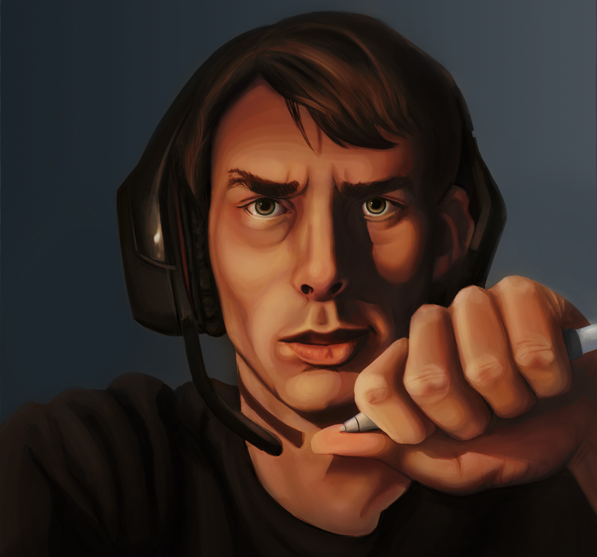
For the past week or so, I've been trying to capture a fairly accurate self portrait of myself. Since I suck at coloring I began at first in grey scale. I think I've gotten to the point where it's ready for colorizing, but I'm not sure how to go about it.
I have the grey scale version below, and would love some suggestions on it. The nose just annoys me as it seems to me to be a bit crooked... but other than that, is there any glaring errors that I'm just not seeing? That, and is the hair rendered well, I've always had trouble with hair.
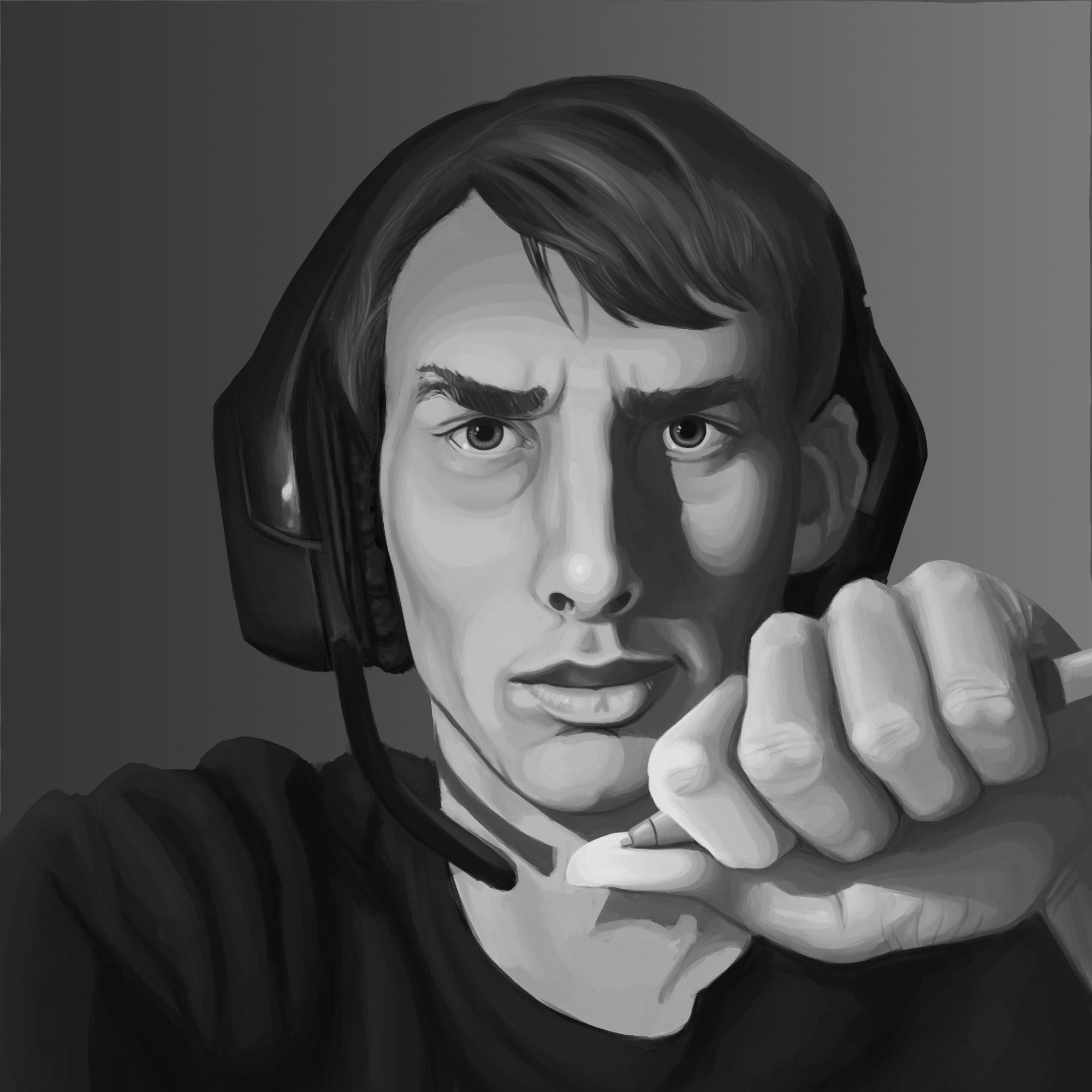
I've tried colorizing it, and so far have gotten to this point. It's difficult, because looking at my face in the mirror, and then at reference pictures, and then at this, it seems like the colors are all different for each.
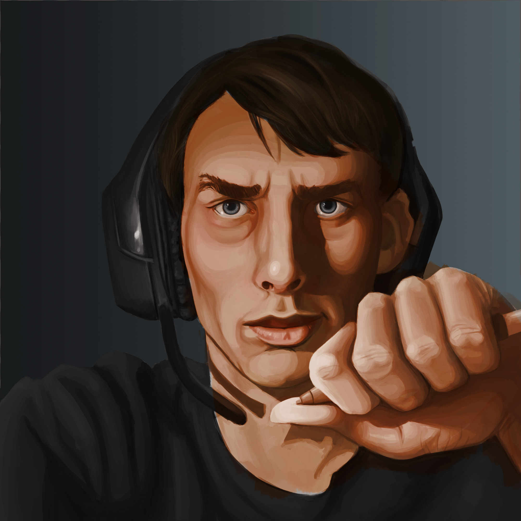
I can post a reference picture if needed, but I already know that this self portrait is a bit flawed according to the picture... I just see myself differently, I suppose.
Posts: 1,970
Threads: 22
Joined: Apr 2012
Reputation:
243
Nice work. In general the style is a little bit more sylised. Is that what you are going for or are you going for realism?
The hair could probably do with a bit of volume and cast shadows to match it more to the volume of the face.
So first the usual stuff: faces tend to be get more warm and saturated colours at the nose tips, cheeks. Slightly cooler, (towards) blues and green in the jaw area, more so for men. Also remember complementary cooler colours in shadow areas for warm lighting.
In terms of colour, bring in some variety of hue for vibrance. Colour vibrance is when shades of different (often opposing temperature) hues are slapped right next to each other. This is an exerpt from Stapleton Kearns blog, great blog about traditional landscape painting. He's talking about snow but this bit applies because it explains so well the idea of color vibrance. Check out the link for the image.
"He is also making his color "vibrate". This is a form of broken or divisionist color. It is a kind of impressionist method. It is also very "Rockport". The painters from the Rockport school often used the square touch, broken color method of painting.The eye jumps back and forth between the warms and the cools and that gives a feeling of complexity that fools the eye into believing it is seeing nature."
Full post here: Stapleton Kearns post
Couple of examples I thought were good for portraits: The blues in the famous first portrait, if you squint really do suggest veins under the skin and right next to the warmer tones of the skin it looks so real...it's amazing. Notice the greens in the second one.
![[Image: rembrandt-self-portrait.jpg]](http://arthistoryuk.files.wordpress.com/2010/09/rembrandt-self-portrait.jpg)
![[Image: 100_1124.jpg]](http://www.arthistorie.com/100_1124.jpg)
Oh and painting from a photograph will result in a painting of a photograph. Paint from life if you can, I think you'll learn a lot more.
Posts: 9
Threads: 1
Joined: Mar 2013
Reputation:
0
Hah, I never knew you were a guy! I think the problem with the nose is that it's quite long, and considering your heavy brow I would assume that there is a slight dent between the nose bridge and the forehead, even if it's subtle, that should show as very faint shading.
Regarding the color, I think looking at portraits of the old masters is a great suggestion. Having said that, I think it's also important to be as objective as possible with your color interpretation. Right now, looking at the colors you've used on your portrait, I think your color choices are influenced by what you think is right rather than accurate observation. That, and the fact that you used values first might have made things more complicated since now you have to battle with the way your software interprets the mix of color and value as well.
I don't think I've ever seen someone doing a still life or self portrait in greyscale first. It adds an unnecessary step, unless the very purpose of the exercise is to capture the values but in your case it isn't. If I were you I'd find a good/steady artificial light source and a large mirror and go straight into using colors so you train yourself to see them as they are.
@MonkeyBread
I'm not trying to be as realistic as possible, but I'm not going to try and perfectly render my face.
I'd like to know what you mean about adding more volume to the hair. I can understand more cast shadows.
I actually just watched a video where the artist mentioned this same exact "vibrating" technique. Thank's a bunch for the examples! I'm glad I at least recognize the Rembrandt painting. It's incredible how that technique works... unfortunately my face doesn't have as many folds and wrinkles that makes his so fantastic.
@Lhune
Haha, well I don't usually post pictures or drawings of myself. I know the nose is too long, but trying to fix it seemed just to ruin the painting in my eyes. I might try again. I tried to add in some subtle shading, as you are right, I saw some very subtle shading in the mirror.
I'm sure you are right, but I'm terrible at gauging color, which is why I tried to gauge by value first, and then add color. It might not be perfect, but for my first time coloring like this, I'd say it's better than anything else I've attempted. I'll have to train my eye, but that's when I've got more time... I'm a bit on a busy schedule.
I never knew you were on this site, but I guess I shouldn't be surprised. There's a bunch of amazing artists and designs on here.
-----------------------------
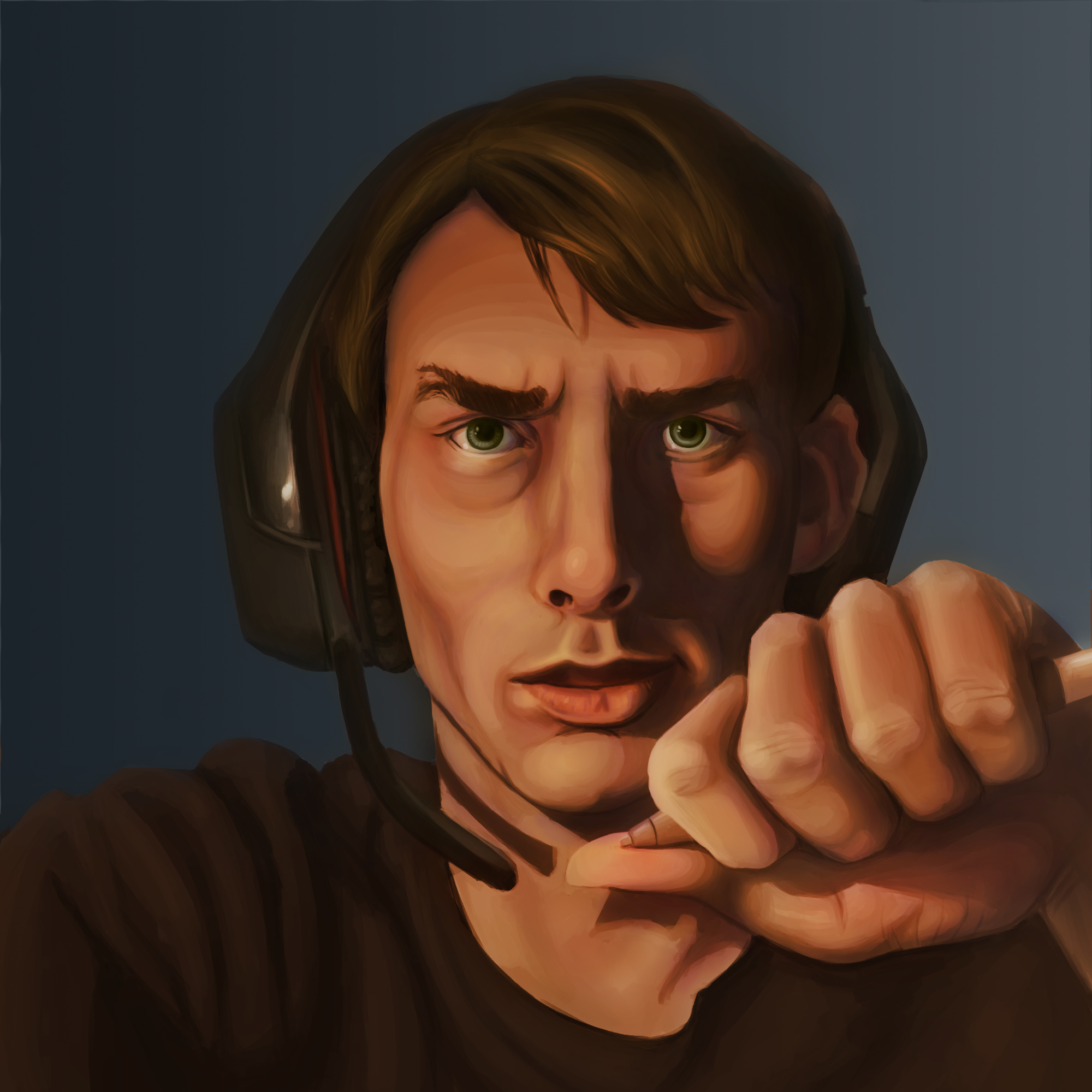
After taking some advice and looking at master portraits, I've come up with this...
Not really sure what to do with the background though...
Posts: 9
Threads: 1
Joined: Mar 2013
Reputation:
0
(10-11-2013, 07:00 AM)opkluu Wrote: @Lhune
Haha, well I don't usually post pictures or drawings of myself. I know the nose is too long, but trying to fix it seemed just to ruin the painting in my eyes. I might try again. I tried to add in some subtle shading, as you are right, I saw some very subtle shading in the mirror.
I'm sure you are right, but I'm terrible at gauging color, which is why I tried to gauge by value first, and then add color. It might not be perfect, but for my first time coloring like this, I'd say it's better than anything else I've attempted. I'll have to train my eye, but that's when I've got more time... I'm a bit on a busy schedule.
Hmm, perhaps you are simply too attached to the painting? There's no such thing as "ruining" a digital painting if you think about it, you can save the individual steps, work on different layers, undo what you've done. If your purpose is to learn and not to create a pretty picture, then do whatever you think needs to be done. Don't be afraid to experiment, don't be afraid to make mistakes. Your life or career do not depend on this one picture so ruin it if you must; if it means you've learned something from it then it was all worth it.
The thing is you are not going to get better at seeing colors by (the way I see it) complicating the process. You get better at seeing colors by working with them. It's great that you're seeing improvement in this piece; at least what you're doing is useful then! But you need to let go of that fear of doing things wrong. Time has nothing to do with it, you could technically make a still life impression in 10 minutes focusing only on large color blocks. In fact that's a great exercise! You could use movie stills for that too.
Here, if it helps your confidence, below is a color impression I just did in 15-20 minutes of a titanic screenshot. It's ugly and the proportions are way off, but that's not the point of the exercise. The point is to capture and understand the colors. As you see I've still got plenty of it wrong but you'll find you get more and more accurate as you do them more often.
![[Image: 9yig.jpg]](http://img826.imageshack.us/img826/4845/9yig.jpg)
Posts: 1,970
Threads: 22
Joined: Apr 2012
Reputation:
243
The update does look better and you're already adding more volume to the hair with those highlights so it's looking better. For what it's worth I think you're doing a lot better than many do at adding colour to grayscale, but you're not quite there yet. It's easy to get very muddy hues and an overly cool-skewed palette with only using blending modes over grayscale. Have you actually painted directly on a normal layer yet? Just curious. I think at some point you will have to, to get a really nice result.
I know you aren't going for realism, but one thing I noticed with your piece is that you have a lot of hard edges. Almost all the form edges are hard and well defined which makes everything look quite harsh. Try softening up some edges especially in the shadowed areas. It will accentuate receding forms and add depth and create a softer look. Also hard edges draw focus so you should use them very carefully to get focus where you want it. The rembrandt image I posted demonstrates that quite well as well, the hardest edges are around the eye...
@Lhune
Haha, funny that you say that, since I'm trying to update my portfolio in order to get into art school. Since it's so expensive here in the USA, I'm really trying to impress the admissions agents and hopefully net myself a scholarship. I've heard a great many stories of the huge amount of debt artists cope with after going to a respectable art school. Therefore, it might just be the piece that decides my getting into art school.
I do understand what you mean, and I should definitely understand color. However, I'm trying to compile a portfolio to send in about a month, so I don't exactly have the time. I have lots of traditional pieces, and was suggested that I include more digital pieces, and color, so that's what I'm shooting for. I just fear that I'll fail and the piece won't reflect my best work...
However, your exercise looks great, fast, helpful, and a bit out of my comfort zone, a good thing. I'll try to make some over the course of the month I still have, and use those skills for my next paintings, but I still am most comfortable with the method I'm using, at least for grey scale. Regardless, thank you so much for your input! I remember the first time I saw your artwork on deviantart a couple of years ago, and marveled at it. You're actually a part of the large inspiration of artists that made me decide to try becoming a professional.
@Monkeybread
Thanks! I haven't yet, and after watching so many videos in which the artist usually does paint over in normal mode, I did attempt it.
Thanks for the tip! I softened up some of the edges farther away from the face, and in shadow. As for the eyes, another person recommended that I maybe add in some small, scattered highlights underneath the eye on the lid to create some contrast and add a little texture, which I will attempt after I take a little break from staring at this piece for hours at a time!
In this rendition I cooled down the shadows a bit, and tried to part from the monochromatic look I had before. Also I realized my eyes are not just green.

Posts: 9
Threads: 1
Joined: Mar 2013
Reputation:
0
Unless it's a really good art school I would personally reconsider. I've heard about the pricing of USA art schools and it's quite frankly ridiculous how much you need to pay. On top of that, what you're getting in return is not even necessarily better than if you simply went and practiced full time on your own.
Still, it's not this one piece that will make or break your portfolio. If you have only a month left to go then your skill is not going to dramatically improve anymore. Either way I think (though I can't be sure since I'm unfamiliar with your school's requirements) the people that will judge your work would rather see a willingness to explore and improve than a few very polished pieces. Don't overwork yourself, you can't do more than your best and your best is not necessarily a beautifully rendered picture. I always thought it worked that way, but some of my most appreciated pieces today are ones that took me only a few hours whereas I have plenty of pieces in my gallery that took me many hours but are largely overlooked.
Thank you, I feel quite honored to have served as an inspiration :).
|


![[Image: rembrandt-self-portrait.jpg]](http://arthistoryuk.files.wordpress.com/2010/09/rembrandt-self-portrait.jpg)
![[Image: 100_1124.jpg]](http://www.arthistorie.com/100_1124.jpg)

![[Image: 9yig.jpg]](http://img826.imageshack.us/img826/4845/9yig.jpg)
