12-04-2013, 09:33 AM
Howdy,
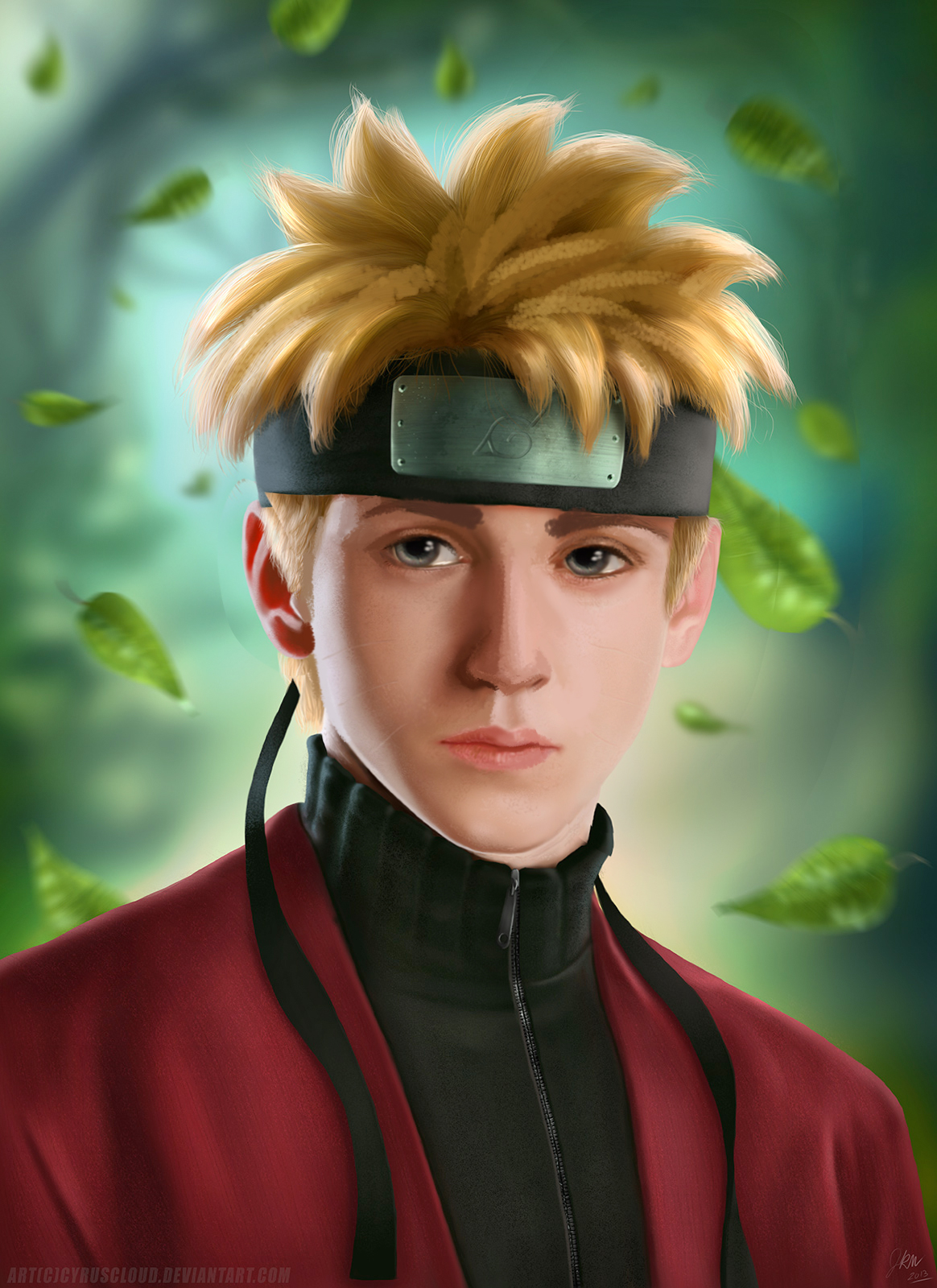
I recently received a critique on this work as below
"There are some anatomical issues with the subject, the eyes especially.
Texture inconsistency issues, some texture well done while others flat and muddy."
Not sure on the anatomy issues, I enlarge the eyes a little on purpose trying to bring him a little closer to his anime form but still don't think I pushed them too large. Main one grabbing my attention is the texture inconsistency, I have had another image get a critique very similar to this so there is something I am doing that is drawing this conclusion and I want to drop the habit. So I'd like a little better description on where this is going wrong and what I need to do to not only fix it but avoid it in the future. Also I had a lot of difficult with the hair on this, I wanted to style his hair like the anime version but make it real, a tall task on itself but it should be doable, I don't think what I have is terrible but of everything that is the part that bothers me the most.


