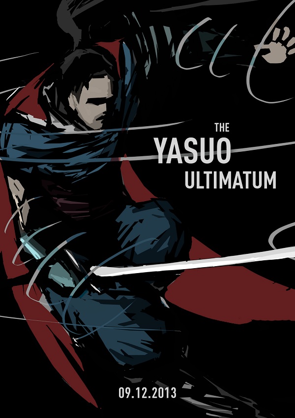
hi im new here
critique plz.. thx )

critique plz.. thx )

|
Critique needed
|
|
hi im new here
critique plz.. thx ) 
12-20-2013, 12:38 PM
That's a nice thumbnail/value study. Is it supposed to be a finished piece? Is it a mock up for a book cover?
Fine art www.qitsune.com
Illustration www.chantalfournier.com Blog qitsune.wordpress.com
01-02-2014, 02:47 PM
Any chance you can push that point of view to even more top-down? Example I was thinking of is this X-23 cover, not as extreme as that, but in that direction, could be more interesting: http://pnmedia.gamespy.com/planetxmen.ga...rget-1.jpg
That's the cover of this issue: X-23: TARGET X #1, and the artist is Pencils & Cover by MIKE CHOI. He's done a lot of comic covers as well as the comics themselves, and his dA gallery has his more recent comic cover art, though he seems to have taken down all of his older stuff, especially the ones for Marvel: http://michaelchoiart.deviantart.com/gallery/ |
|
« Next Oldest | Next Newest »
|