I agree with Mike about the compositional aspect. Same size and shape of the beast and dude on the canvas. I'm going to go further though because I'm also not sold on the entire composition aspect and why you chose a landscape canvas, cutting off both characters at the knees. A lot of people cut off characters at the knees...not sure why. Don't be scared to show full body.
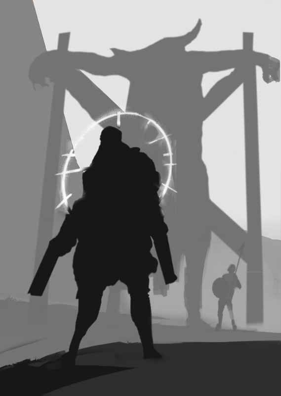
I think there are some neat structural bits already in there so I just took them and rearranged to a composition that showcased the scene and the figures better. The main ideas for this one are the character on a main rule of third focal point; The beast is placed, so cross beams lead towards figure; flipped him horizontally so he was looking at the character rather than away. Small things like that add to the flow. The hill to the side also leads to the figure. Basically it's all engineered to flow, how I wanted it to.
Note also that I perspective warped the figures to get that sense of looking up at them as Mike also suggested.
I find the best way to think about composition is to only work with the most concise shapes that show off a form and do a basic value block in. All you need are simple shapes with the right values applied because these are what will give you the read. if you separate your main components out by value and layer it is so easy to then play with your composition without having to repaint. Use photoshop to your advantage..it is powerful as heck.
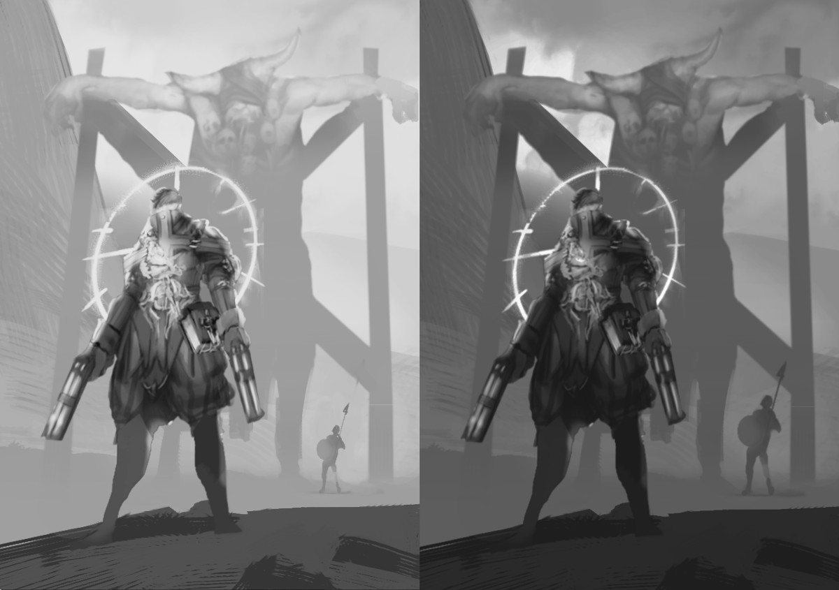
I kept two different sized soldier figures in the distance to show how easy it is to imply scale with something recognizable, and how you can play with these things really easily. Also left in a high key and lower key variation, easy to tweak because...yep different layers.
Once you have your arrangement everything else is just detail and only matters to add wow factor.
Simple shape block in.

With your detailing on top. Note I got carried away, and because I diverged from my comp values and shapes...I actually think the detailed ones are becoming less successful than the simple shape comp! It's always handy to keep your original comp on hand so you can check back and make sure you aren't taking it away from what was intended as you get into the throes of detailing.


