04-21-2014, 11:58 PM
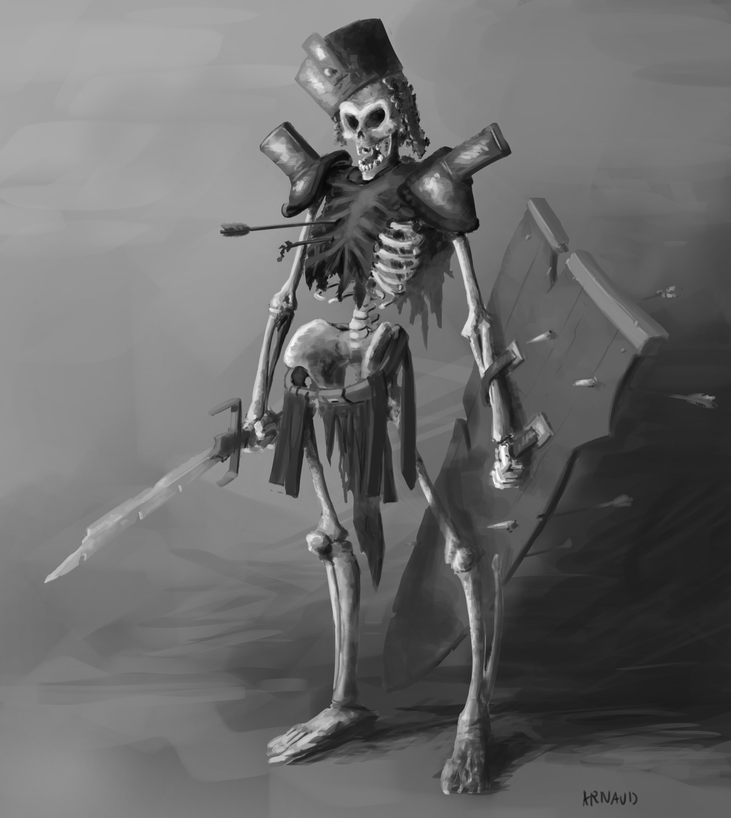
Classic "skeleton warrior makes you throw a d20 dice" D&D style...
Okay so I'm finding myself at the point were I fell that the only way to keep on improving on this is to start a new one.
Still I'll be happy to have honest and strong crits on this, especially about values and blending treatments... Working by values is still new for me.

Tried to keep this as a character concept sketch exercise, something to give a sense of the character without painting it for a week. (Was doing this following C. Bowater's class on skillshare: http://www.skillshare.com/classes/design...ia=profile )
Rain this with crits/flame/"dude u doin' it wrong"/what have you
Cheers!
Okay so I'm finding myself at the point were I fell that the only way to keep on improving on this is to start a new one.
Still I'll be happy to have honest and strong crits on this, especially about values and blending treatments... Working by values is still new for me.

Tried to keep this as a character concept sketch exercise, something to give a sense of the character without painting it for a week. (Was doing this following C. Bowater's class on skillshare: http://www.skillshare.com/classes/design...ia=profile )
Rain this with crits/flame/"dude u doin' it wrong"/what have you

Cheers!


