Nymph pools
#21
awesome crit, couldnt ask for more, especially using a mouse!!
i think i may keep the girl standing in the bottom left, because i dont want to replicate the pose of the focal character too much, plus i like rendering glowing bums.... i think it leads you into the scene well, but thats just a person al opinion. may have her quite close bottom left which will give the focal point a bit more space.
I love the person touching the waterfall bit, that was an awesome idea.
I'm so confused with atmospheric perspective now though, because i was told to boost the value range a bit more to give depth, but that made it look weird and washed out because it was night time, but this looks good. i may add a little bit more of a slightly lighter blueish cyan behind the shroom to make it stick out a bit, and suggest some shroom in the background with some waterfalls.

did you use photorefs for the people? im never sure how much i should be using those as overlay layers etc, because i want to be able to draw faces etc well in any case but i know i dont have sufficient skills at the point in time to be able to pull it off.

as for the boobs, the best reference for the pose had someone rather well endowed so that leaked into this, though honestly thats one of the things that was bugging me- i would far prefer to tone them down because you're right they look very immature especially when rendered amateurly.
yeh i think the low opacity thing is a bit of a bad habit i need to break out of, i just find it so much easier for blending i guess.

where do you suggest i go from here? i dont really want to use your image, purely because i want my art to be my own if you see what I mean and I would consider that cheating (i wouldnt be learning as much), but the only alternative is starting all over again...

in the end its only been a couple hours or so, and im not at all happy with it at this stage so its unlikely i ever will be. will start again and hopefully get it right this time... thanks very much for the crit and the effort you've gone through to do it with a mouse!

Train, gain, or stay the same.
Deviantart
Sketchberk
Reply
#22
Oh I totally chucked in some figures taken from a couple of awesome paintings because I knew there was no way in hell I would try doing figures by mouse. The waterfall girl is all me, and it shows haha.

I think using photo plates is fine, and if this was concept art, then I think most pros have no qualms about using stuff like that, because speed is the driving goal besides design. For personal work, I personally, probably wouldn't go down that route, especially using bits from someone else's painting. I know they say anything goes nowdays for technique, and while I agree with that, using a photograph to "paint" doesn't always satisfy my own sense of achievement and fun. I actually like painting, not layering photographic textures, for the most part.

You know I was trying to see what you were trying to do, then make it better. If I was to attack this subject, I would probably go a completely different route. So feel free to use whatever you want from it to improve your image or to build your next one. I know the feeling though of wanting something to be all your own, so if you feel strongly about it, then definitely go with that feeling.
But only do it for that reason, not because you feel you are cheating by taking some paintover crit!!

Go forth and enjoy

 YouTube free learnin! | DeviantArt | Old Folio | Insta
Reply
#23
so yeh, it changed.
much more happy with it now, some refinement needed.
ear needs to be much lower, need to fit in the figure in the background too, shes too wispy compared to the dark black on her right.
also will fix the dark line under her face.


edit: edited the lighting and the colours quite a bit, new arm position, though not sure i like it- thoughts?


Attached Files Image(s)


Train, gain, or stay the same.
Deviantart
Sketchberk
Reply
#24
Hi Wardy,
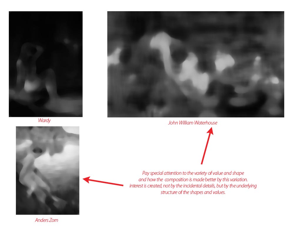
Monkeybread has given you some stellar feedback/critique, but you are seem to still be missing the mark. Your drawing and rendering skills are good, but your compositional arrangements still read as somewhat boring. Here is a side by side comparison of your current iteration along with two examples monkeybread posted:


You can clearly see how your image is "read" when it is reduced to grayscale. This is because the underlying value pattern is really what is creating that initial impression on the viewer. By having a variation in value and pattern, you are creating interest for the viewer. Your image reads as a single figure on a flat background. While this could be well rendered in a number of ways, it is still a very static and somewhat uninteresting idea.
My advice would be to really think about the overall mood of the image you wish to create (is this scary, peaceful, erotic, mysterious, etc.) and firmly establish this "mood" in your mind as you generate thumbnails for this image. Think, not only about the lighting situation, but also about how the light affects the overall value pattern of the piece.
It is easier to take a picture of a naked woman than it is to paint an image of one; what can you add to the idea of a nude figure in an interesting environment? This is the kind of question that you should be asking yourself as you create this image. I hope that my observations have been of some help. Good luck with this piece, and don't give up on it.

-Sketchbook-
"... for drawing is a thinking person's art." - Walt Stanchfield.
Reply
#25
Wow my one seems very boring in comparison! Thats the exact problem I'm feeling, the background seems 'bolted on' to the figure, like its just a 2d add on, which is really baking my noodle. I feel like rendering it even more isnt going to help it anymore, so glad you pointed this out in vaguely early stages, thanks!

I wanted to establish a really intimate kinda secretive mood, like you are peering in on something extremely natural and rare. Like seeing fairies in a forest. Thats what I was going for with the partial moonlighting, a bit of intrigue, but obviously that hasnt come across. Maybe I could add some glowing ferns to add some value variance?

Some great crit, thanks very much. I was actually just about to write a comment saying i'm gonna let this one go, but maybe I'll give it another shot... I'm at the stage where I dont feel like anythings working, im not enjoying it because everything looks static and fake, and i just want to swim back to the cosy island my comfort zone... I miss pure environment design.... Still. Will add some value variance to help out the comp, because I definitely owe that for some great advice, and will see where it goes from there.

Thanks very much man!

Train, gain, or stay the same.
Deviantart
Sketchberk
Reply
#26
Nothing trancendental will come out of one piece. I think you've made a bloody good effort in rocking through the various stages and changes from where this started. My leaving thought for the day is this: skill without vision is boring, vision without skill is disappointing. It's all about a balance, but I'd say vision is the one you really want to cultivate. Most people focus on skill to the detriment of vision or meaning these days in the rush to prove they can do a job for a paycheck. Good luck with whatever you choose! :)

 YouTube free learnin! | DeviantArt | Old Folio | Insta
Reply
#27
yeah i know, its frustrating but true. this is essentially my first ever proper figure piece that I've carried through, so I was never expecting wonders. Thanks man, its been a very steep learning curve!
exactly, i need to work out why im painting what im painting, and what i want to convey, if its a design or a mood/emotion. The main thing behind my work atm is very shallow mood. They are like a landscape you see out the window then find out its a piece of painted cardboard someone stuck onto your window... Simile of the day :)

I think I'm gonna let this one rest, though thanks very much for all the advice everyone, especially you mate, you've been enormously helpful as always. I've learnt a hell of a lot, i just need to learn to apply it to the next piece I do.

Train, gain, or stay the same.
Deviantart
Sketchberk
Reply


Forum Jump:


Users browsing this thread: 7 Guest(s)