Posts: 1,970
Threads: 22
Joined: Apr 2012
Reputation:
243
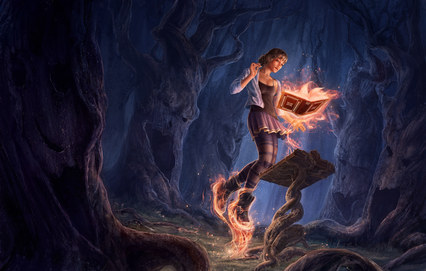
Hey there, first off nice work in general. There's a great balance of composition, texture density and colour in this. A small anatomy thing is her fore and middle fingers seem a little too long and sausagey than they should be so refining those down a bit might be good. I think her singlet folds could probably do with better construction than they are at the moment and maybe follow around her torso a bit better
.You may want to provide a bit darker cast shadows of the lectern given the strength of the magic flames. This could also translate to some well chosen darker cast shadows on the trees in to help the composition and ominous feel of the lighting even more.
I do feel the comp does push out to leave the canvas at the lower right corner a teensy bit, but it's not overwhelming.
And actually another exploratory idea you might want to try is to remove the ground plane completely and make it appear like she is floating higher above the ground. It might add to a sense of her being out of control and help accentuate that nice slight diagonal angle of the trees push through the entire composition a bit more.
My only other crit is that, well you mentioned that the narrative is obvious, but actually, it isn't really. Is she in control of the book, or is the book in control of her. Is she there willingly or unwillingly. These questions need to be answered.
In my opinion the biggest failing in this piece is her expression. It is so blase and neutral that I don't really have any sense what this event means to her. I think perhaps opening her eyes a bit more to show surprise or fear, or doing something halfway cliche like whiting out her eyes, (or at least something to that effect) would provide some interest.
I don't think you need to tighten up things too much further either to be honest. The style you have is quite detailed already and you don't want to overegg the render. This is a stylistic preference of my own though, and I tend to prefer it when things are left somewhat to mystery and imagination a little.
Hope that helps.
Posts: 20
Threads: 6
Joined: Mar 2013
Reputation:
1
I can see your point about the facial expression. I was thinking the girl was entranced or hypnotized (not sure what the word is) by the book, not having a completely strong emotional reaction to it. Perhaps I should try something with the eyes to make that more obvious.


