Posts: 274
Threads: 0
Joined: Feb 2014
Reputation:
3
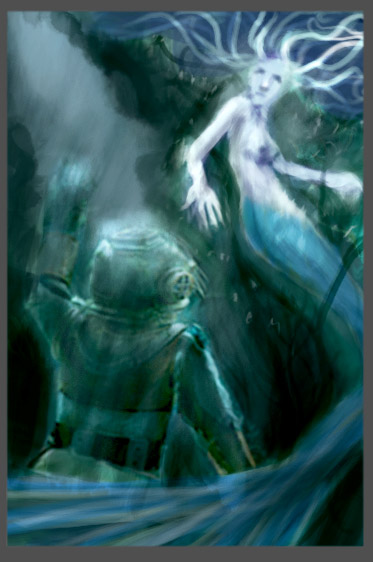
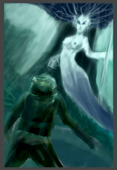
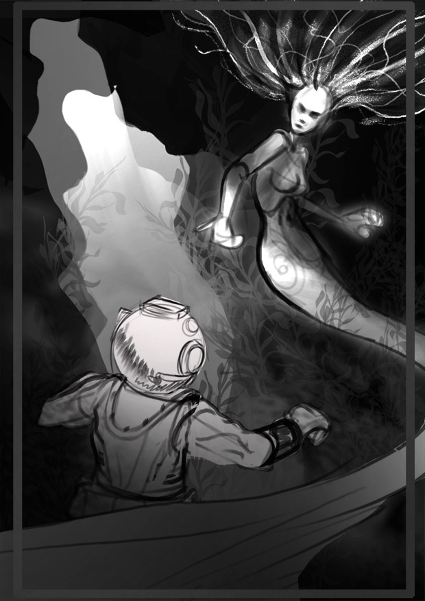
Hm, those are fairly detailed for thumbnails, they're looking pretty good. You should probably get more of a contrast in the finished piece, the contrast in those thumbnails are a bit muddy.
Posts: 286
Threads: 4
Joined: Oct 2014
Reputation:
16
Hi Kyteki! Great Job so far! Its not that muddy for an underwater shot 8).
Love the Mermaid gesture. And I also empathize your attempt to redo the thumbnail in value. Its all about values
I suggest you Google for pictures and study underwater shots. Its always dark in the bottom and light at the top - as sunlight having difficulties traveling thru the water.
Keep the great work.
Posts: 40
Threads: 2
Joined: Apr 2014
Reputation:
4
I think you're on the right track with simplifying in any case. I tend to fall into that same trap almost every time, but I think you did great with these! Just keep on doing studies and it will all come.
I also like your 2 mermaid concepts - they have a very different feel though, one seems like the creature is intimidated by the man, while in the other it's the exact opposite. At least that was my read. Could be something to consider perhaps if you decide to go further with these - might also help with the color palette.
Looking forward to seeing more! :)
