11-20-2014, 07:49 AM
Personal project of mine that has been over a year in the making. I've started and stopped, changed things around, etc. many times. I really like the IDEA but I don't think I'm executing it correctly.
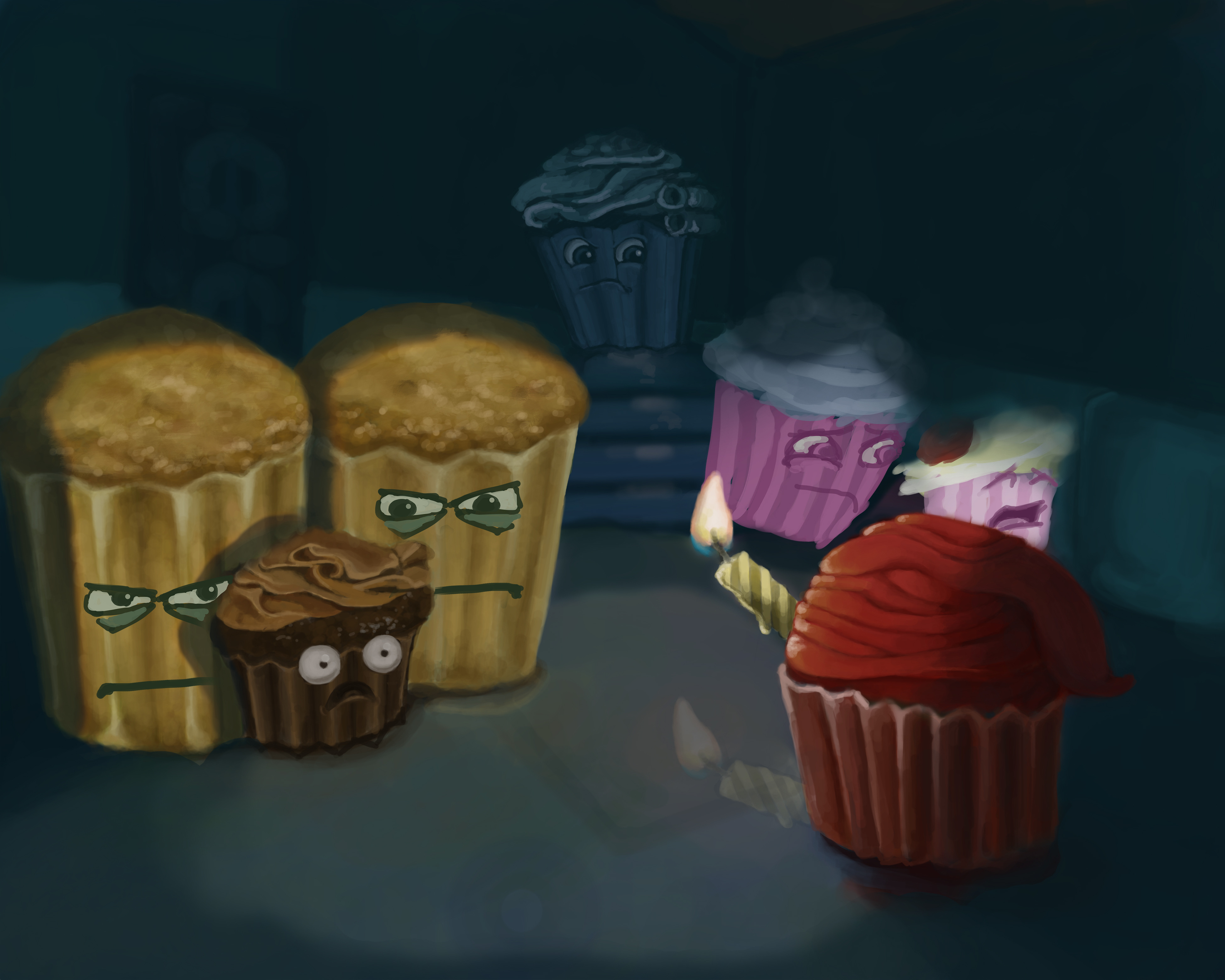
So first: hopefully it is obvious but the idea here is that when the lights go off, baked goods are free to engage in intrigues. Here we have a "chocolate" cupcake who fell on the wrong side of the king due to an inappropriate relationship with his daughter.
The image is kinda a mess. I have some things that are way more rendered than they should be--I'd prefer to work the entire image pretty much at the same time. But here I have candle reflection, highly rendered (though not complete) cupcake bread, etc. This is probably due to all the starts and stops and re-works.
Main questions:
1. Is my overall compostion good? What can be arranged to really push the idea?
I want the focus to be on the chocolate cupcake and his immediate surroundings (guards, executioner) and then the viewer will look around to see the distraught princess, the consoling mother and the resolute father.
On that note, should the father be looking at the daughter or the chocolate cupcake?
2. Any suggestions on lighting and overall color scheme? I probably struggle most with this one. I feel like I do really well rendering monochromatic pieces. I pretty much jumped right into color on this one though. I'll attach a color scheme ref.
Do you think I can continue rendering this out AND THEN bring in the color scheme I want (like with overlays and such)? I'm using Photoshop.
Thank you!

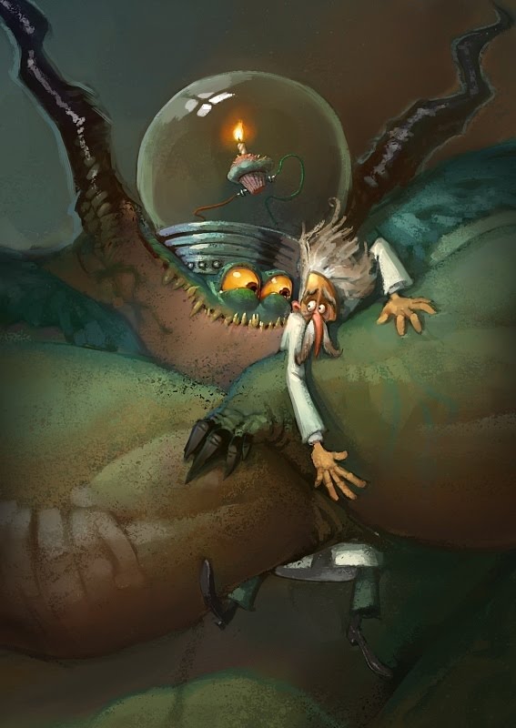
Here is an example color scheme I really like (Sam Nielson):

So first: hopefully it is obvious but the idea here is that when the lights go off, baked goods are free to engage in intrigues. Here we have a "chocolate" cupcake who fell on the wrong side of the king due to an inappropriate relationship with his daughter.
The image is kinda a mess. I have some things that are way more rendered than they should be--I'd prefer to work the entire image pretty much at the same time. But here I have candle reflection, highly rendered (though not complete) cupcake bread, etc. This is probably due to all the starts and stops and re-works.
Main questions:
1. Is my overall compostion good? What can be arranged to really push the idea?
I want the focus to be on the chocolate cupcake and his immediate surroundings (guards, executioner) and then the viewer will look around to see the distraught princess, the consoling mother and the resolute father.
On that note, should the father be looking at the daughter or the chocolate cupcake?
2. Any suggestions on lighting and overall color scheme? I probably struggle most with this one. I feel like I do really well rendering monochromatic pieces. I pretty much jumped right into color on this one though. I'll attach a color scheme ref.
Do you think I can continue rendering this out AND THEN bring in the color scheme I want (like with overlays and such)? I'm using Photoshop.
Thank you!

Here is an example color scheme I really like (Sam Nielson):


