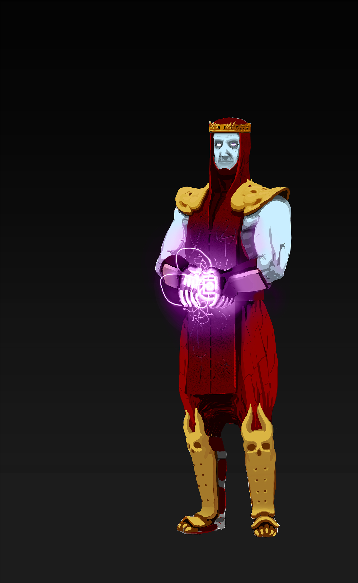
Shinnok on Mortal Kombat X
#1
Hi!
so usually i can spot lightning inconsistencies, anatomy mistakes or design flaws on other ppls drawings but struggle with my own, i'm having trouble in particular on the belt of the character and how light would interact with his hands and different materials such as skin, fabric and metal from his gautlets...

any feedback is welcome, thanks in advance!

Reply
#2
I'm no expert at light myself, but I believe if that purple light were the only light source, everything would be tinted that shade of purple. So I think you first have to establish the light sources affecting the figure and the shadows that result from it. Then consider what material his clothes and armor are made of and color those materials accordingly. A background isn't necessary, but with the right lighting placement, you wouldn't need it. Remember that things always become darker the farther away they face from the light.
Reply
#3
(12-26-2014, 01:59 PM)Comicsink Wrote: I'm no expert at light myself, but I believe if that purple light were the only light source, everything would be tinted that shade of purple. So I think you first have to establish the light sources affecting the figure and the shadows that result from it. Then consider what material his clothes and armor are made of and color those materials accordingly. A background isn't necessary, but with the right lighting placement, you wouldn't need it. Remember that things always become darker the farther away they face from the light.

Hey buddy, thanks for your reply, it took me a while to get a response in here, so i went ahead to get some advice elsewhere and forgot about it, anyway, here is the finished painting.


Reply
#4
Hi there!

I loved Mortal Kombat! Looking forward to how the new game turns out. You got the feeling of the character and MK universe quite well with the costuming. To me what stands out is the pose is a bit strange. I can see from the previous WIP that the light was coming from the belt buckle but in your revised image it's hard to tell. It almost looks like he's being impaled by an object. Also, i'm seeing that it's pretty flat overall. The arms could use some muscle definition.

Some good advice I was given once is to nail down the basics before you get into the fancy lighting and all that. Get the composition, pose, anatomy all figured out. The lighting effects is all extra. I hope this helps out!
Reply


Forum Jump:


Users browsing this thread: 8 Guest(s)