Posts: 1,970
Threads: 22
Joined: Apr 2012
Reputation:
243
Great effort everybody well done. QuikCrit time...it's quick so it might sound harsh.
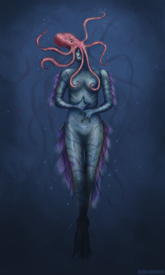
Iamorim: Nice design though this is more mermaid or sea creature than Rusalka to me as a design. I like how you have handled the legs and lighting in general. The pose is a bit stiff, esp. upper torso and there are anatomy and proportion issues. Like the idea of the Octopus, but it's a bit confusing...is it eating her? You get no sense of the actual personality of the character here.
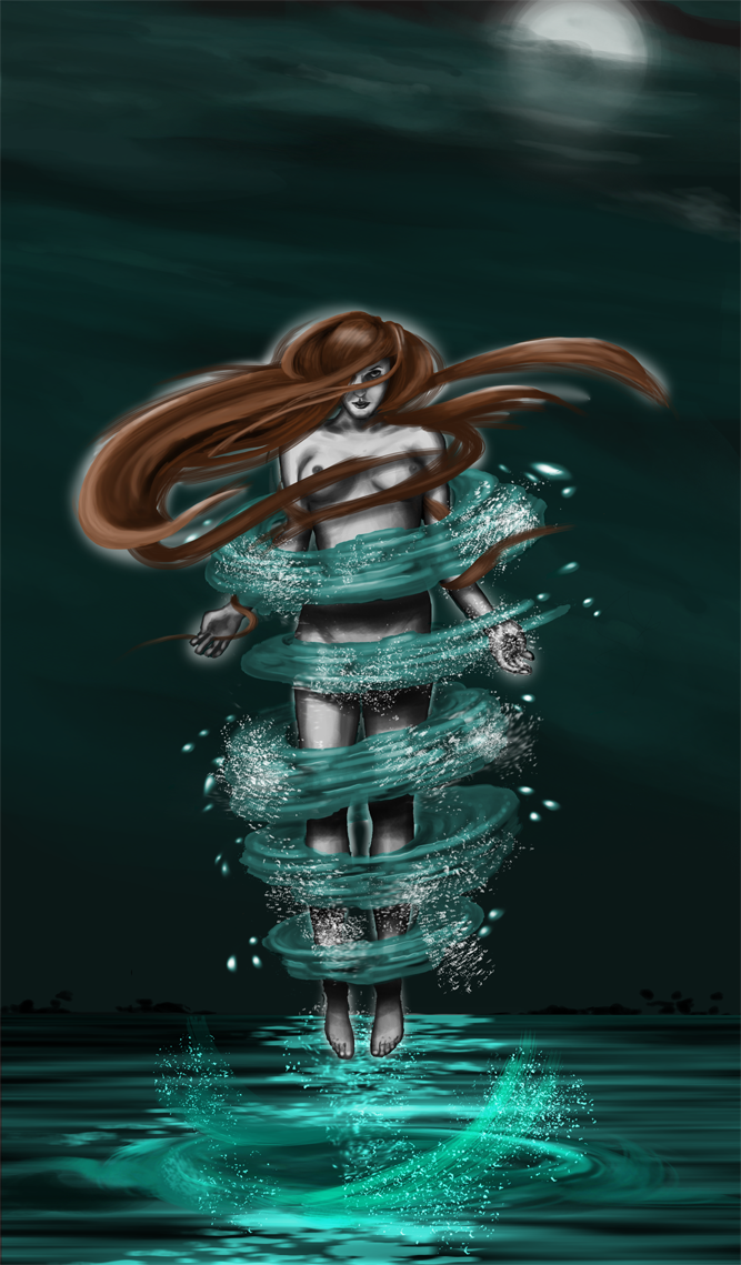
Lurch: I like the personality in this character. The pose and her expression are nice. The water tornado is a nice touch. Good job. Design wise....almost no design here at all. naked chick, red hair. Almost everybody did this so it's an easy trap to fall into.
Ctrow: Interesting pose and personality but the execution could be a lot better. Design wise, same as most of the other entries, there is no design. Naked woman with red hair only. I saw some figure sketches you did (pencil sketches?) earlier on and those were absolutely great but didn't translate to the piece at all.
Olooriel: Nice idea, rusalka in space? Again as with the other entries, hiding her almost completely in hair is a bit of a design cop-out. Can't say any more really because there isn't much to see.
Punk-A-Cat: Yes! The execution is I am guessing unfinished, but you were one of the few to think outside of the square in terms of design. I do think lionfish markings probably suggests ocean-going creature rather than rusalka of a stream/river/lake. Pay attention to your values. If you could have applied values of your shark study to this in some way, that would have been great.
VoodooMama: Best execution and rendering of the lot for sure, but pretty light on design. Another red haired naked girl. I like the touch of the plants and things on her body. The pose is great as is her face, they are both beautifully expressive.
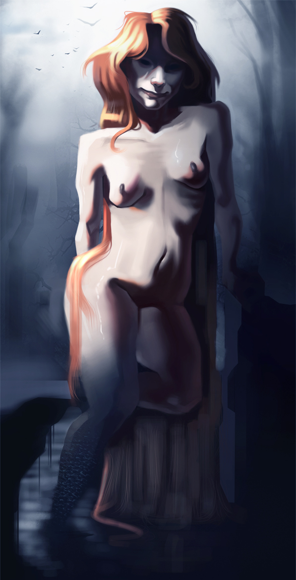
Bookend: Nice effort. There are issues with her arms and there is not so much a sense of volume to her body. The perspective of the environment is not at all in line with the figure. Design wise, as with pretty much everyone else, there is very little in terms of design here.
DanielG: I like that you spent a bit of time actually considering design elements for her. Things to look at other than just a naked girl. I like the idea with her lower half becoming vegetative.I think there are a few issues with proportion and anatomy, and the expression while good, is a bit neutral. The knife seems a bit out of place. If she was beckoning enticingly to us maybe that would fit the brief a bit better? Technically, the values seem a bit flat, and I think this could do with a proper lighting pass to really get some dramatic mood and turn the forms a bit more.
And I'm going to harp on again about this because, nobody else will. DESIGN is about DESIGN. You have to actively think about how to portray what the character is about, what is their story, what have they been through, what does that imply for what they wear, how they accessorise, what demeanour and posture they have. One obvious thing that almost nobody did was to think about clothing! So this woman drowns and becomes some weird ghoul nymph, well maybe she still has some or all of her clothing that she drowned in on her? It would add another layer of narrative, and set time period and context. Everything in design has to be done with a purpose, you can't half-ass it and just go with some well-trodden trope (naked girl, red hair) and expect it to be interesting without some effort.
Sorry if this sounded harsh, but if you guys want to make good characters, you HAVE to stop being lazy and not only think about this but apply it.
Great job in participating everyone!
Posts: 202
Threads: 1
Joined: Jun 2015
Reputation:
12
Thanks for the crit Amit! appreciate it :) will focus on more design from now on
Posts: 177
Threads: 2
Joined: Aug 2015
Reputation:
9
thanks Amit, appreciate the feedback.
I definitely went with the generic option this time around, it was bugging me, but I just couldn't see past it.
definitely something to consider more on the next one.


![[Image: rusalka_by_olooriel-d98lkqy.jpg]](http://pre03.deviantart.net/a923/th/pre/i/2015/250/5/9/rusalka_by_olooriel-d98lkqy.jpg)
![[Image: chow_15_fin_by_punk_a_cat-d99efsr.jpg]](http://img07.deviantart.net/4c7c/i/2015/255/3/2/chow_15_fin_by_punk_a_cat-d99efsr.jpg)
![[Image: 15-Rusalka-VoodooMama.jpg]](http://i1224.photobucket.com/albums/ee361/cavalieredispade/Arte/15-Rusalka-VoodooMama.jpg)