02-10-2016, 08:01 AM
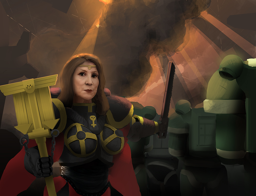
Hey this is my last painting, i'm not sure where to go from here, it was pretty effortless tbh, i feel like i'm a little stagnant on my progress, so please help me out!


|
critique pls
|
|
02-10-2016, 08:01 AM
Hey this is my last painting, i'm not sure where to go from here, it was pretty effortless tbh, i feel like i'm a little stagnant on my progress, so please help me out!

02-10-2016, 07:30 PM
Ok, so some quick thoughts, hope they are understandable.
1. Why and What? What is going on here? what is the context? What are we supposed to take away from this scene as a viewer? I get a sense of a commander/queen posing in front of a squadron of something (robots/mechs?). That's it. Her expression is ambiguous. Looks like a photo ref of modern Carrie Fisher in a totally different context but applied to this situation. It doesn't work. 2. The composition is split in half horizontally. It's not too bad in this instance because you have definitely made her face the focus, but it makes for a pretty undynamic comp in general. 3. You are lacking depth. Need more attention to values and contrast. In general less contrast the further you go. Consider showing scale differences in depth, by making the robot things go into the distance more, and having more environment cues visible to bolster that. 4. Edges. Your edge control is very limited. Everything is hard edged. Hard edges draw focus, so you need to balance them with lost edges. I would recommend paying more attention to where your hard and lost edges are. Google up stapleton kearns on edges. Or Alla Prima by Richard Schmid has the best treatise on why edges are important to any painting. 5. Lighting is inconsistent. The background and environment suggests a different lighting scheme than is on the main figure. She should be a bit more backlit, a bit more in shadow because of her own cast shadow on herself. Pay attention to lighting direction and shadowing....not to the detriment of the image...but it should make some sense outwardly. 6. More textures. Just leaving that here. Needs more material distinction, everything looks the same. Beginner's flat matte plastic, is what I call it, no disrespect intended. :) Every material reacts to light differently, if you are painting them all the same, you would benefit from specific material studies to allow you to figure out the properties of various materials in various lighting. Those are the main things. You have some decent rendering skills as evidenced in her face, but there is no cohesiveness to the overall scene because of the above points. Hope that helps
02-10-2016, 08:19 PM
(02-10-2016, 07:30 PM)Amit Dutta Wrote: Ok, so some quick thoughts, hope they are understandable. awesome, thanks! EDIT: actually i painted over her face, i should have stated in the initial post, sorry :C EDIT2: yea, there's no point in the painting, its really "this real person in this fantasy situation"
02-10-2016, 08:46 PM
Yep, I was gonna say the face was photobashed, but I gave you the benefit of the doubt because...well whatever...photobashing is a thing these days :) You haven't integrated it too badly, but you know, you have had to stay with the initial expression and that destroys the piece entirely if it doesn't fit and you can't adjust it enought to fit. I think it would be better at this stage to draw the face using reference that fits the scene and emotion rather than take the lazy way out and rely on a photo..you' l probably learn more.
02-12-2016, 08:16 AM
What stands out to me the most as needing work in this image is highlights and defined edges. I think you need to push light and shadow more to help define some of the more ambiguous shapes in the main character's armor. You have a big orange explosion looking thing right behind her and you should be able to use orange highlights to define her silhouette. Also there seems to be too many colors competing with each other. Try bringing in the colors of the sky/light sources to tie things together more.
I did a quick paintover pulling highlight colors from the sky and using color overlays. I used golden overlays to change the color of her staff/armor details from greenish yellow to a more proper gold, and I tried to simplify her cape thing so her form reads better. Hope this helps! ![[Image: uQfsAp.jpg]](https://imagizer.imageshack.us/v2/897x685q90/921/uQfsAp.jpg)
|
|
« Next Oldest | Next Newest »
|