Landscape paintover
#1
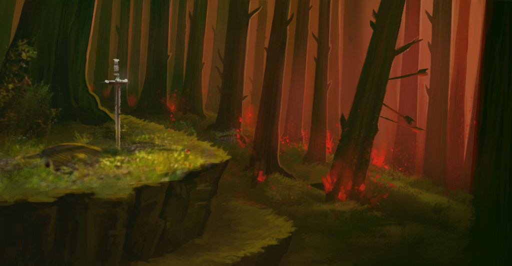
I need help!   I am having a lot of trouble finishing this painting and creating a focal point for it.   I know I've over-rendered the crap out of some areas, and the colors\lighting are super confused.  I'm trying to salvage and wrap it up but I'm having a hard time deciding what to put on the grass/moss in front of the left tree (not 100% into the sword/shield there) and how to render that area.

A little bit about the goal of this piece:  There are 20+ "mystical locations" I need to do.  The mystical locations are places the characters will do battle and are defined by the appearance of red crystals somewhere within them.  However I am choosing not to include the crystals explicitly in each image because I feel that would be repetitive  and abrasive, but maybe this image would benefit from them? The image will be used as a background image on a webpage explaining the location and summarizing the battles that have taken place there, so I've tried to keep major details and focal points to a minimum, because there's a high probability my boss will want to put text over it and stuff, and he has a tendency to use the images I provide at sizes and in applications that jeopardize the initial composition.

I hope someone can help me tie this together, much thanks :)

[Image: forest1wip_by_solipselene-d9rcxt1.jpg]
Reply
#2
I think there is a clear focal point here which is the sword and shield area and that tree to the right on the third step draws quite a bit of focus as well.

Do you have any info about the layout of the page..where the main titles, text blocks will go, will they be transparent or mostly cover up entire areas? Might be useful if we are talking about creating focal points that don't conflict with what it is used for. Having said that it sounds like it is more an asset that the client will want to use in many situations, so maybe you don't need to consider how it will be used as much?

I don't really want to give any feedback without knowing a bit more, since it is client work.

 YouTube free learnin! | DeviantArt | Old Folio | Insta
Reply
#3
I like the style and rendering.

IMHO..

You have several interesting elements, the backlit trees, the terraced ground and the weapons, all are about of equal importance.

I like the tress as they are dramatic and would not change them much. Maybe the ground could be simpler and mostly shadowed, perhaps shape the ground so it leads the eye to the weapons (mound). The weapon placement is boring, I would have them interacting (or overlapping) with each other, and struck into the ground. Maybe use sun beams from the trees to point at the weapons. Maybe place a crystal on the hilt of the sword.

Amit's response is important..

A video game artist for ~2 decades I like to design model & animate characters + study traditional drawing painting & sculpting

Please follow me on Instagram or Facebook

Reply
#4
ArtisteBot is on the money.

Here's an option I bashed quickly. Think a bit more detail at focal points. If a battle is supposed to have happened, maybe a bit of the remains of that going on for context? Depends how literal the scene is meant to be. Maybe the sword can be driven into the ground standing up, like some sort of gravemarker?
I changed that one tree angle...felt something to contrast the direction for that one against all the others would help give it a more organic sense and really make it a secondary focal point.

I did add crystals (shitty ones) to give a bit more that magical vibe, but yeah, totally depends on the entire series too.
I amped up lighting and saturation, but again without knowing the stuff to go on top which should heavily inform how you handle this in the image.

EDIT: I did the sword.
EDIT2: I got rid of the third level edge..the shape and perspective of all the levels aren't quite right for the scene, but I didn't fix them. I like what the full diagonal of the lower level hill does for the comp


 YouTube free learnin! | DeviantArt | Old Folio | Insta
Reply
#5
You've got some good feedback already, I did a quick paintover which takes the image in a pre battle direction. I  adjusted some things -  the light you have coming through the trees can be used to increase attention on the focal points by hitting the spots you want the viewer to focus on, as Amit said that mound is the main focal point I think the image reads better flipped  so have it flipped horizontally. You have a really great opportunity with the image to play with the reddish light source and have cool blue in the shadows to really push some nice contrasting colours and use the browns and varying hues to help add interest. The roots and branches could also be used to guide the eye by and make them feel more organic by not having all the branches uniform. I also used the sword and shield element to place some very quick figure silhouettes one of a resting warrior and then his sword points those who are opposing him coming round the corner and the sword the front guy has points to the branch which points back to the main focal point so you have a triangle there to keep the eye in the image.

You have some great feedback already and as has already been said without knowing the client's exact requirements this might not help as much but hopefully it gives you some ideas.


Attached Files Image(s)


Reply
#6
(02-12-2016, 07:51 AM)Amit Dutta Wrote: I think there is a clear focal point here which is the sword and shield area and that tree to the right on the third step draws quite a bit of focus as well.

Do you have any info about the layout of the page..where the main titles, text blocks will go, will they be transparent or mostly cover up entire areas? Might be useful if we are talking about creating focal points that don't conflict with what it is used for. Having said that it sounds like it is more an asset that the client will want to use in many situations, so maybe you don't need to consider how it will be used as much?

I don't really want to give any feedback without knowing a bit more, since it is client work.

I cant give any more info on the page layout because I don't know what that is going to be yet.  Your comment about it just being an asset for the the client rings true.  I'm trying not to overthink composition, because he will kinda use it for whatever, regardless of what I set it up for.  He really doesn't give me a lot of feedback/guidance so I try to keep things somewhat generic-y (which is frustrating).  He'll just be happy that its finished for the most part.
Reply
#7
I feel your frustration!. Sometimes getting the info you really need from clients is like leading a parched thirsty mule to water but it really doesn't want to drink! Sighs.

 YouTube free learnin! | DeviantArt | Old Folio | Insta
Reply
#8
Wow! Thanks a bunch for a the feedback so far! Its been so long since I got feedback on my stuff since starting with this client, so it feels great! I really like your edit Amit, it looks like you used some brushes to get some interesting ground cover in the lower right particularly, any chance you could share them? Like 80% of my image is hard round brush >.<
Reply
#9
Glad it was useful.
For much of my rock/grass texture I use one brush from the brilliant Jamie Jones.
http://digitalbrushes.tumblr.com/post/57...nload-link

It is the one that looks like this.  


Note  I don't use PS, I use Krita which doesn't import PS settings, so the brush settings I use will be different to what comes in his file. I also added a bit of texture to the brush tip, which is specific to Krita. Hard rounds are great, but you need at least one great versatile texture brush, and I find that this one works well for lots of situations.

 YouTube free learnin! | DeviantArt | Old Folio | Insta
Reply
#10
Thanks everyone!  Heres what I did with the feedback:

[Image: forest1wip2_by_solipselene-d9rduns.jpg]
I will probably revisit this tomorrow and try to clean up the nasty bits.  Perfectionism FTL
Reply


Forum Jump:


Users browsing this thread: 2 Guest(s)