Heya
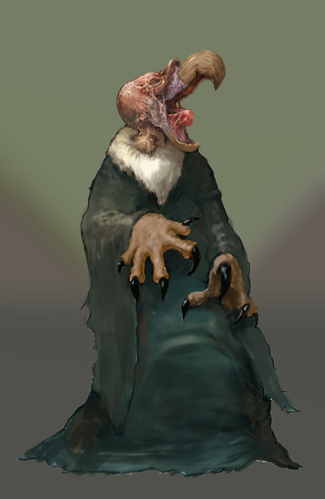
Gone too long without proper critique from my peers and my edge has dulled because of it. Going to be uploading public pieces from now for you guys to pick apart. Starting with this one.
![[Image: 04%20sizes%20color%20flat%20resized_zpsnfozk6xu.jpg]](http://i1209.photobucket.com/albums/cc388/Tenebraestudios/04%20sizes%20color%20flat%20resized_zpsnfozk6xu.jpg)


![[Image: YYF-GK00f45o1XdG_wmQvfqIZ4RzPaC7od9X3Iby...ize_mode=3]](https://photos-5.dropbox.com/t/2/AAAMHaLi51wndXrN4W3tDZsZPfa8sKmFpY65HV0LppBDVA/12/23198737/jpeg/32x32/1/_/1/2/from%20fb.jpg/EN_3uBEYoAYgBygH/YYF-GK00f45o1XdG_wmQvfqIZ4RzPaC7od9X3IbyetY?size=1280x960&size_mode=3)