Flo's sketchbook
Orza Reckenhauer

Lines by Lena Kuschka

Coloring by me

I feel like I learned a ton while working on this piece. :)


Attached Files Image(s)


Please help me getting better by checking out my sketchbook

HOMEPAGE http://floart.weebly.com
Reply
A quick doodle in "black ink"


Attached Files Image(s)


Please help me getting better by checking out my sketchbook

HOMEPAGE http://floart.weebly.com
Reply
Hey guys,

long time no post

Here is a piece I am working on for a presentation at work. It is the typical knight slays dragon story and I want to keep them all a bit rough, so I can do around 3 - 4 next to my other duties.

I would love some C and C

Cheers,
Flo


Attached Files Image(s)


Please help me getting better by checking out my sketchbook

HOMEPAGE http://floart.weebly.com
Reply
More work for the presentation


Attached Files Image(s)


Please help me getting better by checking out my sketchbook

HOMEPAGE http://floart.weebly.com
Reply
more work on the mushroom guy. C and C always welcome :)


Attached Files Image(s)


Please help me getting better by checking out my sketchbook

HOMEPAGE http://floart.weebly.com
Reply
just a quick change on the comp

I will make sure, that I like the comp before I start to render stuff out


Attached Files Image(s)


Please help me getting better by checking out my sketchbook

HOMEPAGE http://floart.weebly.com
Reply
These were done for a presentation I held at work.

I am happiest with the first and last piece.

Cheers,
Flo


Attached Files Image(s)


Please help me getting better by checking out my sketchbook

HOMEPAGE http://floart.weebly.com
Reply
hey guys,

I am still alive ^^

some studies (finally) and some more stuff for sofatutor.

the dragon is actually a mathematical master whose wings' tips are rectangular... :D

Those crazy people at work ;)

as for the horses, both were done in 30 min. the one with the horn was done from memory without ref. It as a bit too saturated and the shapes don't read as well. but it is ok for my first horse completely from memory.

Cheers,
Flo


Attached Files Image(s)


Please help me getting better by checking out my sketchbook

HOMEPAGE http://floart.weebly.com
Reply
a value study, a Ferri study and a painting for my game - project

popow!


Attached Files Image(s)


Please help me getting better by checking out my sketchbook

HOMEPAGE http://floart.weebly.com
Reply
I worked some more on the ferri study.

And a new card - colorization. I think I might have overdone it with the specular on his face, looks a bit plasticy right now.

Also it doesn't look as realistic as I wished it would. But I haven't figured out why yet.


Attached Files Image(s)


Please help me getting better by checking out my sketchbook

HOMEPAGE http://floart.weebly.com
Reply
Don't think you can hit realism when everything needs to be outlined in black, unless you go front lighting like flash photography I think it would be pretty hard to achieve. Your other stuff is looking killer though! Watch the values on that ferri study though, the background gradient up top adds more to atmosphere of the piece than you might think, and you got some rim light on the bottom! I'm sure you're just getting round to those things, but at least the background; you always wanna establish that somewhat doing your studies, even if it doesn't look like anything :p.

Reply
hey Skeptical,

thanks for the constructive critizism. You are right, I havent seen the background as a gradient, I will check that out.

Also thanks for the compliment, that means a lot coming from you!

finally I start to grasp values of skin. Not to good yet but it is coming. It helped to check out Anthony Jones' stuff, he is the value king.

After looking at some of his pieces I wanted to do a quick mutant dude so here it goes: about 1 h yet
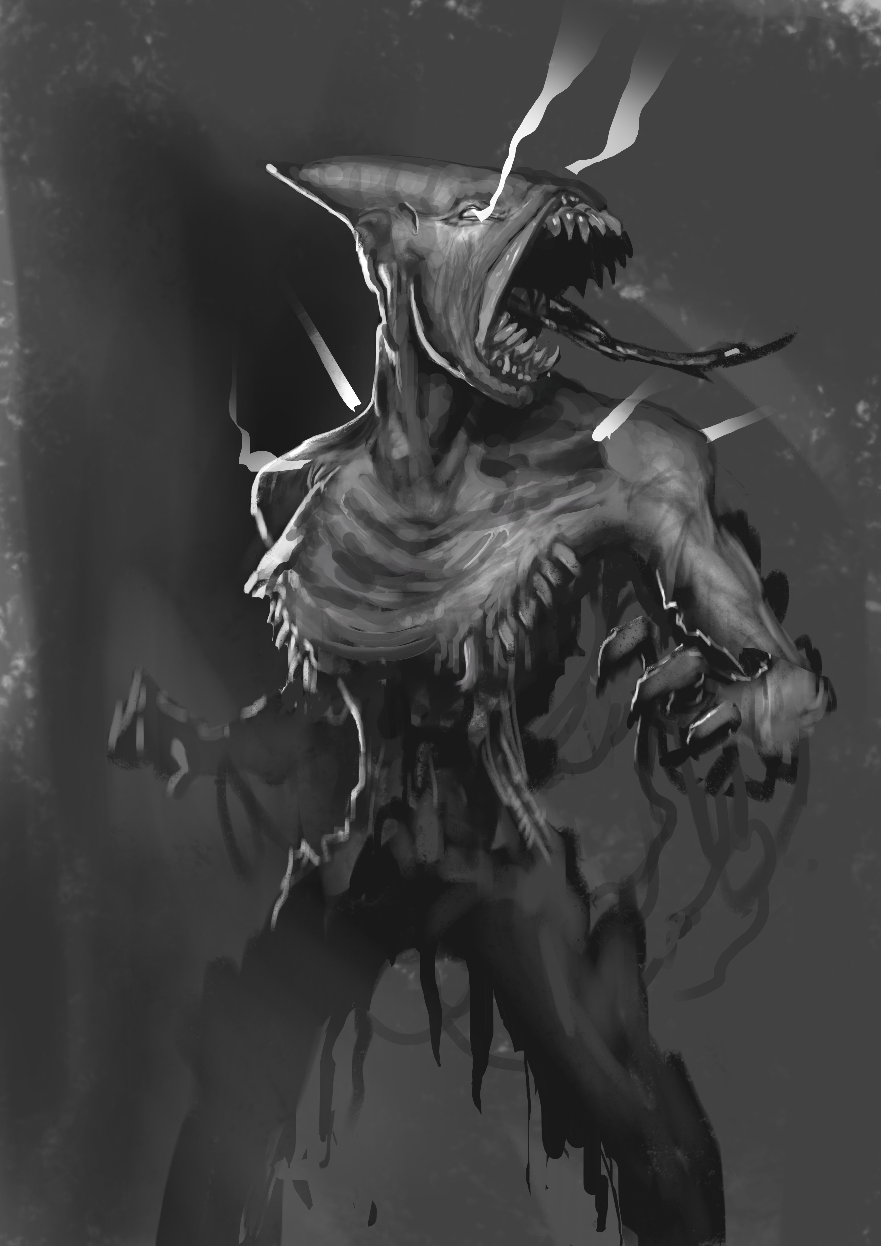

The other one is for the 30th birthday of my brother. He is going to do his dr. which is a phd. in english I think.
I want to make it look like a movie poster or a comic book cover. It will show him fighting of viruses and bacteria with medical stuff (he is a pharmacist)

If you have ideas how I can enhance the composition let me know.

Cheers,
Flo


Attached Files Image(s)


Please help me getting better by checking out my sketchbook

HOMEPAGE http://floart.weebly.com
Reply
here's the next card.

I don't know, I am not too happy with it. There are parts I like, especially how the rimlight works with the lowered arm. But all in all it is nothing special.

but I had to think about how to paint leather, which was good. And I used a cool brush. It has color dynamics on and just pours ALL of the hues out. Pretty useful to get some color variety.


Attached Files Image(s)


Please help me getting better by checking out my sketchbook

HOMEPAGE http://floart.weebly.com
Reply
hey guys,

some stylized stuff, the clouds on the earth are a mix of lasso tool, clipping mask and smudge tool.

the bougereau color study is something new for me. Honestly I don't know if it is doing something for me. I will see if I can extract some new information from it. But the composition study was fun and informal, I can really recommend it.

the 2 sausage like things are just try-outs of how to render stuff the it looks translucent or solid.

the tree is a try-out of Shaddy Safadi's technique of using a rich under-painting in order to get more interesting colors.

this is a level-screen for my private game-project


Attached Files Image(s)


Please help me getting better by checking out my sketchbook

HOMEPAGE http://floart.weebly.com
Reply
some composition notes and a value study on one of the Hudson River School's awesome landscapes


Attached Files Image(s)


Please help me getting better by checking out my sketchbook

HOMEPAGE http://floart.weebly.com
Reply
I saw a interesting exercise the other day, about using reference without directly copying.
Miles Johnston did this
http://th09.deviantart.net/fs70/PRE/f/20...6uyuc2.jpg

I did this


I kinda failed this, but it is a fun exercise


Please help me getting better by checking out my sketchbook

HOMEPAGE http://floart.weebly.com
Reply
hey guys,

so this is the piece I am working on atm.
I hope it doesn't turn out super cartoony, like my stuff most of the time does, but a bit more realistic.


Attached Files Image(s)


Please help me getting better by checking out my sketchbook

HOMEPAGE http://floart.weebly.com
Reply
some arm studies

Hogarth and http://figuresfordrawing.tumblr.com/archive

I did invent some of the lighting on these and I am not 100% sure about it. If you spot mistakes please tell :) I am just trying to improve.


Attached Files Image(s)


Please help me getting better by checking out my sketchbook

HOMEPAGE http://floart.weebly.com
Reply
That was an interesting example of using reference without copying, could do more with that?


Focus.
Reply
Hey meat,

I am not 100% sure of what you mean. Could you clarify it please?

I made a post about today's study in the Critique Section http://crimsondaggers.com/forum/thread-5054.html Feel free to answer :)


Attached Files Image(s)


Please help me getting better by checking out my sketchbook

HOMEPAGE http://floart.weebly.com
Reply


Forum Jump:


Users browsing this thread: 152 Guest(s)