Posts: 205
Threads: 4
Joined: Oct 2015
Reputation:
7
Hey daggers,
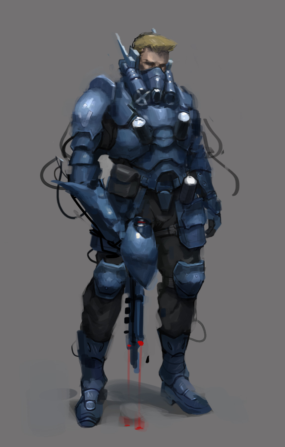
I'm looking for some critique on this character concept piece I just finished. He's a space fighter pilot, think Halo or Starcraft.
Thoughts on my mind: Colors are too boring? Does he need a weapon? More detail on the armor?
Any words of advice are appreciated! Thank you!
Posts: 671
Threads: 8
Joined: Feb 2016
Reputation:
113
Hello Nick D!
Quote:Thoughts on my mind: Colors are too boring? Does he need a weapon? More detail on the armor?
Seeing that you think the colors are boring, have you tried giving the armor an accent color? I like how you gave the character blond hair to break the overall color monotony. It might work on the armor as well.
The torso armor looks like it's going to grind against the belt if he tries to turn. It might work if it's shaped like an inverted 'V'? Have you tried giving him a thicker belt? Again, not sure if they'll work!
The kneecap guard's strap looks like it's made of garter, and it feels uncomfortable wedged in between where the legs fold. Probably it would be nice to explore a different design on that. Maybe a two strap design (one for the lower part of the upper leg, other on the upper part of the knee)?
I like the arm glove and the samurai skirt armor going on. And especially the boots! I wish I made it to that design conclusion as well for myself.
Oh! And consistent lighting on the face and armor! It looks like they have different light sources. (Or again, it might just be me!). If you have time... Dramatic lighting! Here's a cheat I normally do. Give the character a dark background, give him an edge lighting (light behind and above the figure) and boom!
Seems to me what you have right now is design number 1. I'm looking forward to the second! Good luck Nick and I hope I helped even if it's just a squeek!
If you are reading this, I most likely just gave you a crappy crit! What I'm basically trying to say is, don't give up!
----
IG: @thatpuddinhead
Posts: 18
Threads: 3
Joined: Jul 2016
Reputation:
1
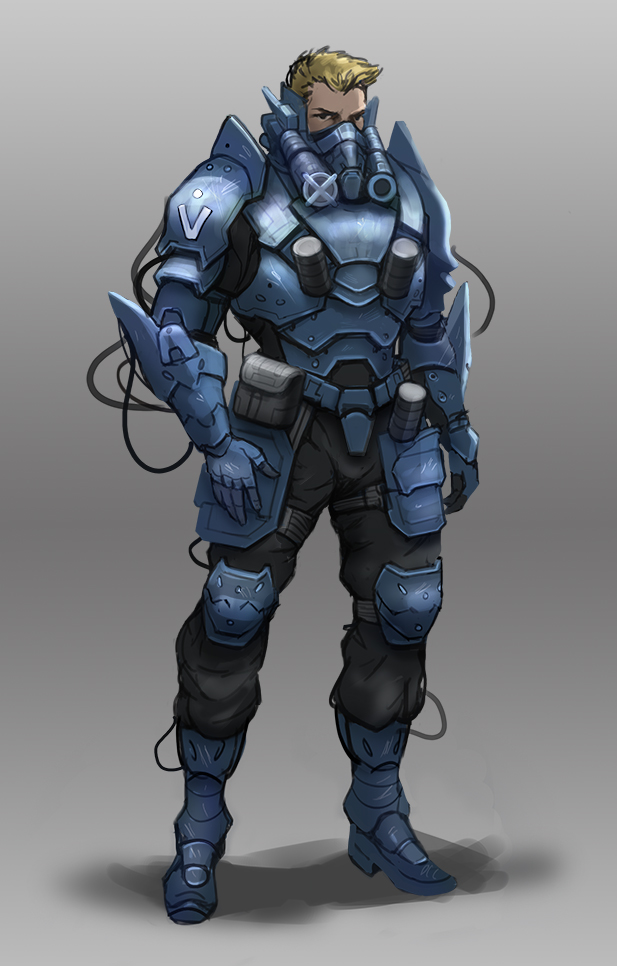
Hello Nick! Well, I had the freedom to change a few things on top of his painting. You asked if the colors seemed flat, and seem so! Blue armor need some variation, it is kinda blue baby knows? Need a little purple, a little dark brown. What I did above, it was to add a layer to Overlay blending mode in Photoshop (not sure if the program used) but in short, is to take this blue uniform, give a little more life.
And the hair, blonde does not mean that the hair is yellow. Just when you discolor it and looks like egg yolk. hahaha but the natural blonde is light brown, sand color. Notice in the photos, in real life the REAL color of things, remove prejudice "grass is green, the sky is blue, blond hair are yellow" you will see that the grass is pulled yellow, pro brown and there goes! This applies in armor too .. do not use pure blue, take a little saturation also I think it will become more realistic.
Well, the rest I did was apply an additional glow in the armor, I think the color of her ta very stoned, have to improve a little in values, make the correct rendering of metals know?
But the tip is to always use a sugeira above, to the things do not get too uniform.
I loved the design, I thought the character're nice, very beautiful. Now just set the forms, put more light and shade.
Well, it's my first feed back! If you can say what you think, I'm new to the forum and I wonder if I helped you :D hope so, hugs!
![[Image: F9242QE.jpg]](http://i.imgur.com/F9242QE.jpg)
Posts: 205
Threads: 4
Joined: Oct 2015
Reputation:
7
(08-02-2016, 11:03 PM)John Wrote: Hello Nick D!
Quote:Thoughts on my mind: Colors are too boring? Does he need a weapon? More detail on the armor?
Seeing that you think the colors are boring, have you tried giving the armor an accent color? I like how you gave the character blond hair to break the overall color monotony. It might work on the armor as well.
The torso armor looks like it's going to grind against the belt if he tries to turn. It might work if it's shaped like an inverted 'V'? Have you tried giving him a thicker belt? Again, not sure if they'll work!
The kneecap guard's strap looks like it's made of garter, and it feels uncomfortable wedged in between where the legs fold. Probably it would be nice to explore a different design on that. Maybe a two strap design (one for the lower part of the upper leg, other on the upper part of the knee)?
I like the arm glove and the samurai skirt armor going on. And especially the boots! I wish I made it to that design conclusion as well for myself.
Oh! And consistent lighting on the face and armor! It looks like they have different light sources. (Or again, it might just be me!). If you have time... Dramatic lighting! Here's a cheat I normally do. Give the character a dark background, give him an edge lighting (light behind and above the figure) and boom!
Seems to me what you have right now is design number 1. I'm looking forward to the second! Good luck Nick and I hope I helped even if it's just a squeek!
Hey John,
Thank you for taking the time to look this over my friend!
Alright, these should be relatively easy changes to make. We're on the same page about the colors; I'll tone down the saturation and shift the hue to a less "baby blue" and add a touch of brown and green to break up the uniformity.
Good catch on the kneepad strap. After taking a quick look at military kneepads I've definitely got it all wrong. Either 2 straps or no straps is the way to go.
It's subtle but I see what you mean about the lighting. The light direction is coming from the left on the face, directly above for the rest of the body. Easy fix.
I'm going to politely disagree with you on the lighting setup in this situation. For this particular character the armor design with all its little details is the main focus as opposed to the overall read of the silhouette. Thus, the simple diffuse lighting I have established is more appropriate. If there was more happening on the outside, such as some crazy spikes or an extreme pose or a fancy weapon, edge lighting would be a great way to pop the form. I could be entirely wrong about that, it's just something I've observed.
Looks like I've got some work ahead of me!
Posts: 205
Threads: 4
Joined: Oct 2015
Reputation:
7
(08-03-2016, 05:48 AM)Milena Mantovani Buzzinaro Wrote: Hello Nick! Well, I had the freedom to change a few things on top of his painting. You asked if the colors seemed flat, and seem so! Blue armor need some variation, it is kinda blue baby knows? Need a little purple, a little dark brown. What I did above, it was to add a layer to Overlay blending mode in Photoshop (not sure if the program used) but in short, is to take this blue uniform, give a little more life.
And the hair, blonde does not mean that the hair is yellow. Just when you discolor it and looks like egg yolk. hahaha but the natural blonde is light brown, sand color. Notice in the photos, in real life the REAL color of things, remove prejudice "grass is green, the sky is blue, blond hair are yellow" you will see that the grass is pulled yellow, pro brown and there goes! This applies in armor too .. do not use pure blue, take a little saturation also I think it will become more realistic.
Well, the rest I did was apply an additional glow in the armor, I think the color of her ta very stoned, have to improve a little in values, make the correct rendering of metals know?
But the tip is to always use a sugeira above, to the things do not get too uniform.
I loved the design, I thought the character're nice, very beautiful. Now just set the forms, put more light and shade.
Well, it's my first feed back! If you can say what you think, I'm new to the forum and I wonder if I helped you :D hope so, hugs!
Milena,
Hey thanks for doing a paintover!
I like what you've done with the values; the shadows are deeper and the reflected light on the metal is brighter. The higher contrast really enhances the sense of depth.
You're right about the colors, I was pretty lazy here with the basic blue armor and basic lemon yellow blond hair. I'll look at some reference and add more hues so that the palette isn't so limited and boring.
I appreciate your feedback, thank you so much, and welcome to the forum!
Posts: 671
Threads: 8
Joined: Feb 2016
Reputation:
113
(08-05-2016, 03:12 PM)DQ_Nick Wrote: I'm going to politely disagree with you on the lighting setup in this situation. For this particular character the armor design with all its little details is the main focus as opposed to the overall read of the silhouette.
Totally cool. I use the rim light like how people back in the day use lens flare: Looks dope, but totally unnecessary. Haha!
Looking forward to the next one! I super dig armor designs!
If you are reading this, I most likely just gave you a crappy crit! What I'm basically trying to say is, don't give up!
----
IG: @thatpuddinhead
Posts: 18
Threads: 3
Joined: Jul 2016
Reputation:
1
(08-05-2016, 03:21 PM)DQ_Nick Wrote: (08-03-2016, 05:48 AM)Milena Mantovani Buzzinaro Wrote: Hello Nick! Well, I had the freedom to change a few things on top of his painting. You asked if the colors seemed flat, and seem so! Blue armor need some variation, it is kinda blue baby knows? Need a little purple, a little dark brown. What I did above, it was to add a layer to Overlay blending mode in Photoshop (not sure if the program used) but in short, is to take this blue uniform, give a little more life.
And the hair, blonde does not mean that the hair is yellow. Just when you discolor it and looks like egg yolk. hahaha but the natural blonde is light brown, sand color. Notice in the photos, in real life the REAL color of things, remove prejudice "grass is green, the sky is blue, blond hair are yellow" you will see that the grass is pulled yellow, pro brown and there goes! This applies in armor too .. do not use pure blue, take a little saturation also I think it will become more realistic.
Well, the rest I did was apply an additional glow in the armor, I think the color of her ta very stoned, have to improve a little in values, make the correct rendering of metals know?
But the tip is to always use a sugeira above, to the things do not get too uniform.
I loved the design, I thought the character're nice, very beautiful. Now just set the forms, put more light and shade.
Well, it's my first feed back! If you can say what you think, I'm new to the forum and I wonder if I helped you :D hope so, hugs!
Milena,
Hey thanks for doing a paintover!
I like what you've done with the values; the shadows are deeper and the reflected light on the metal is brighter. The higher contrast really enhances the sense of depth.
You're right about the colors, I was pretty lazy here with the basic blue armor and basic lemon yellow blond hair. I'll look at some reference and add more hues so that the palette isn't so limited and boring.
I appreciate your feedback, thank you so much, and welcome to the forum!
Nice Nick! Glad you like my feedback. Thank you and post here the evolution of you work :)
Posts: 374
Threads: 16
Joined: May 2013
Reputation:
59
I have to disagree with Milena a bit. While variation is color is often nice, I don't think is the reason why the image looks less impressive than it could. Unity in color doesn't necessarily dull an image if it is being actively acted upon with light and shadow. I would argue that the reason for this somewhat "dullness" is twofold. One is the lack of specificity in information and the second is a lack of hierarchy in value.
So for the first point. This image doesn't have much of a light source. The shadows are soft and blurry and I would suspect this is done because you might be unsure of how to represent light and shadow over form. There are no real or clear cast shadows, no shadow lines, no thing to really grip on to that makes the painting feel as if it's a 3D object in space that you could touch.
I get that it is difficult to be super specific and I'd actually suggest being a little vague with some information in the beginning of an image to make it easy to work with and change (you don't want to start rendering highlights before the general impression of the subject is there), but at some point you need to be clear and say "this is in light, this is in shadow".
So on to the second point, a lack of hierarchy. If we look at a Rembrandt painting (it's best to do so in real life but photos work as well) we notice one thing is almost all of his work. It's really dark. Like, the values are really dark. He has done this so that when he uses bright paint, in relationship to the rest of the painting, it looks extremely bright. We relate values to other values and in his work there is a clear hierarchy of values.
This concept of relative values and hierarchy is something we can use in all our work. When we're painting anything, we need a key. What a Key basically is, is an extreme point in light/darkness that we assign a certain value to. Think of it as your brightest bright and darkest dark. Now with these points defined, we can easily compare the brightest bright and darkest dark to a third value and ask, where does this third value fall between the two keys. After we have a third value and want to paint a fourth, we can compare it to our key but we can also compare it to the third value. But maybe the fourth value is too dark in comparison to the third value but if we go brighter it becomes too close to the brightest bright. What we then can deduce is that the third value is relatively too bright and needs to be made darker so the fourth value is proper.
You can play this game of comparing values over your image to establish a hierarchy and it really gives you a tool to better control the image. Now there is some more complexity to this but this is the general idea. Just an interesting side-note, you can actually find half-finished paintings and studies by Zorn, Sargent and Krøyer where you can see them comparing values like this on the canvas.
I've attached a super quick paintover to show this general idea. Let me know if there was something I haven't been clear on, too lazy to proof-read ;)

Discord - JetJaguar#8954
|


![[Image: F9242QE.jpg]](http://i.imgur.com/F9242QE.jpg)
