09-02-2016, 11:01 PM
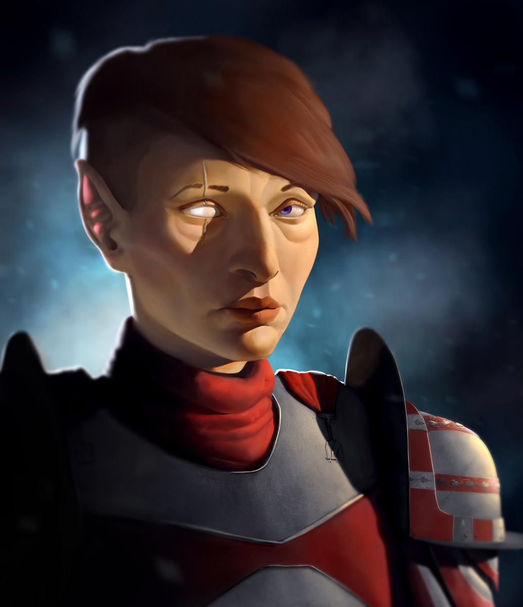
Just wondering what do you think of this...

my sketchbook, meh - http://crimsondaggers.com/forum/thread-7549.html
|
Looking for some thoughts and crits
|
|
09-02-2016, 11:01 PM
Just wondering what do you think of this...

my sketchbook, meh - http://crimsondaggers.com/forum/thread-7549.html
09-14-2016, 03:20 AM
I would make the pupil larger, and reposition it slightly, she looks like she has a lazy eye. As a side note, for some reason, I really respond to this painting more when it's flipped. I'm not sure why
09-15-2016, 02:18 AM
Admbrns- Thanks yea eyes are tricky thing you can study how far apart they are when they are looking at different objects in different distances. And funny thing, actually I posted it everywhere flipped. It worked for me better as well :D
my sketchbook, meh - http://crimsondaggers.com/forum/thread-7549.html
09-16-2016, 04:30 AM
Hello Varbas!
I hope I'm not to late! I really like this piece. The rendering and lighting on the face is superb! I wish I could do that! :D I really love that all your value work is really paying off here. There are some slight issues with the face like the eye that was already pointed out and I think there is also something slighty off with the nose... but these things really don't matter to me that much. Here are the things I take issues with: Composition - eventhough it's okay and the shape distributation works it slightly pulling the piece to the left corner which is putting it out off balance 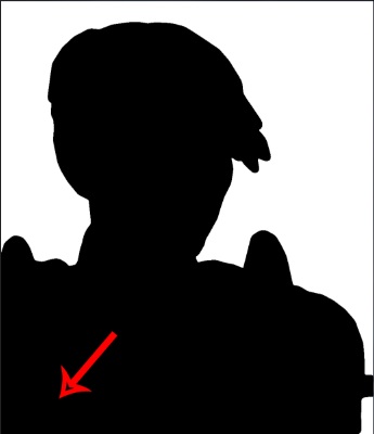 -If you place the whole thing to the middle and extend the shoulder then there is much more balance in the piece which makes it a lot more comfortable to the viewer. 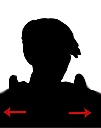 Lighting: Oh noes black in the shadows!!! Black is a really tricky thing and usually I would try not to use it the shadows as much. Usually the surrounding area reflects so much light that very rarely we have the absolute exclusion of light (dark black shadows) And consider this: There is a white light source in the background as well some lightsource that light up the face from underneath. So we should see more of the armor. I did a crappy paintover. I hope you can at least see what I mean. 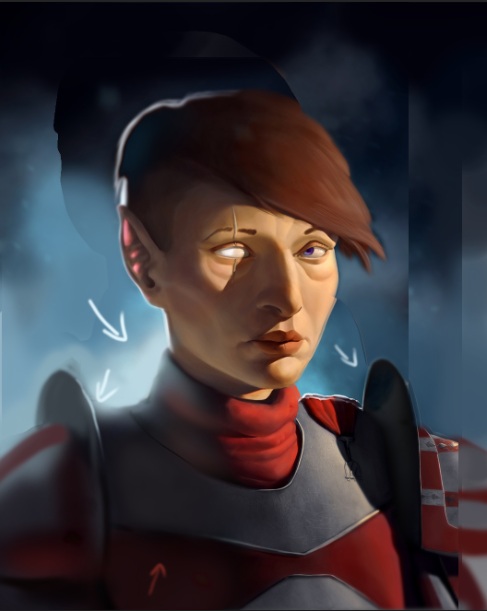 But that's really all :D Other than that this piece is coming out really strong! Awesome work.
My signature is broken and there is no way to fix it.
[url=http://crimsondaggers.com/forum/thread-926.html][/url]
09-16-2016, 06:46 AM
I agree, you did a good job with rendering and lighting the face, and though imo you could have some more soft and lost edges in there to make it feel less sterile, this style is something that reminds me of what a lot of cardart looks like, so if that's where you're trying to go with it don't let me stop you.
A lot of things have already been pointed out by admbrns (wait, is that like a mock-phonetic way of spelling adam berns/burns or something?) or covered by Zipfelzeus' paintover, but one issue that hasn't been mentioned yet is the texture of the hair. You could make it feel more like a lot of individual threads of hair forming a big mass by simply adding a few strands sitting on top of the general mass of hair, following the form of the head, and by showing that the hair is growing out of the head by hinting at the skin underneath where it parts. Also, remember the hairline.
09-17-2016, 05:33 AM
Zipfelzeus- Thanks for crit. Yea all of it make sense but the drawing was pretty old so it has far more problems. I used it just as a rendering study or something. But yea thanks I will be more aware with those things in the future... aand also I dont know anything about composition so I super suck at it :D
Lodratio- Thanks for crit. Yea hair is something I know I dont know and always put it aside :D but yea at least I know what should I study now. Again thanks for the crits. Now I know what to be aware of in the future :D
my sketchbook, meh - http://crimsondaggers.com/forum/thread-7549.html
|
|
« Next Oldest | Next Newest »
|