09-19-2016, 05:01 AM

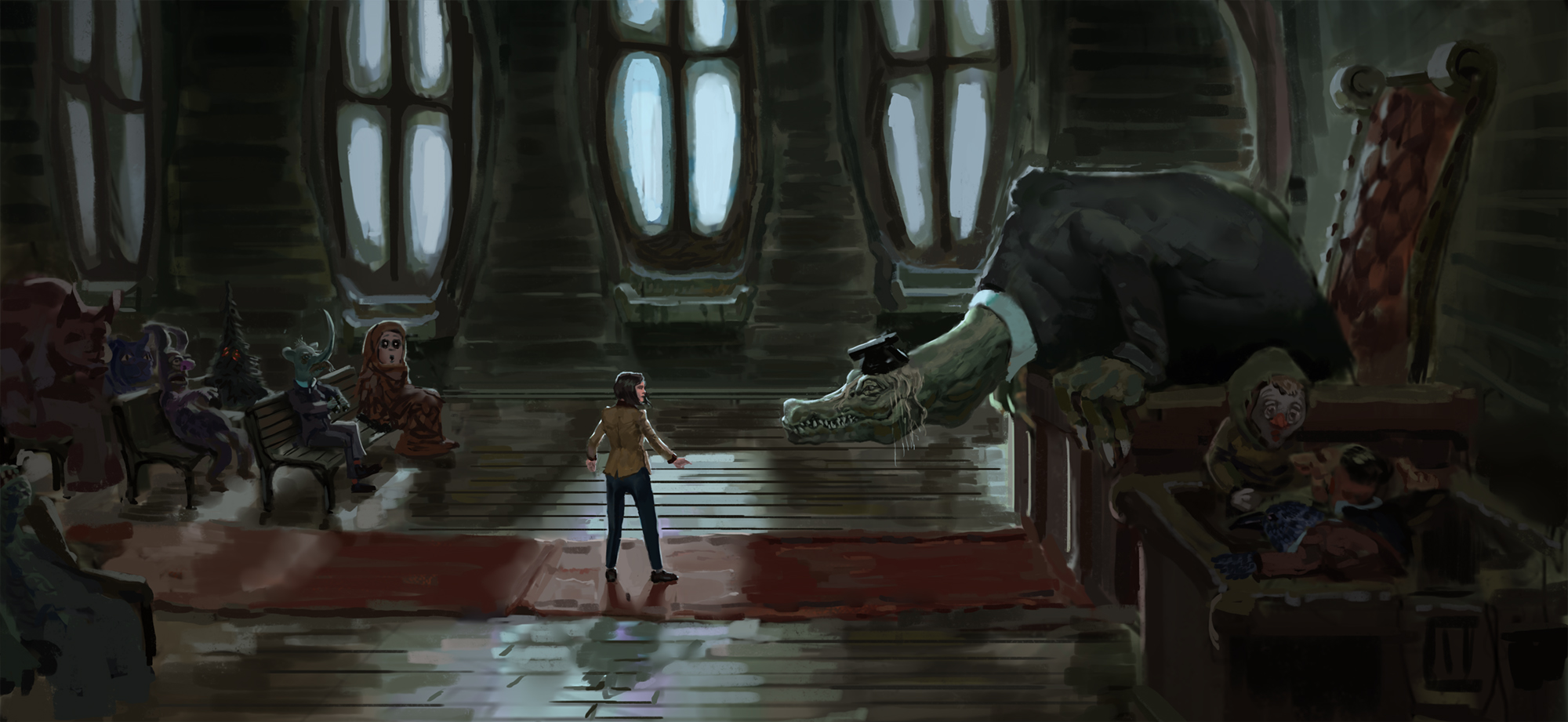
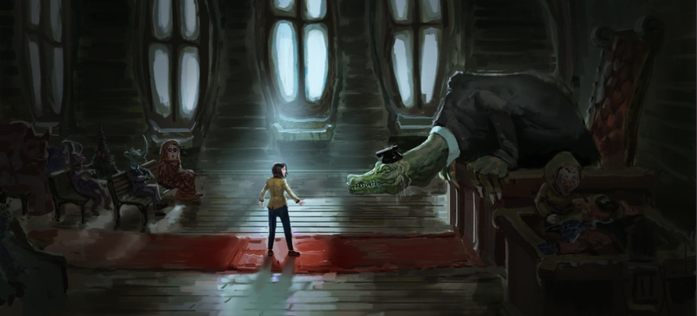
So, i struggling with lightning, that its kind of hollow, my intend was to do the girl a folcal point and other stuff is secondary and list contrast, but now its just looks wrong. (And sorry for my terrible english)
|
In need for critiq
|
|
09-19-2016, 05:01 AM
 So, i struggling with lightning, that its kind of hollow, my intend was to do the girl a folcal point and other stuff is secondary and list contrast, but now its just looks wrong. (And sorry for my terrible english)
09-19-2016, 06:27 AM
Heya! And welcome to the board.
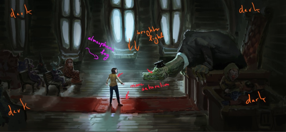
Really cool piece! Is this from a book? Okay hear me out... I'm not an expert on lighting. I'm just trying to help. If any other Daggers have suggestions please feel free to share. So you want the girl in the center of attention right? My suggestion would be to darken the area around the outer corners of the piece and lighten up the center where the girl stands. Also slightly more saturated colors on the girl and the dragon creature to separate them even more form the background cast. I did a quick paintover. I hope this helps.    Sorry if this is not the mood you're going for... I tried haha D: My lighting might be a bit to strong... but I hope you get the idea.
My signature is broken and there is no way to fix it.
[url=http://crimsondaggers.com/forum/thread-926.html][/url]
09-20-2016, 03:35 AM
Very interesting, I like the story you're laying out here. The biggest issue I see is your composition isn't very fitting for the scene. The straight side view come of as very static. You may have a reason for this choice, but there's better fitting compositions for what it seems your story is here.
I really like the interior you're setting up. Is there any reason for that one window to be lower than the rest? I would suggest, before you go any further with painting, to really refine your line art and get your perspective spot on. If you haven't- use some reference pictures of old churches and courtrooms to really nail the look you're going for.
09-21-2016, 01:28 AM
(09-19-2016, 06:27 AM)Zipfelzeus Wrote: Heya! And welcome to the board. Thank you for ripley. No it's for my series of painting that i'm planning to do. Yeah, i thought about it as well but for some reason didn't do it, i will try this one out.
09-21-2016, 01:43 AM
(09-20-2016, 03:35 AM)Admbrns Wrote: Very interesting, I like the story you're laying out here. The biggest issue I see is your composition isn't very fitting for the scene. The straight side view come of as very static. You may have a reason for this choice, but there's better fitting compositions for what it seems your story is here.My idea was that the judge stood up and lean toward the girl to look at her closer, and crowd filing the purpose of showing that girl is an alien/danger to them. So, if you have some idea on what composition will fit better please share. Wow the perspective is really off, i was noticing that there something wrong, but not really paid attention to it. Thanks for reply. 
09-24-2016, 10:41 AM
Sorry I didn't spend much time on it, or take the time to explore other options, but this is what came to mind immediately
|
|
« Next Oldest | Next Newest »
|