Eric's Clever Sketchbook Title
#1
Hey everybody, welcome to my Sketchbook.

I guess I'm not 100% sure of what I want to put here, so it'll probably be all sorts of studies and whatnot. I'm encouraging critiques on this book, I want to learn, so lay 'em on my when you feel the need!

Anywho, here are some recent studies.
First is a still life of some military memorabilia that I had lying around. Don't worry, they're both dummies! Took about 1.5 hours.


Next is a series of noses. I'm doing the Jason Seiler portrait course on Schoolism.com it's been fun to go through that course. I'm only doing the subscription. I can't afford the full course with instructor paint overs, etc...
Reply
#2
Hey buddy. It seems like you definitly got some mileage allready judging by line quality and such. For your first study that you posted, I recommend that you read up on specular reflections and similar to learn more about painting material.

Keep it up, and lets see some personal work! :)

Reply
#3
Thanks, Zorrentos, I appreciate the feedback. Anything and everything helps. Line work comes a bit easier to me than painting right now. Still new to the whole painting thing overall, but line art is something I've been using for years and years. I wanted to take my art in a new direction, so here we are!
Reply
#4
This is what's been on my desktop for the past few days. It's the first environment piece I've done, and it's proving to be quite the challenge. I feel like it's missing something, but I'm not sure what... some sort of x-factor is eluding me. It will be colored after this stage is finalized.

[Image: EncounterRoom_3.jpg]
Reply
#5
Updated with color.

Reply
#6
Quote: I feel like it's missing something, but I'm not sure what... some sort of x-factor is eluding me.

Feel free to disregard this, as you might be figuring out this by yourself.

If I can help you out on the x-factor you're trying to look for.. maybe it's a good idea to re-evaluate the lighting setup for this piece. It feels as if there are too many light sources or the light source isn't as consistent. I made a quick paint-over. Arrows indicate the direction where light is headed. Each color is represents a different light source.


Oh btw, the forages are pretty! I like the colors!

If you are reading this, I most likely just gave you a crappy crit! What I'm basically trying to say is, don't give up!  
----
IG: @thatpuddinhead
Reply
#7
Thanks for the paint-over John, it was really helpful. I still need to work on lighting overall, so that was great feedback

Below are a few things I've been tinkering on recently.
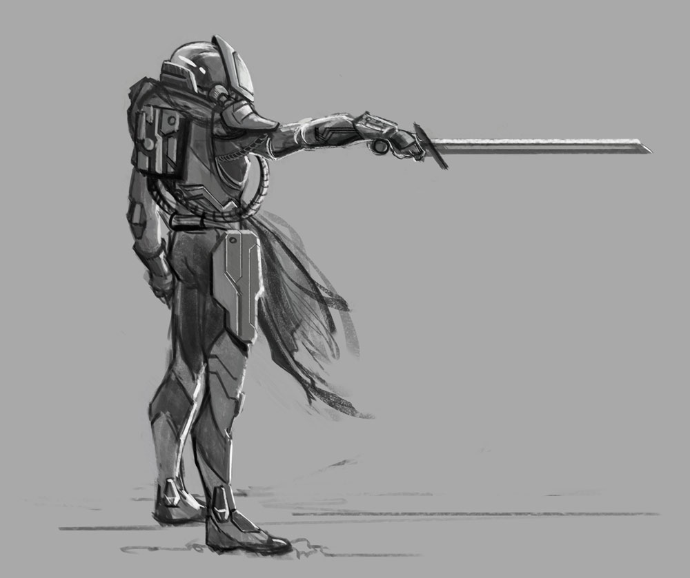
 First is a sci-fi knight concept.


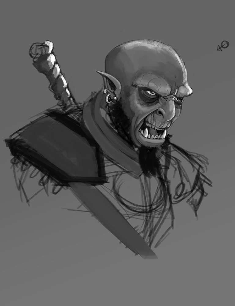
Next is an orc portrait I'm working through. It's gone through a few changes, but I accidently merged the adjustments onto the old layer, so I don't have a way to show progress.


And a few figure studies...

Reply


Forum Jump:


Users browsing this thread: 2 Guest(s)