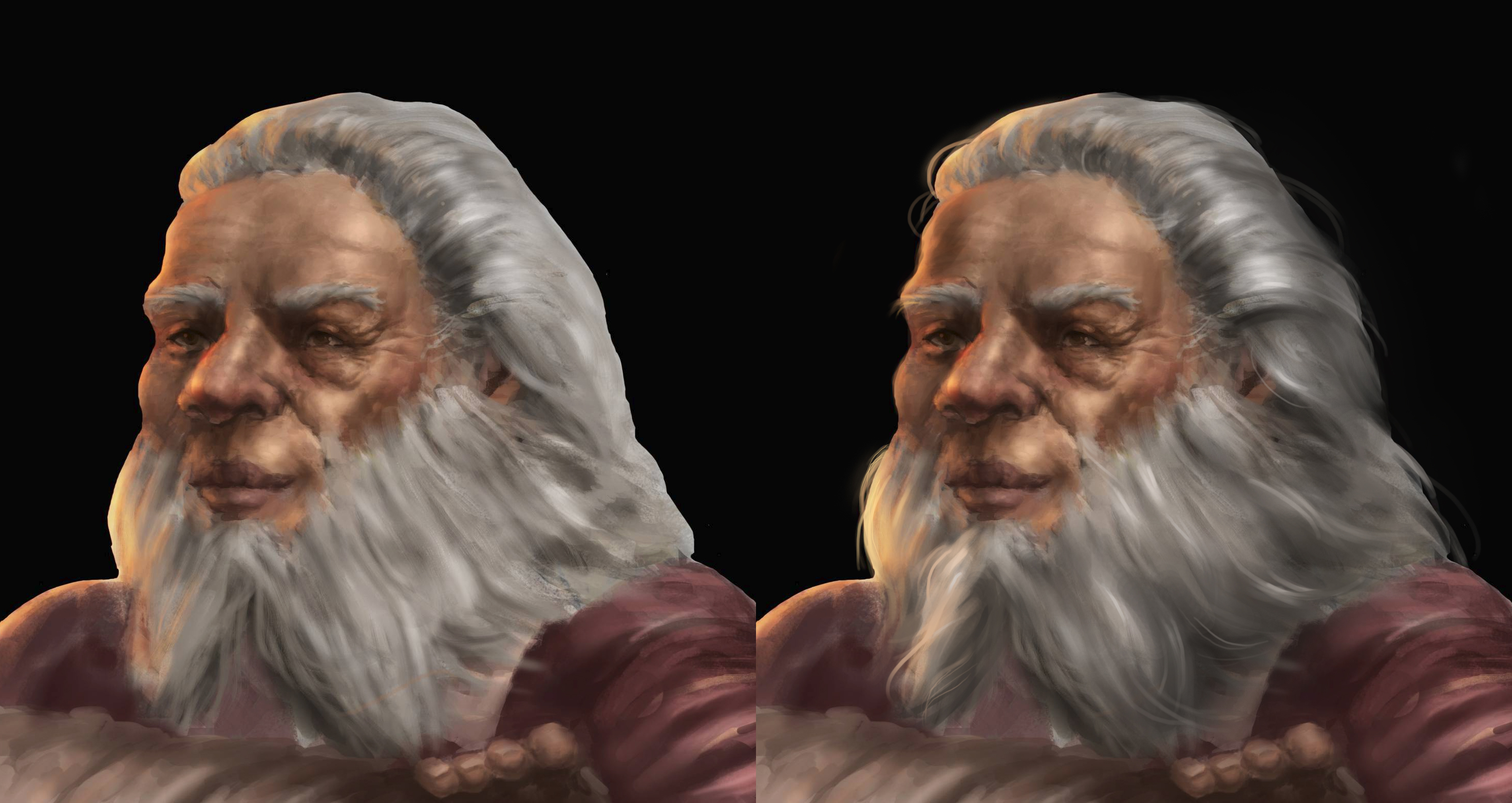
Can you help me push this further?
#1
Hey guys !
Here is a random character that i painted.started off from witcher 3 -vimme vivaldi but ditched the reference in the middle of the sketch and kinda went on from there.

I think i currently have the following problems:
-the folds are not believable?
-the hands are not believable?
-the hair is not rendered that good?

i would want to improve what i did wrong so looking forward to your thoughts/critiques 


[Image: jrDlO6n.jpg]

Sketchbook     Artstation    Faceboob   
Reply
#2


Hello there! This is a really nice painting so far. I'm not exactly sure how to address the other issues but I can give my 2 cents on hair which is something I feel more comfortable with. 

My thoughts for hair:


Make clumps--or layers---of hair
To achieve this, remember that light will not hit all the hair evenly. Create a clearly readable shadowed and light area; be selective about which areas you add highlights. Make sure it makes sense with the lighting situation.

This isn't specific to your piece but a common mistake I see among many budding artists is the tendency to draw as many strands as possible that it begins to rob the hair its sense of depth.

Make purposeful brush strokes. His hair is looking a bit muddied together. It will come with confidence and practice over time, but it is something to keep in mind.

Add little rogue strands. Hair is messy, even in the best of times.  Use a hard brush for this to really make them stand out.

This isn't specific to hair, but this post does a very neat little sum up on explaining edges and I think it will really push your work a good notch or two forward if you can understand how to better handle edges. Your character's silhouette feel flat because he has a very stark, clean line completely separating him from the dark background.


http://muddycolors.blogspot.com.au/2015/...s.html?m=1

I hope this is somewhat helpful and made sense. ^^ Keep going!

~
Reply
#3
(03-10-2017, 04:12 AM)aere Wrote: Hello there! This is a really nice painting so far. I'm not exactly sure how to address the other issues but I can give my 2 cents on hair which is something I feel more comfortable with. 

My thoughts for hair:


Make clumps--or layers---of hair
To achieve this, remember that light will not hit all the hair evenly. Create a clearly readable shadowed and light area; be selective about which areas you add highlights. Make sure it makes sense with the lighting situation.  

This isn't specific to your piece but a common mistake I see among many budding artists is the tendency to draw as many strands as possible that it begins to rob the hair its sense of depth.

Make purposeful brush strokes. His hair is looking a bit muddied together. It will come with confidence and practice over time, but it is something to keep in mind.

Add little rogue strands. Hair is messy, even in the best of times.  Use a hard brush for this to really make them stand out.

This isn't specific to hair, but this post does a very neat little sum up on explaining edges and I think it will really push your work a good notch or two forward if you can understand how to better handle edges. Your character's silhouette feel flat because he has a very stark, clean line completely separating him from the dark background.


http://muddycolors.blogspot.com.au/2015/...s.html?m=1

I hope this is somewhat helpful and made sense. ^^ Keep going!
oh.my.god
the paintover is amazinngggg !!!!


thanks for taking the time to write about the process - it really helped me a lot!
i found the article really inspiring-i'll try to use the tips in my next paintings for sure

Sketchbook     Artstation    Faceboob   
Reply
#4
I might overlap some of the points above.

1. I think the rendering is not bad perse. The main thing that jumps right out of the bat for me is that the edge of the character is very crisp, even in places where it shouldnt be (like the hair). Secondly, there are inconsistencies in the light direction (in the front arm, it looks like it's coming from the front, in the belt, from the left, in the head, a sort of 3 quarter with a rim light. Finally, the materials look pretty much the same, which could be improved with more carefully planed texture and variety in value and saturation range).

2. The main problem in the drawing is the left arm going behind the right one, recheck the anatomy there asap.

3. What's the action that is going on? Did he just throw the coin, or is he going to catch it? In the later, his throwing hand should be closed with a thumb up. In the later, the coin should be vertical to his hand. If you made his eye gaze go to the coin, the acting would be much stronger than with his look "to nowhere". Next time, try to "act out" the pose you want your character to make in a mirror or something, so you can have an idea of what nuances can make it stronger.

Hope it helps :>

Reply
#5
(03-15-2017, 11:27 AM)cesartalves Wrote: I might overlap some of the points above.

1. I think the rendering is not bad perse. The main thing that jumps right out of the bat for me is that the edge of the character is very crisp, even in places where it shouldnt be (like the hair). Secondly, there are inconsistencies in the light direction (in the front arm, it looks like it's coming from the front, in the belt, from the left, in the head, a sort of 3 quarter with a rim light. Finally, the materials look pretty much the same, which could be improved with more carefully planed texture and variety in value and saturation range).

2. The main problem in the drawing is the left arm going behind the right one, recheck the anatomy there asap.

3. What's the action that is going on? Did he just throw the coin, or is he going to catch it? In the later, his throwing hand should be closed with a thumb up. In the later, the coin should be vertical to his hand. If you made his eye gaze go to the coin, the acting would be much stronger than with his look "to nowhere". Next time, try to "act out" the pose you want your character to make in a mirror or something, so you can have an idea of what nuances can make it stronger.

Hope it helps :>
thank god for your comment. i sensed that the anatomy was off on the arm but i kept telling myself that everything is ok :))
i was thinking that he just threw the coin and he was going to catch it.
i think i heard an interview with dave rapoza where he said that he takes a photo of himself sometimes for reference ( forgive my ignorance if that was not him and another artist) now i heard that from you too so i might as well try it xD it will certainly be helpful ( i kinda eyeballed the anatomy unfortunately - so my lacking of anatomy fundamentals becomes quite obvious)

i just want to thank you for taking the time to write those useful tips ! it really did help me a lot ! :D

Sketchbook     Artstation    Faceboob   
Reply


Forum Jump:


Users browsing this thread: 1 Guest(s)