07-03-2017, 04:37 AM

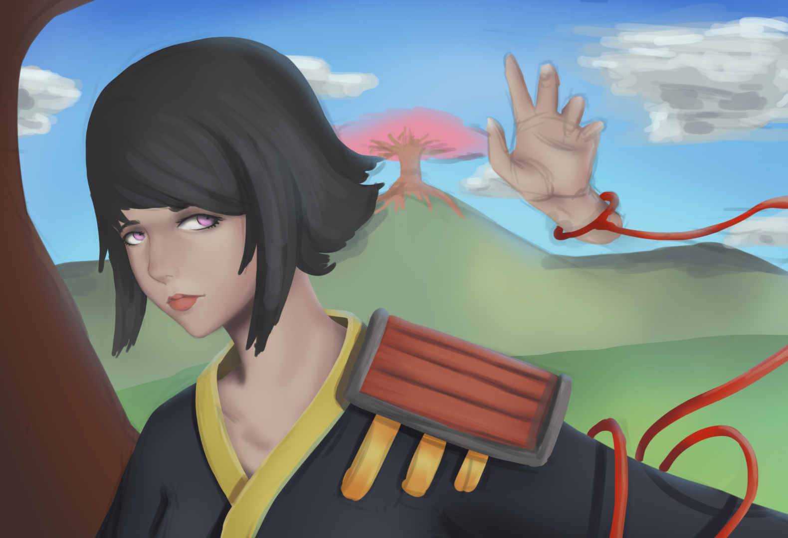
Here is a painting I'm currently doing, and I'm a bit afraid to continue rendering, because it looks like the colors are out of balance ... if you can help me and show me more mistakes, thank you in advance :3
|
Help in colors
|
|
07-03-2017, 04:37 AM
 Here is a painting I'm currently doing, and I'm a bit afraid to continue rendering, because it looks like the colors are out of balance ... if you can help me and show me more mistakes, thank you in advance :3
07-05-2017, 03:45 PM
depends what look youre going for, can homogenize the colours a bit but chucking a photo filter layer over it then painting back the colours in areas of your focal points. the issue right now to me is i dont know whats important in the picture cos there not much contrast in value, saturation or detail. for what looks like a bright sunny day the shadows are pretty minimal and soft. maybe find some reference of people outside on a sunny day. values more important than colour. also you can keep adjusting colour right till the end of the painting so chuck on a new layer and keep working things out. if after 20 minutes you check the old layer and you dont think you improved things, question why. odds are itl look better though.
hope thats of some help!
07-29-2017, 12:46 AM
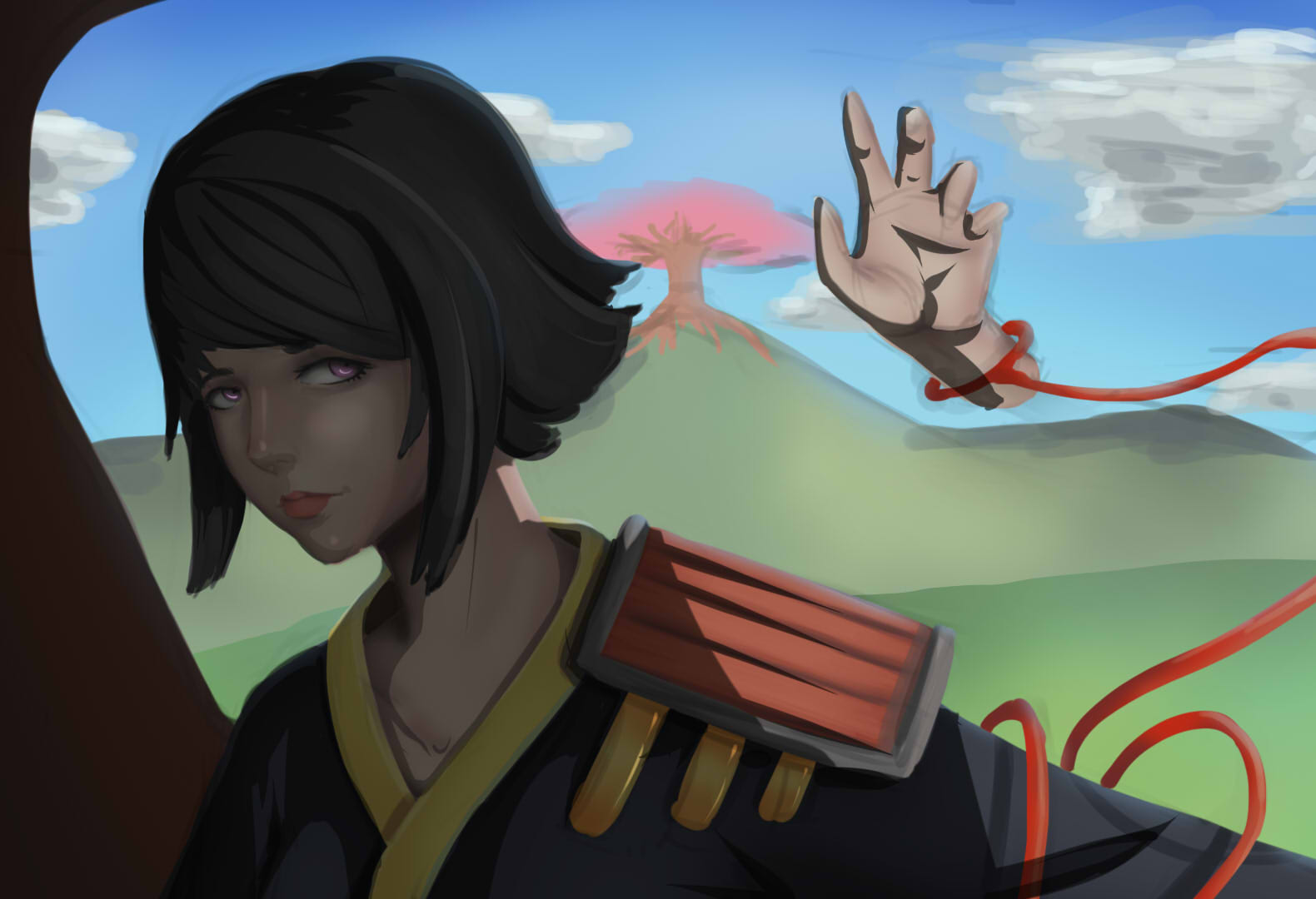
 Here is a paintover and crit for you Happy FEEDBACK FRIDAY!
Livestream Crits/Paintovers: www.twitch.tv/mike086
Loomis Study videos: http://www.youtube.com/user/mike086 My Facebook page: MCIII
07-31-2017, 01:33 AM
The picture itself is a splendid idea :) I like what you're doing here. I did a quick pain tover on some of the basics that I felt you where missing. Hope you don't mind. sorry ><;;
I didn't spend a lot of time trying to fix it. i just wanted to give you an idea. You need to keep your light source(s) in mind, also your values. Don't be afraid of dark areas. Remember that coloring isn't just putting color on a picture, but drawing light. Mine isn't perfect either, so i wouldn't use mine as a definitive resource. I just tried to show you the contrast. So you could have a better understanding of the values. Use reference for everything. I know a lot of people say it's cheating, but using reference is the fastest way to learn how things actually are. The shoulder armor, hair, shadow, light, everything... and it makes it easier to understand what it is you're drawing. There's nothing wrong with drawing something from your head, then using reference later to make it look better. Good luck in your arting adventures, and I hoped I was able to help even a little. 
08-02-2017, 01:35 PM
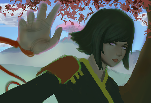
(07-03-2017, 04:37 AM)Lottusz Wrote: Here is a painting I'm currently doing, and I'm a bit afraid to continue rendering, because it looks like the colors are out of balance ... if you can help me and show me more mistakes, thank you in advance :3 Hi here is my paintover from your work, maybe try to darken a bit the character, and put on some shadows from the leaves on the tree near her, since you background is quite bright. and this way you can go on with the process on improving the details. I hope this will help. keep going. Cheers |
|
« Next Oldest | Next Newest »
|