06-09-2017, 12:45 PM
![[Image: ckJW5ty.jpg]](http://i.imgur.com/ckJW5ty.jpg)
I'm (somewhat) aware of some of the pitfalls i commited in this piece, but i'd love a second opinion :)
|
Critique, please :-
|
|
06-09-2017, 12:45 PM
![[Image: ckJW5ty.jpg]](http://i.imgur.com/ckJW5ty.jpg) I'm (somewhat) aware of some of the pitfalls i commited in this piece, but i'd love a second opinion :)
06-12-2017, 11:12 PM
3 things you might want to look over:
1. Perspective. The buildings at the back looks like they serve two different vanishing points. Unless it was your intention that the left side is tipping over the other, you might want to recheck. 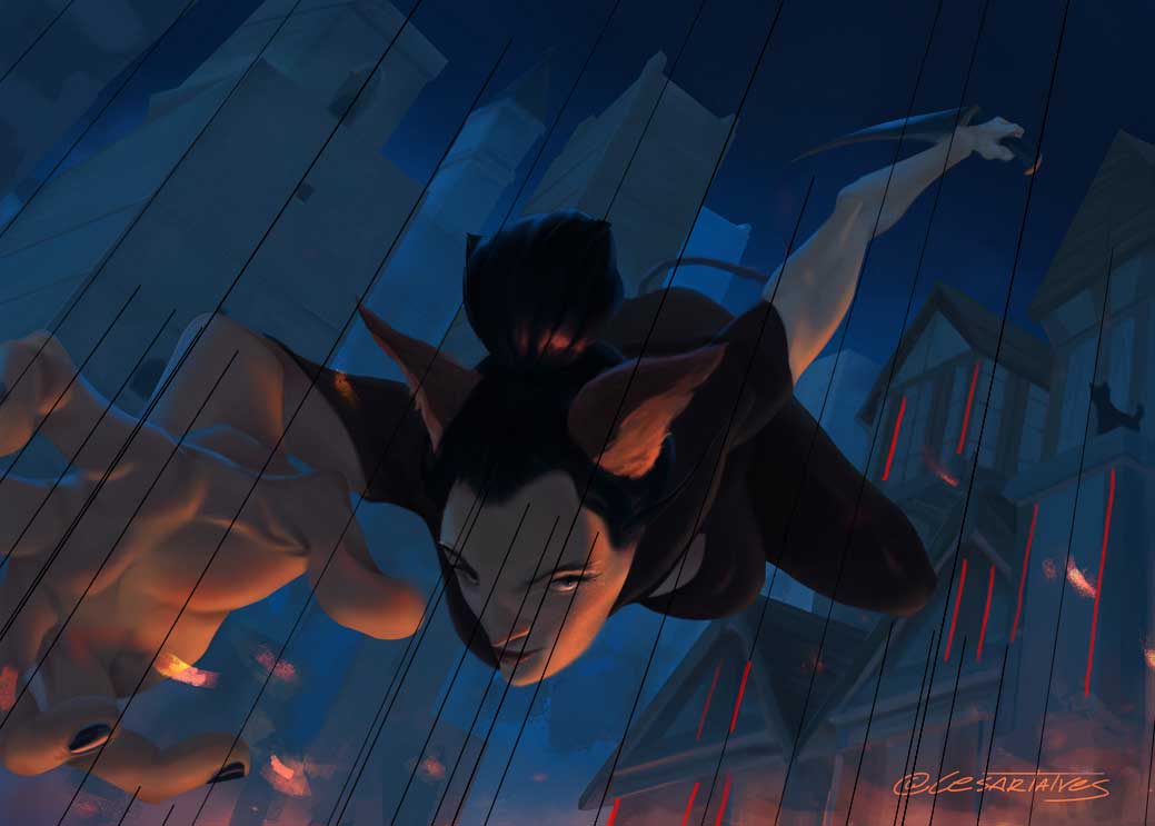 2. Anatomy. More specifically, foreshortening. Foreshortening isn't exactly easy to pull of because it is so easy to mess up the proportions. This is probably a tough thing to verbalize so I hope this paint over is sufficient. 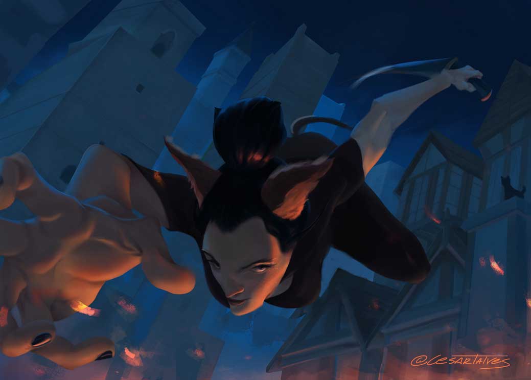 I adjusted the breast a bit. And foreshortening at the back. I'd recheck how you painted in the shoulders. And the arm/hand that's coming towards the reader. That I don't have an immediate answer for. 3. Values (?) Your value variation (separating it to Shadow, around two half tones and a highlight) needs a bit of balancing. Or contrast. Or both. Currently, running it through Posterize and B/W, it looks like this: 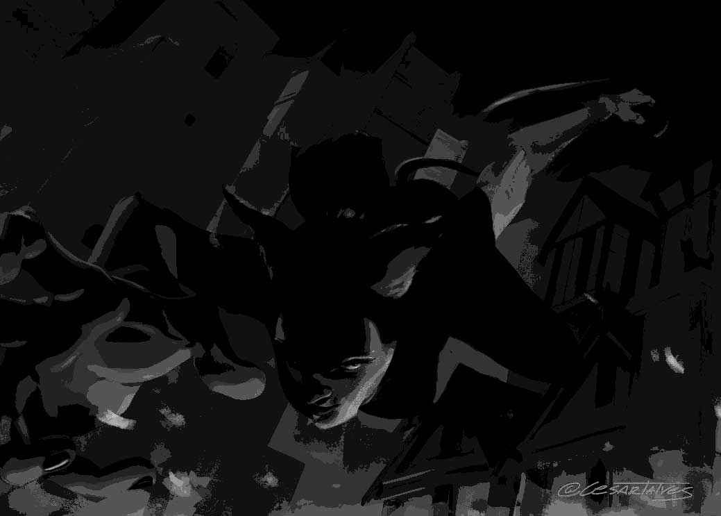 Maybe repaint some of the stuff you want the viewer to look at more by lightening up some of the values you want them to focus on. Or, simply adjust the levels of the painting. 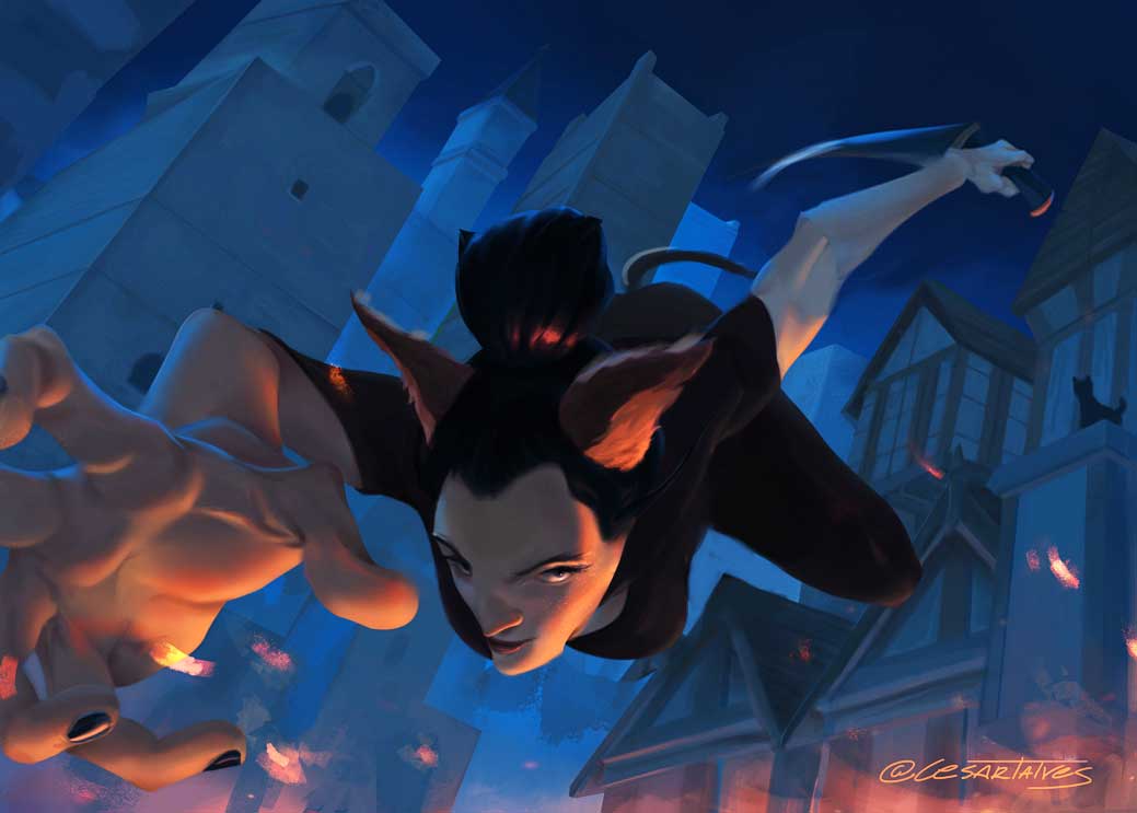 You're doing a good job so far. Keep it up!
If you are reading this, I most likely just gave you a crappy crit! What I'm basically trying to say is, don't give up!
---- IG: @thatpuddinhead
06-13-2017, 12:31 AM
awesome hands, great job with those! How is the silhouette? fingers and stuff are good for that but how is the rest of the body, especially the bun of hair poking up (maybe it's all fine, just something else to check!)
Her eyes let it down a little in my opinion, we always want to look there but her eyes feel a bit dead. If she's diving towards something and is looking up at it, her eyes should be looking straight in front of her (otherwise it feels like she's missed whatever she was diving for). Otherwise she could be looking down, towards where she's going to land. Combine with more of an expression so we see her mood / feelings a bit? Here are some quick crappy suggestions: 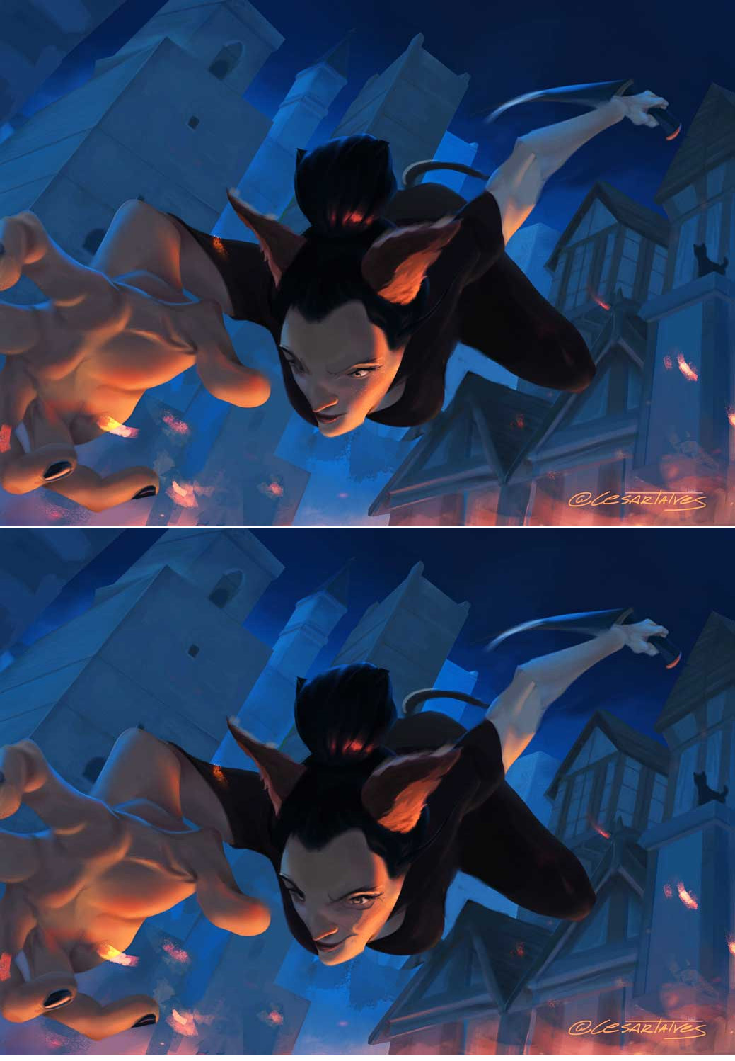
06-13-2017, 10:15 AM
Thank you very much guys :) I will try to apply your advice during the week
@Mariyan-Hristov i tried a rim light, but it made the character jump too much, and i couldn't come up with where the light would be originating. I might give it a shot again @John I can notice the perspective is indeed off. I made a hand drawn perspective grid on paper, so i'm gonna recheck that. About the foreshortening, this piece was a way to pratice it, so it's good that you pointed it out :) And about the values, i wanna keep the overall key in a dark tone, so I'm going to play with the lights like you suggested. Thanks for the input! @JyonnyNovice That bun of hair doesn't make any sense with that point, right? I will redo the entire face and try to enhance the overall expression. Let's see how it goes :- |
|
« Next Oldest | Next Newest »
|