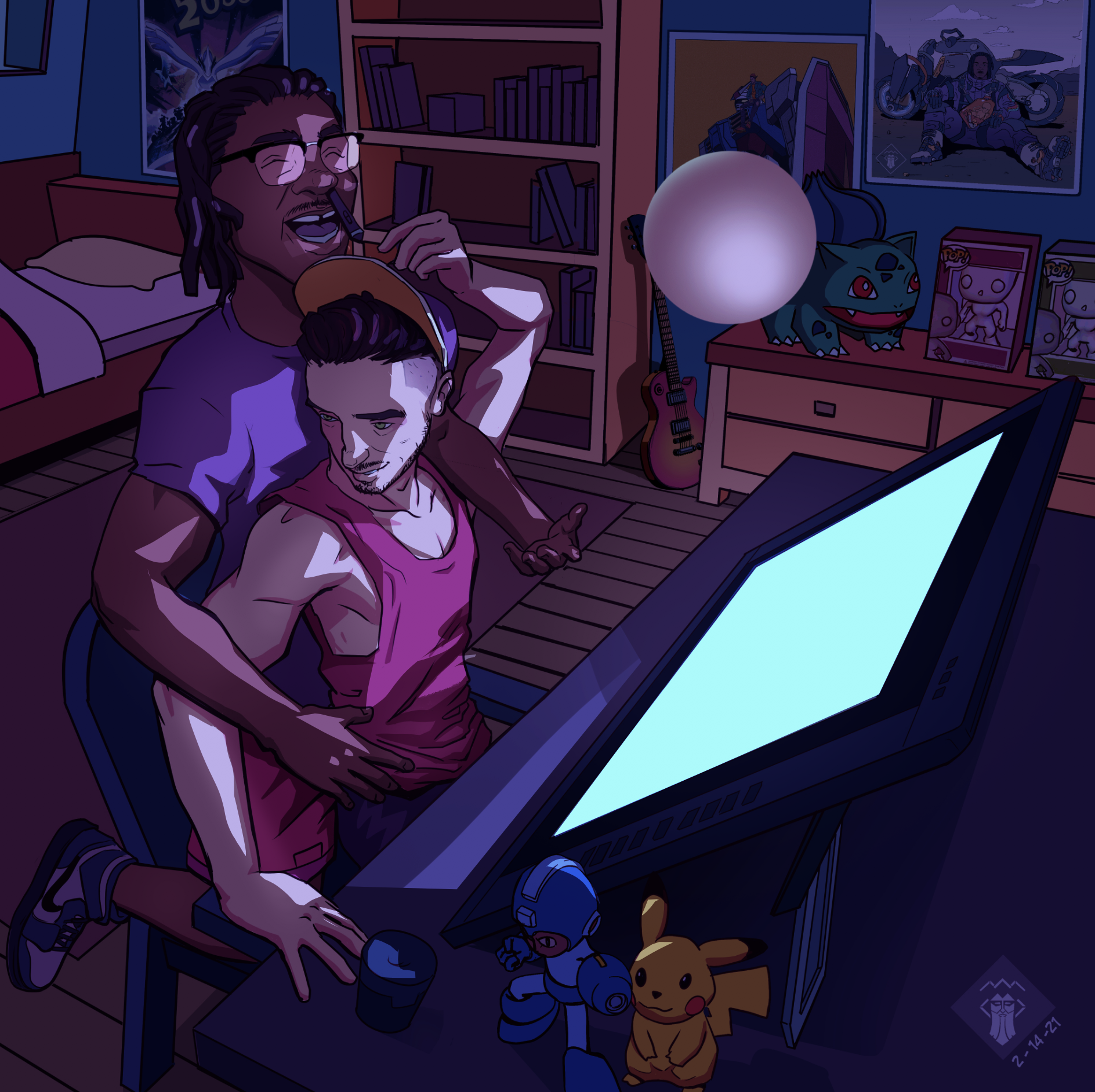
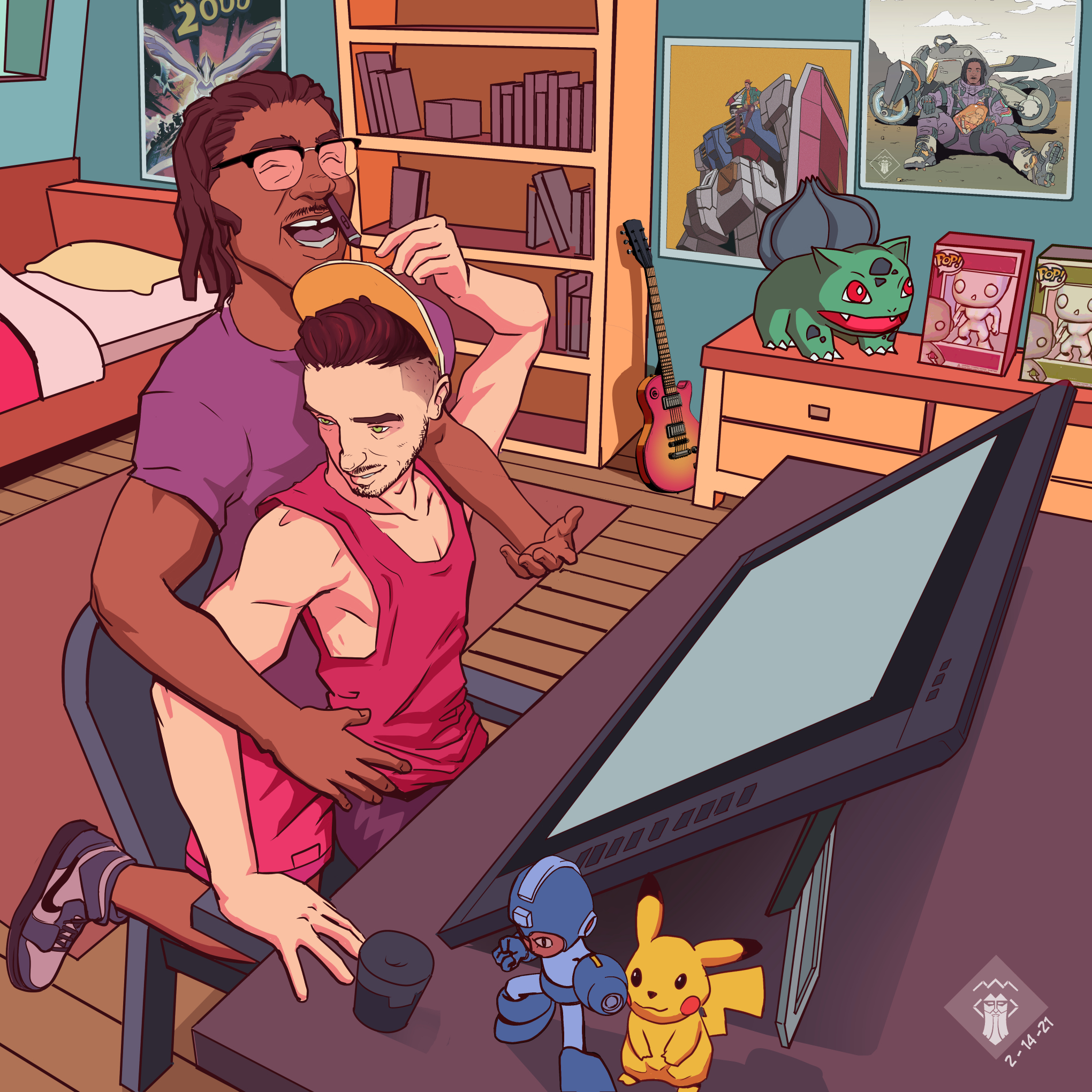
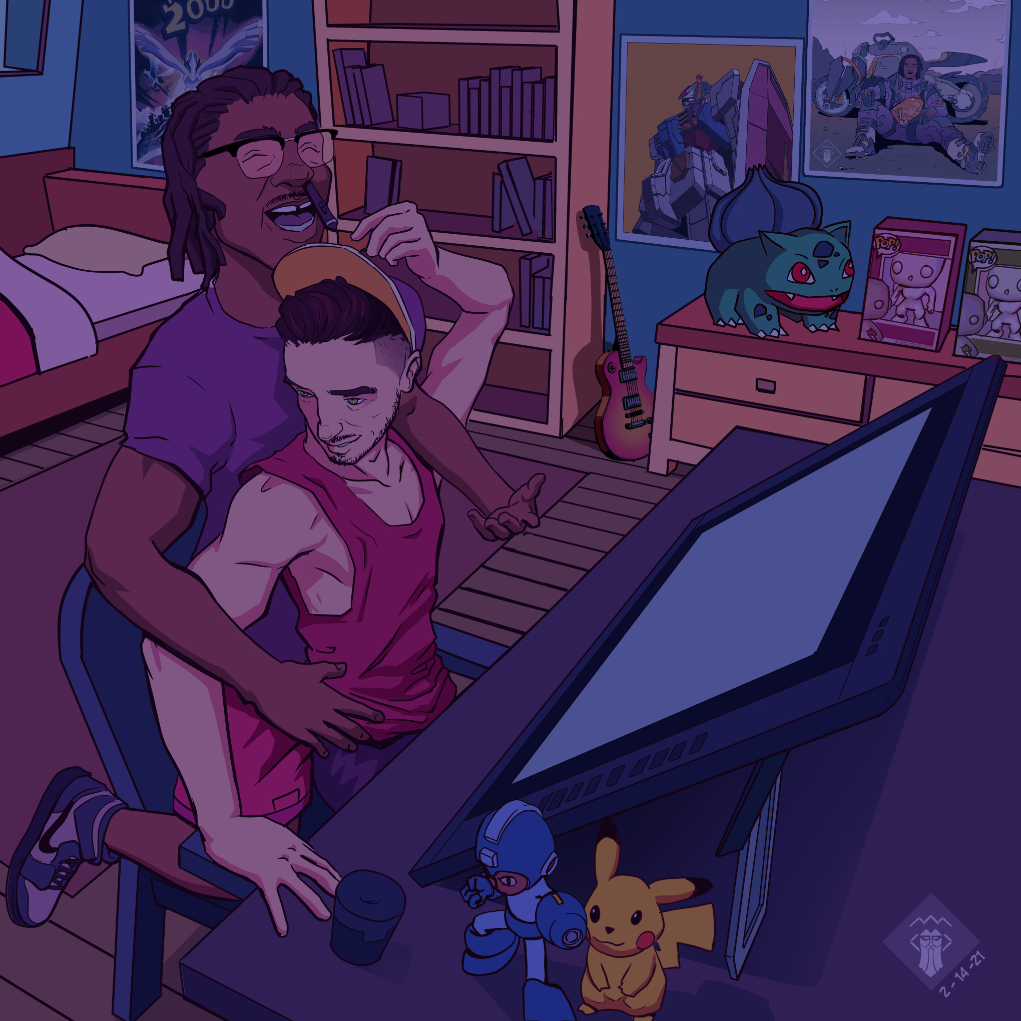
Fun piece dude. Seeing how you've already darkened the overall "diffuse local color" in your new piece, you're off to a perfect start! Next would be using values and deciding where and how the key light source (screen) interacts with objects around it.
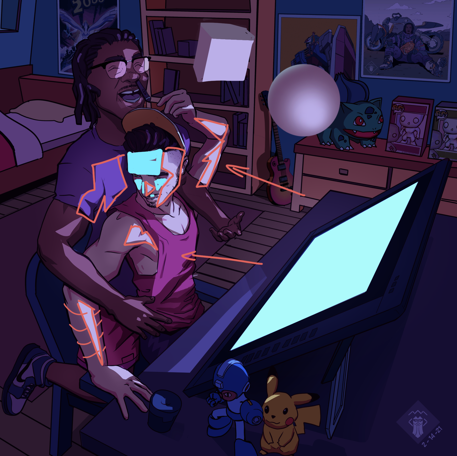
My paint-over here is super rough, but I basically thought "which planes are facing towards, and closest to our key light source?" For example, some areas would be the front of tank-top's chest, left plane of their face, and (if treated like cylinders) some parts of their arms. I tried to visualize this a bit in my second attachment- showing how thinking of the forms in 3D and which planes/surfaces I think the light would logically hit. The cyan blue would represent planes of the face that are facing
away, thus catching none, if not, very little of the key light.
Looking at some reference, I also darkened the local color/value of the room even more just to up the contrast a bit
