Artloader - Sketchbook
Excellent studies and notes in your latest post! Taking notes as you go along and really thinking about what you are doing and why you are doing it is the best way to go IMO! Especially if you create tons of quick sketches as you go along!

Reply
Cool sketchbook, you made great progress since the beginning. I like the notes on the last posts, thanks for sharing . Keep it up
Reply
@Zorrentos:  Thanks my friend - yep - making notes really helps me think back over what I learned and solidify stuff in my head.

@Kassatay:  Hey thanks for stopping by and for the encouragement :).

So I've been pressing on a bit with the Craig Mullins Schoolism course.  Lesson 2 was about two different approaches to painting:

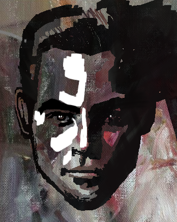
1. The Graphic Approach:  Using a full opacity brush and painting shapes in 4 values from black through to white.
My learnings with this approach:
a. It forces you to be decisive about your shapes.
b. I liked how Mr Mullins showed us how to turn each of the value patterns into selections and paste photos into the shapes to give texture and interest.  Not something I'd normally do but useful to keep in the toolbox in case it ever comes in handy.
c. Don't be afraid to use the digital tools to adjust the value levels.
d. You still need to prioritise drawing (placement and proportion) - Mr Mullins keeps on emphasizing.
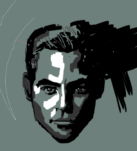


And this is me playing around with a bit of photobashing an oil painting into the different value patterns:


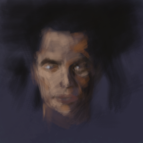
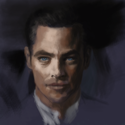
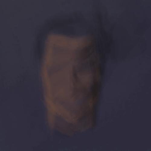
2. The Glazing And Scumbling approach:  Starting off at a middle value with a low opacity brush and making your painting "appear out of the fog".
My learnings with this approach:
a. You still need to prioritise drawing (placement and proportion).
b. You don't have to get it right first time - you can keep on adjusting all the way through the painting.
c.  I seemed to be able to get more accurate values and colours with this method.


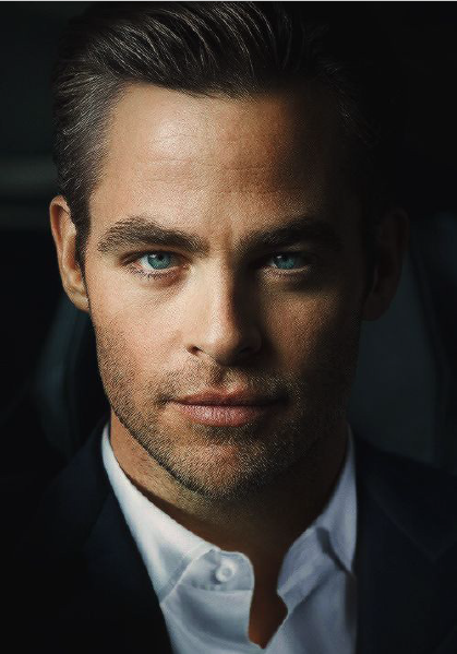
And here's the ref:


Additional thoughts:
Neither of these approaches matches the way I normally paint and I felt a bit out of my comfort zone but I feel like it is useful to try different techniques as I usually pick up a few useful tips and tricks.

“Today, give a stranger one of your smiles. It might be the only sunshine he sees all day.” -- H. Jackson Brown Jr.

CD Sketchbook


Reply
Great studies , you’re doing well! Thanks for sharing these lessons. The course looks really informative.
I like the second study, I actually use this approach when doing my portrait. It’s like sculpting.

You can check this video it will help you out with the process https://youtu.be/QNR0xW39ejM

Keep it up!
Reply
Hey it might be worth watching some of the feedback videos that Craig Mullins does for other students. (I'm not following my own advice because there's loads and it gets draining )...But the first few I watched were quite enlightening. And kind of hilarious too how he essentially drew a stickman-esque triangle with a smiley face for the guy in the head dress and was like "right, you need to make it more like this"

Reply
Looks great, glad you're getting value out of schoolism. Paying for stuff is a good motivator to get on and do the assignments, right!

For the anatomy stuff, what I've been finding useful is to devote a short bit of time at the end of each day to drawing with pencil in a sketchbook and doing a ton of arms/legs/whatever from imagination. I found it's a good test of how much I've remembered and kind of solidifies any new stuff.

Comic book creator
Sketchbook
Instagram
Abandoned Hideout Discord Server
Discord: JonR#4453
Reply
Hello Daggers, been a while, I got out of the art habit but hopefully will rebuild one this year.  Hope you're all doing alright :).

@Kassatay: No worries, thanks for the comment and link.

@Skeffin: Yeah I took your advice and watched the feedback videos - very useful and I think I know the stickman video you're talking about heheh.

@JyonnyNovice:  Thanks, good advice with the drawing loads of anatomy from imagination.

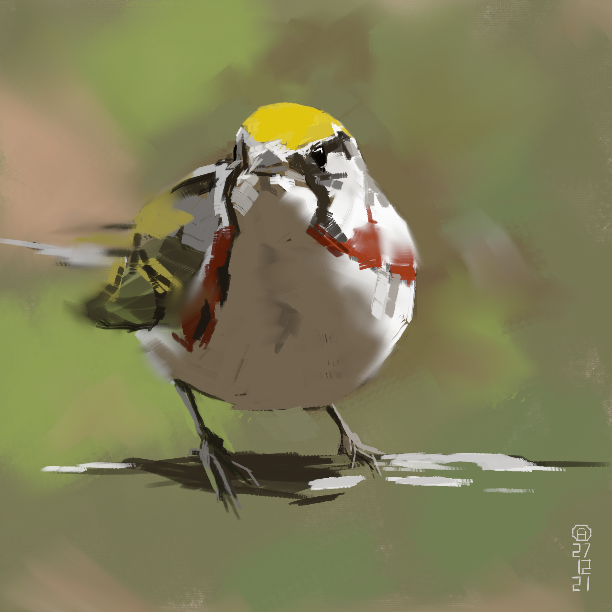
Here's a study of a chestnut sided warbler - any feedback would be appreciated.

Reference from this photo on Unsplash by Patrice Bouchard:  https://unsplash.com/photos/4RUq2sFZFhc


“Today, give a stranger one of your smiles. It might be the only sunshine he sees all day.” -- H. Jackson Brown Jr.

CD Sketchbook


Reply
Welcome back, Artloader! Sometimes it's good to take a break.

I have no crit on the bird. You captured the perspective and roundness well with just a few strokes.
Reply
Hey Pubic Enemy - thanks for the warm welcome - I think you're right about taking a break - this was my first painting for months and I really enjoyed getting back into it.

“Today, give a stranger one of your smiles. It might be the only sunshine he sees all day.” -- H. Jackson Brown Jr.

CD Sketchbook


Reply
(12-29-2021, 06:56 AM)Artloader Wrote: Hey Pubic Enemy - thanks for the warm welcome - I think you're right about taking a break - this was my first painting for months and I really enjoyed getting back into it.

Hi,

Yeah I've taken breaks and it's good to recharge sometimes.  [Image: tongue.png]

Looked over your last two pages and think you're doing well with your studies etc.  No critz for now....

I had to laugh at myself reading your first post on the last page about not using layers and undo — which I can't seem to live without.

In fact, when I'm out sketching in my 'real world' sketchbook — I'll draw for a bit and then look for the undo button — it's become such a habit by now in the digital world.   [Image: wink.png]

Ciao fer now

Reply
Thanks for dropping some of your schoolism notes here! Those are very helpful.
Looking at the warbler and the ref, I'm feeling like it's body/feathers could use more carefully placed soft edges, as you've already started doing quite well. That way, the key areas like the beak and eyes can pop even more as the focal point without feathery areas distracting from it. regardless, it looks great and reads well i think!

Reply
Really love the way you doing shape studies. The thing that I still struggle with >.<

---------------------------------------------------------------
Devianart

Sketchbook

Instagram


Cara

Twitter/X

Artstation


Reply
@Jephyr: Thanks for stopping by and yeah I find the lack of the [undo] button in working traditionally makes me more careful in how I make marks.

@_spec: No worries on the Schoolism notes - it kinda helps me to solidify my thoughts as well. Also thanks for the tip on the softer edges - I definitely agree it would have pushed the realism. I guess at the moment I'm more focussed on brush economy - any tips on that would be appreciated by the way :).

@cicakkia: Thanks for the comment - yeah shapes are still something I need to work on too :).

“Today, give a stranger one of your smiles. It might be the only sunshine he sees all day.” -- H. Jackson Brown Jr.

CD Sketchbook


Reply
Working from the mid tones I don't see recommended often but have passively preferred to do so I'll look into that method more and see what people have to say. I always found it was better to 'push' the values in either direction rather than 'build up' value from light or dark. It made the process more sculptural I guess.

It's good to see your recent updates - looking forward to more.

Sketcherinos

Link Tree

Discord: emnida
Reply
@RottenPocket:  Hey good to hear from you again :) - yeah it was interesting to experiment with the various approaches to painting but I've just come back from a break from art and feel like I've studied so much and tried so many different techniques that I don't know what I personally prefer any more so I'm just taking it steady and doing what I feel resonates with me the most for now.

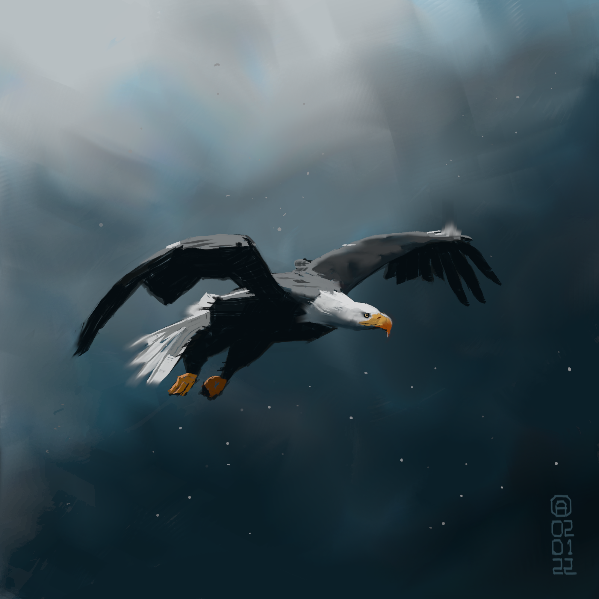
Here's another study, at the moment I'm loving the big brushes and more impressionistic approach so I feel like pursuing that for a while (crits welcome as always - thanks):


Here's the reference by Philipp Pilz on Unsplash:  https://unsplash.com/photos/ID48ekBTlDo

“Today, give a stranger one of your smiles. It might be the only sunshine he sees all day.” -- H. Jackson Brown Jr.

CD Sketchbook


Reply
Hey Crimson Daggers, been a while, hope you're all good.

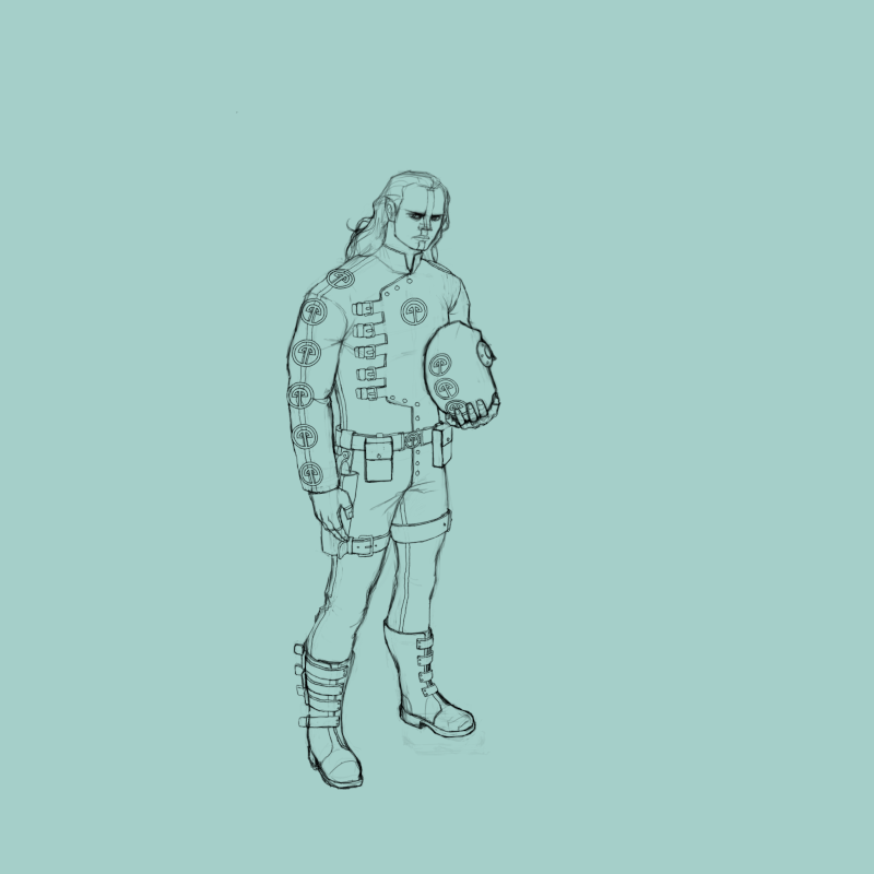
Character concept I've been working on:


“Today, give a stranger one of your smiles. It might be the only sunshine he sees all day.” -- H. Jackson Brown Jr.

CD Sketchbook


Reply
The suit make it look like it a one piece suit is it the idea?

If that not latex and it leather for the pant it should be showing more of the fabric folding on itself at the knee in my opinion and possibly at the bottom of the pant depending on how thigh they are.

The object he is holding doesn't make much sense right now i suspect it a glass helm because of how aerodynamic the oject look other then that i don't know if that a correct observation.

The repeating motif from the vest let me think it part of the costume but at the same time it let me think that the object could be made be of the same material...

Also you have the helment object resting slight against the torso which would mean the leather would be a little press with would create new plane.

For the pose depending if it just for personal use or for project that could model by someone else it could be necessary to make the object behind the arm more obvious so choosing a pose that give the most information could be adapted if necessary or adding additional drawing to the character design sheet would be expected for example drawing the belt separately and the helmet could also probably use a turn around because it hard to figure out how they put in on and how it stay there.The design as to follow the function.


Attached Files Image(s)


My Sketchbook

Perfection is unmeasurable therefor it impossible to reach it.
Reply
Welcome Back!

Likewise, hope to see you around more - Sylen Benevolen? Are you doing a spacer personal project?

Sketcherinos

Link Tree

Discord: emnida
Reply
Smile 
Hey @darktiste - thanks for dropping by and taking the time to crit [Image: smile.png].
It is a one piece suite and a metal helmet.  
I will be just drawing this stuff myself in 2D so won't be passing it onto a 3D modeller - this piece is just me trying out a character design to see if I like it.

Hey @RottenPocket, thanks for the warm welcome, I hope to post more regularly now [Image: smile.png].  Good to see you posting again as well [Image: smile.png]. Yeah this dude is part of a personal world building project - post apocalyptic stuff.

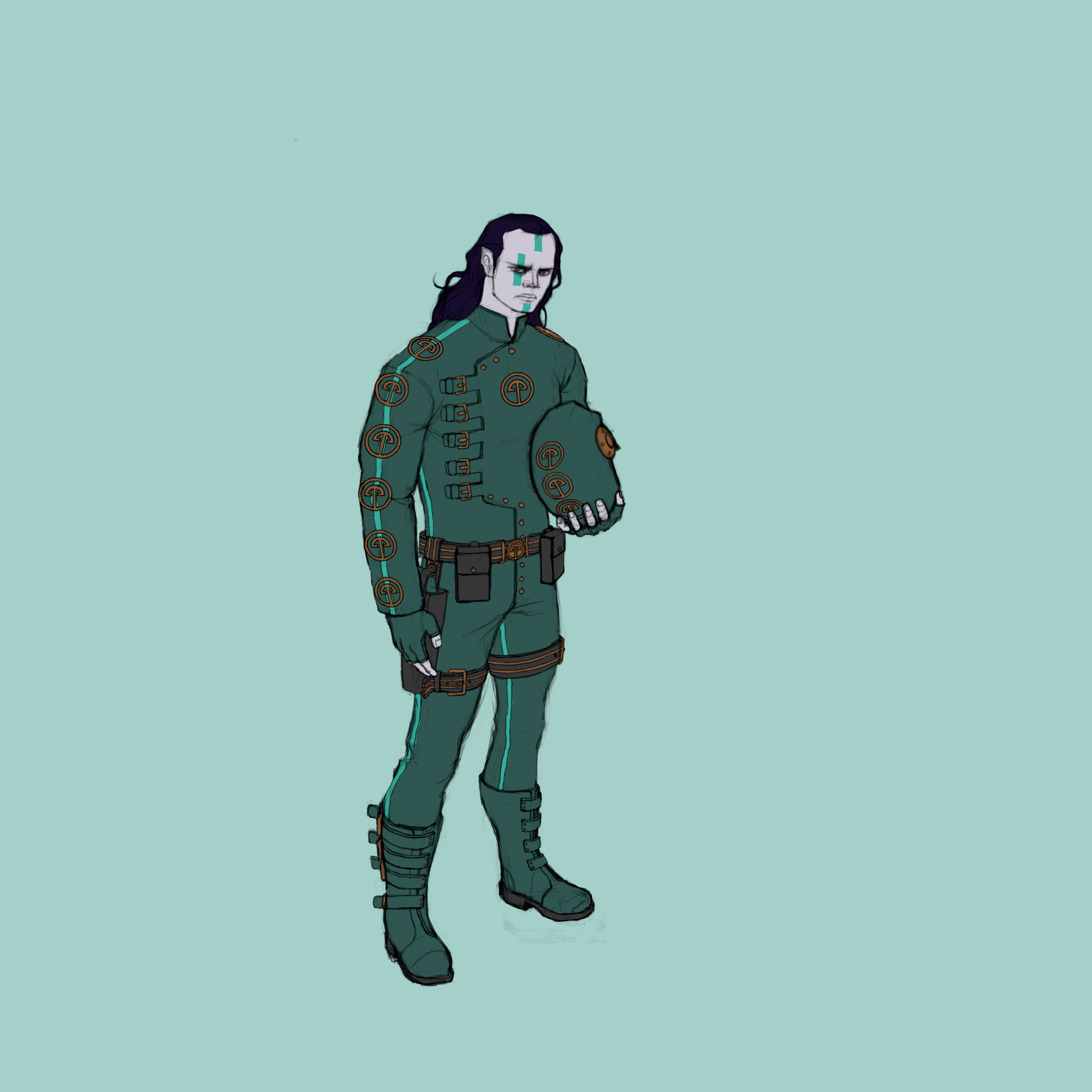
Here he is with some flat colours on:


“Today, give a stranger one of your smiles. It might be the only sunshine he sees all day.” -- H. Jackson Brown Jr.

CD Sketchbook


Reply
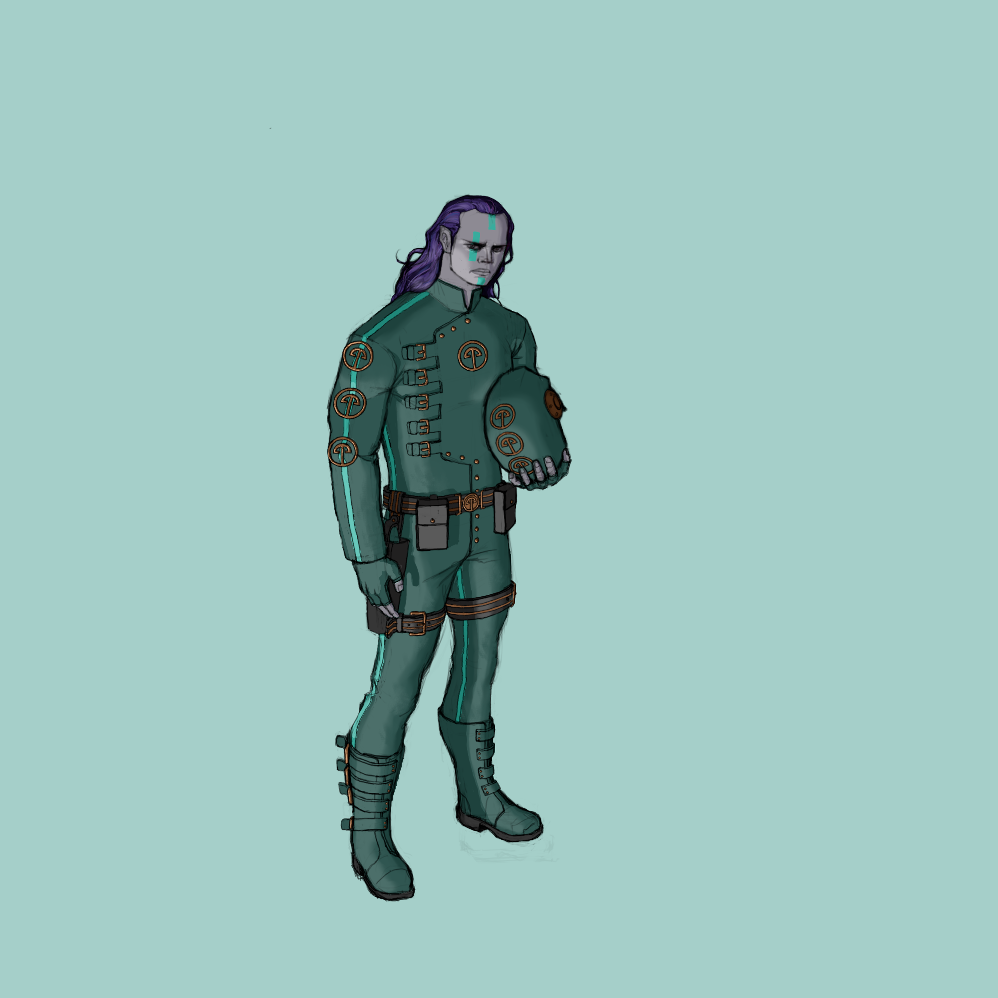
Did an ambient lighting pass ...


“Today, give a stranger one of your smiles. It might be the only sunshine he sees all day.” -- H. Jackson Brown Jr.

CD Sketchbook


Reply


Forum Jump:


Users browsing this thread: 26 Guest(s)