
+- Crimson Daggers — Art forum (//crimsondaggers.com/forum)
+-- Forum: PERSONAL ARTWORK (//crimsondaggers.com/forum/forum-9.html)
+--- Forum: SKETCHBOOKS (//crimsondaggers.com/forum/forum-10.html)
+--- Thread: CGMythology's Sketchbook (/thread-7224.html)
RE: CGMythology's Sketchbook - darktiste - 03-05-2022
I think the before end picture had a very nice quality to it i feel like you still need to try to remember toward the end to apply restraint with the light i am kinda repeating myself on that point for a while but it because i believe everything is better with moderation and it create actual visual hierachy to try to limit the highlight.If you flood everything in light it not always going to work it might be great for angel but not so much otherwise i would say.Plus there no real need for this much yellow taint to everything since this isn't a scene that seem to be happening in a landscape with alot of sand particule.The vegetation suggest a temperate and clear air.
I just wanted to give you a little peek at how your piece look just before the point i am talking about.I feel like it already a great picture at that point.
My problem is when you start to lose the figure with the sky because both start to become to yellow.Just a note also since you are very upward angle there should be less atmospheric perspective i feel the more you look up the less you generally have the heat of the floor coming up and creating the atmospheric disturbance that create the atmospheric perspective in regard to heat blurring thing like on hot summer day.Also the hair have a strange etheral quality to them when i feel they should feel more powerful and play to her ''sex appeal''
RE: CGMythology's Sketchbook - cgmythology - 03-07-2022
darktiste: Thanks for your input! I preferred a warmer color theme for this one as I felt it was more appropriate, but hopefully I didn't overdo the lightning effects. Great input as well, will keep what you said in mind for future pieces.
................
Time for a new illustration! Want to experiment with a sci-fi theme again so I chose to depict a cyborg. I was inspired by this reference photo here which had very dynamic lightning. I didn't want to be a slave to it so I came up with my own figure as well as theme. Below is the sketch, any input before I begin the painting process would be appreciated!

RE: CGMythology's Sketchbook - mixedmax - 03-09-2022
Man I need to do lots of catching up, there are some really nice pieces in here and a lot of dedication!
Digging the patterns on your latest sketch. Curious to see where it goes.
Cheers!
RE: CGMythology's Sketchbook - cgmythology - 03-13-2022
mixedmax: Thank you, much appreciated!
.................
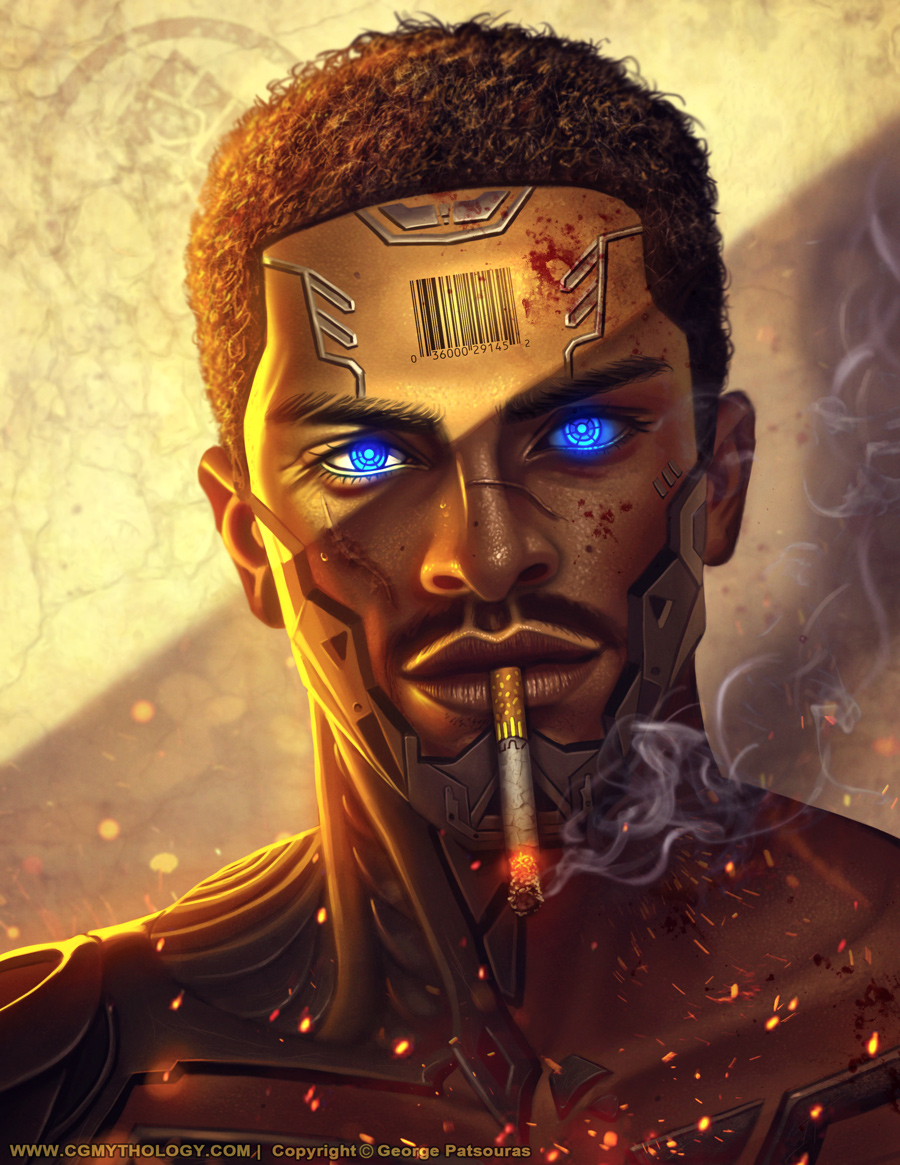
Finished the painting process for the cyborg. Tried to play up the details with this one and am fairly satisfied with how it turned out. Below is the image followed by the steps if you're interested. Of course there's still time to apply feedback if necessary, so any input is welcome!

RE: CGMythology's Sketchbook - mixedmax - 03-14-2022
I like how much time you've put into rendering the portrait, good job overall!
Really digging some of the subtle stuff you've put in there like some of the very well-placed highlights on the nose.
One thing I'd be careful with though is how much detail and effects you spread across the image, making it feel slightly overloaded/overrendered.
Great stuff though!
Cheers :)
RE: CGMythology's Sketchbook - Jephyr - 03-14-2022
Hi CG,
I'm completely impressed with how much you have developed in just the last 9 months. Just went through your last 6 pages or so and with every page and image you're making incredible strides.
Your last two are no exception and the last one is especially engaging.
Well done — can't wait to see what you can accomplish as you keep at it!
RE: CGMythology's Sketchbook - cgmythology - 03-20-2022
mixedmax: Thank you! I agree about the details/fx, will try to tone it down as I've been overdoing it a bit as of late! Glad you enjoy the image regardless!
Jephyr: Thank you kindly! Really appreciate your positive words and encouragement, really means a lot to me and it's always great to hear I'm improving my technique!
.................
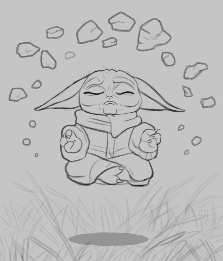
I began work on another personal piece, an illustration of Baby Yoda. Want to do something a bit simpler this time in terms of composition, so I didn't opt for a detailed setting. Below is the sketch, any feedback before I begin the painting process would be most appreciated!
RE: CGMythology's Sketchbook - darktiste - 03-20-2022
Just one word before you go.
RE: CGMythology's Sketchbook - Jephyr - 03-29-2022
Hi CG - Looking forward to seeing the Baby Yoda as you work at it.
You mighta already covered this in older posts that I've missed — but are you studying with someone or somewhere? Who is your main inspiration right now?
Ciao fer now
RE: CGMythology's Sketchbook - cgmythology - 03-29-2022
darktiste: Haha, thank you :)
Jephyr: Thanks for your support as always! I'm pretty much self taught so I'm not studying with anyone currently. Right now I'm currently appreciating the art of Dan Luvisi, especially since I started experimenting with more sci-fi related images. His work is a huge inspiration in that regard!
......................
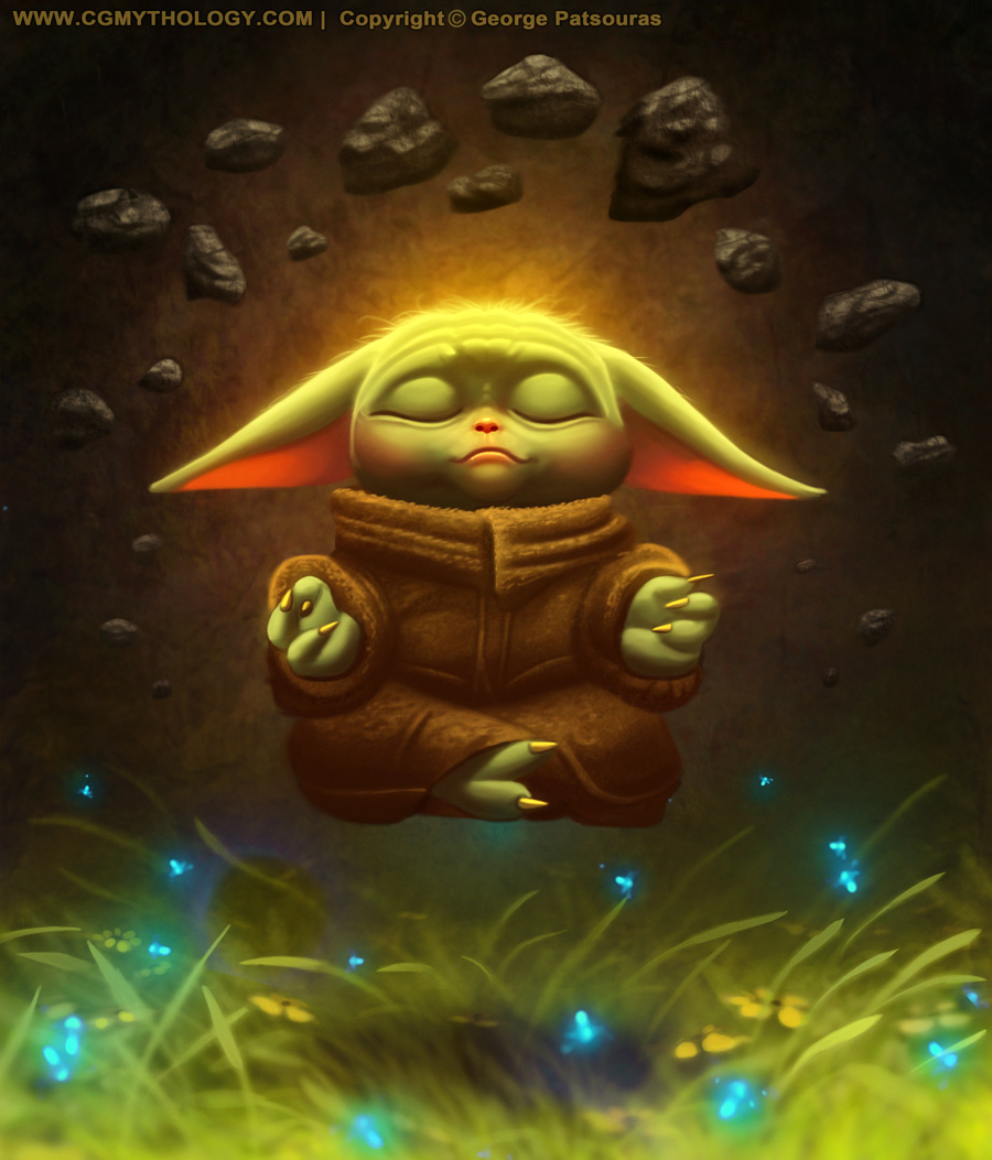
And the image is finished! Had a blast with this from start to finish, although the colors weren't quite working during the later stages. I actually limited the color palette towards the end for better harmony as the grass color was too distracting. Below is the final image followed by the steps for those interested.


RE: CGMythology's Sketchbook - cicakkia - 03-31-2022
The baby Yoda turn out nicely. Well done :)
RE: CGMythology's Sketchbook - darktiste - 03-31-2022
I will try a last attempt at convincing you not to over do the lightning in general. I find this stage perfectly acceptable. Maybe except the foreground grass that added a bit more depth i find it was already pretty much done everything made sense.So i hope you can excuse me for being a broken record.I think you treat the skin as something with way to much specular reflection .Which you should reserve for metallic surface in my personal opinion. Look at how little even a metallic surface give specular highlight an how small the radius of the specular is depending of course on the distance from the viewer.
One thing that is odd to me is why we see such a strong lighting when the background is so dark.Also we see rock but it a grassy terrain those are a few of the inconsistency of the storytelling in my opinion.This lightning could be possible but i would say it would have to be an artificial light like a spotlight which doesn't make sense here since it seem to be taking place outside
One note concerning the force it generally a blueish aura for the jedi and it true for yoda in particular which you can find picture of where he is shown with it if you want to stay true to the color symbolism.
I still like it regardless of how brutal my critic might be toward you it always with my best intent.
RE: CGMythology's Sketchbook - RottenPocket - 03-31-2022
Hey CG,
Gotta say I have not watched the Mandolorian. I do think though that if you're using a simpler composition as you say, then considering focal points and detail are just as if not more important. In your final the blurring in the textures and background make the image appear flatter, and the uniform yellow hue adds to the flatness.
All in all, I think the one step before the final actually worked best for this image:
The lighting is not overpowering and his form doesn't blend in with the background.
RE: CGMythology's Sketchbook - cgmythology - 04-06-2022
cicakkia: Thank you, glad you enjoy it!
darktiste: I agree, I go a bit too crazy with some of the lighting effects towards the final stage. Excellent point regarding my rendering of the skin, it does look a bit metallic likely due to the values of the halftones and highlights, they're much too bright. I reworked Yoda's skin and toned down that aspect, and I will keep this in mind for my future pieces in regards to shading the skin.
Also regarding the strong lighting, it's simply a personal preference as I want the picture to pop, and having strong highlights against a dark background helps do this. I might be overdoing it though so it might look a bit unnatural, I guess I need to find a better balance overall. Thanks again for your input, very constructive as always!
RottenPocket: I haven't watch the show neither (I don't have DisneyPlus in my region!) but I love the character design for Baby Yoda! Great input as well, I removed the blurry glow from behind baby yoda (I was trying to give it the impression of movement but I guess it didn't work too well). Made some final adjustments to the image, hopefully it works better now!
.................
I tweaked Yoda a bit more based on the input I received, should work a bit better now! Below is the update:
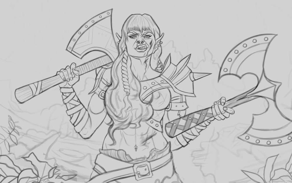
Next up I started work on a new image featuring a female Orc. The figure's general pose was referenced from here as well, tried my best to capture it and I think I was fairly successful in that regard. I think it's about ready to paint but any feedback before I do would be most welcome! Here is the sketch:
RE: CGMythology's Sketchbook - darktiste - 04-06-2022
Don't miss the opportunity to create foreshorten with those weapon.For added depth.
For the axe i would say get rid of the double sided one it just doesn't look like a very good balanced weapon choose in the weight distribution aspect being hold by one hand right now nor does it invite a balance composition being such a big shape i would say if you want a double axe combo pick a smaller one like a throwing axe instead of the right one.
But what i really would like suggest to change is the perpendicular arm with the handle of the double sided axe.One other thing is the rivet aspect on each axe for me it doesn't work it to many repeated rounded shape and the shape are to organize and well crafted for the idea we generally associate with ork i think the look work for the armor because it not repeat across all the object and fit on the armor.One other reason why i see a favorable a change in those detail is that sometime it good to have symmetry to represent subsconcious order but for ork i really like to think more in term of asymmetry when designing thing .
The belt doesn't look finish yet i can see the right side but where the left side?
The reasoning as to why i change one axe to a sword was due to how the blade could help create the foreshorten that would create a bit of depth in that frontal heavy composition which can generally feel flat.For the hand and weapon on the left it could be kept in a pretty similar fashion but this time it would hold nothing but a fist full of rage in as if she about to take revenge on her foe.You will see why.
Also as a drew i erase and i stubble opon a small happy accident will erasing the left axe i saw what look like burnt particule flying throught the air that you might want to add for storytelling the background could be a small village in fire maybe it was destroy by the ork or something no need to go heavy on the detail just a suggestion with a bit of blur perhaps.Heavy smoke in the sky as the sun goes down.
I change her hair to be a little less organize and clean cut (not very ork like to me)
I also change the armor to be less like the one you did in the past and i challenge you do draw some fur instead.
As for the wrapping on the arm and the weapon try to add a bit of thickness for the leather if it not all medical wrap it shouldn't be paper thin and she show some thickness.
RE: CGMythology's Sketchbook - CBinnsIllustration - 04-07-2022
I love a good Ork maiden, looks good. I would agree with Darktiste advise to get the weapons feeling less flat with some foreshortening or perhaps design tweaks.
But the one element i would really like to see is some beefier Traps. Your human reference is fine for a human, but I would imagine this beasty dual-wielding warrior would have some plumper traps to help hoist those skull crushers!
reference for some traps I would imagine her to have, dont need to go this big but you can imagine this lady throwing a mean axe around with ease
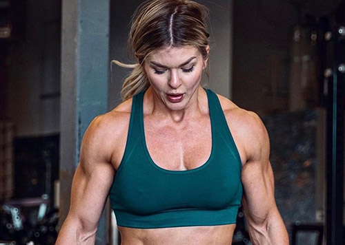
{edit} just to add a subtle paintover to show what i would do. I when i draw women i at some point draw the shape you see here in red. it helps me get the right breast to shoulder distance to get a bit more room for the traps and clavicle. It doesnt need much in my opinion. Breast down a tad, traps up a tad and a slight expansion of the neck. plus some bonus braids. but just my two cents, looking forward to progress here.

RE: CGMythology's Sketchbook - cgmythology - 04-10-2022
darktiste: Excellent input as always! I love what you've done with the sketch, especially with the sword! It's a great improvement so I just incorporated to the image! Also incorporated the fur as suggested, thanks again for your input!
CBinnsIllustration: Glad to hear it! Great input as well, love what you've done with the braids in particular so I've incorporated it into the image!
.................
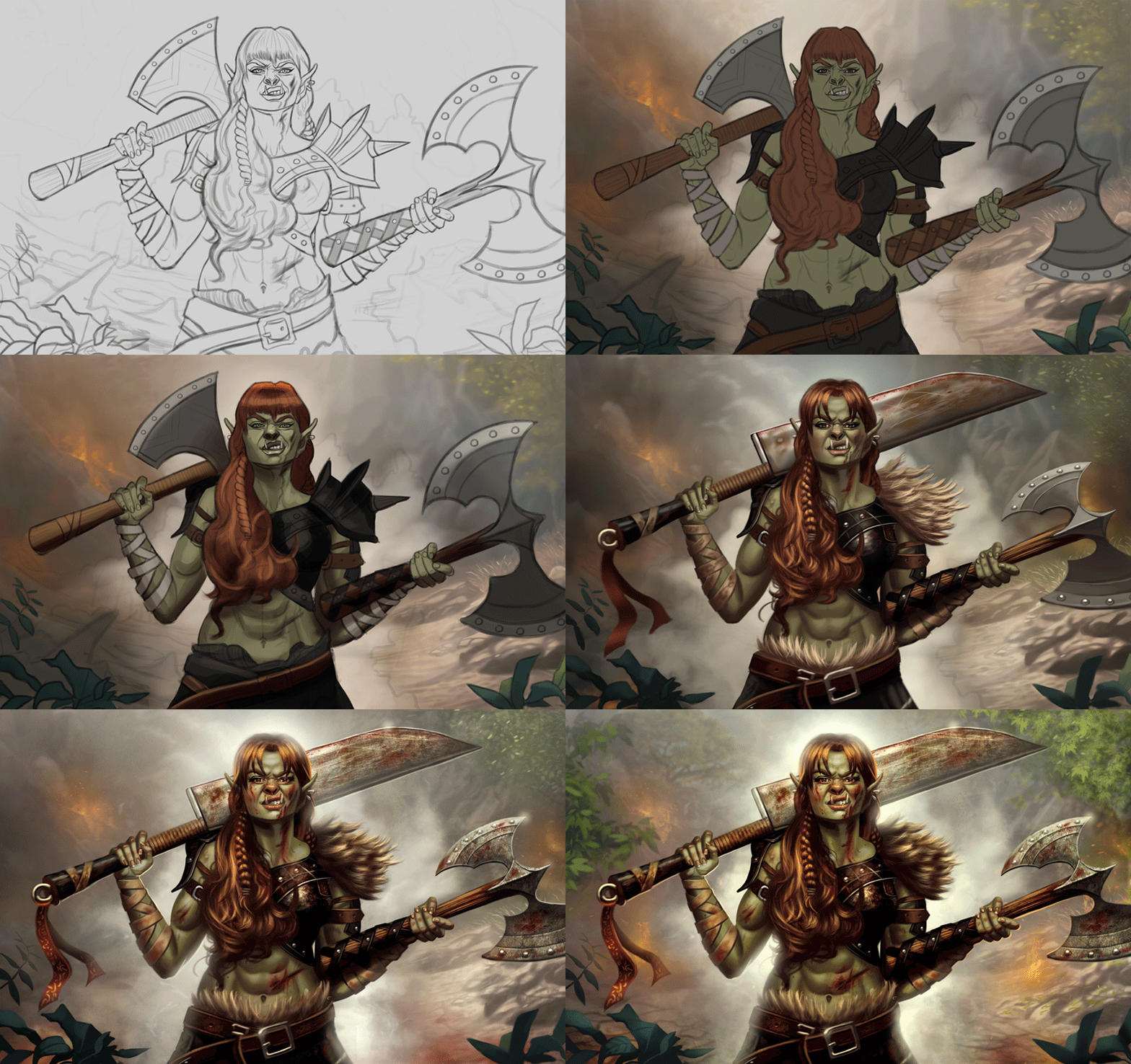
I reworked the image heavily based on the image I received, and I feel it's a big improvement in regards to the previous sketch. The painting itself is pretty much finalized, and I'm quite happy with it. Did my best to not go crazy with the colors and avoided strong highlights on the skin which gave my images a bit of a plastic look... Went for a more muted color palette in general as well. Overall I learned a lot from this image, it was a fun challenge! There's still time for tweaks if needed, so any final input would be welcome. Below is the final image followed by the steps for those interested.

RE: CGMythology's Sketchbook - JosephCow - 04-11-2022
Nice I like what you've done with the orc painting. The backgound really sets the scene just enough
RE: CGMythology's Sketchbook - darktiste - 04-11-2022
You just level up so much wtf .I knew you would you been anyways nnothing but receptive to critism. Which is to your credit really.
Good initiative to scale down the axe.
Here a challenge if your up for it try your hand at a illustration the theme is a dual between two mortal enemy could be creature or human or a mix. Good luck if your up for the challenge and if not that perfectly fine.Here the reasoning I think incorporating a little bit more character than one character might be a interesting challenge for you since so far they have been interaction with 2 character but in a rather very passive manner this time the idea is to have tension or action.
RE: CGMythology's Sketchbook - cgmythology - 04-12-2022
JosephCow: Thanks! I wanted to go easy with the environment as not to take away too much focus from the figure, so I'm glad to hear that input!
darktiste: Thank you, your comment made my day! I receive great input here at the forums so I'm doing my best to take the advice and critiques and put it into practice, and it always makes for a stronger image, so I'm extremely grateful for all the comments I receive.
I love what you described for a new image, should be a fun challenge! I'll try to think of something in that theme and come up with a sketch during my spare time. Thanks again for all your input and words of encouragement, very much appreciate it!
..............
I started work on a new sketch, based on one of Satine Zillah's awesome reference packs. I chose a very complex image to replicate featuring several figures, and I think I was fairly successful in doing so, so I'm quite happy in that regard. I did take some artistic liberties for some more natural looking poses as well as a bit character design, and added an environment as well to bring the sketch together. I'm going for an epic aftermath of a battle with this one, so hopefully that shows through with the sketch. Any feedback before beginning the painting process would be most appreciated as always!
