
+- Crimson Daggers — Art forum (//crimsondaggers.com/forum)
+-- Forum: PERSONAL ARTWORK (//crimsondaggers.com/forum/forum-9.html)
+--- Forum: SKETCHBOOKS (//crimsondaggers.com/forum/forum-10.html)
+--- Thread: CGMythology's Sketchbook (/thread-7224.html)
RE: CGMythology's Sketchbook - cgmythology - 01-29-2023
darktiste: Thank you! I did do some texture work on the desk and carpet with a combination of techniques (photo texture, textured brushes, hand paintingetc.), I don't want it too distracting as to not take attention away from the figures. Regarding photo bashing, I'm not against this technique as I think it's a great way to speed up your process if needed, and I'll have no issues experimenting with it for commissions when budget and deadlines are tight. But for my personal work I prefer a more painterly feel, and I have no desire to rush the process. I think the closest I'll get to that is overlaying some photo textures here and there if need to give more life to the image, but I'm careful not to abuse this technique as overusing photo textures tends to flatten an image. And yes, that's an ornate object by the desk, hopefully it's not too distracting!
.....................
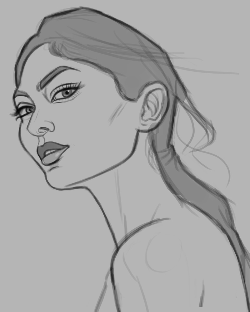
Some updates! I plan on recording a process video focused on drawing and painting a digital portrait in Photoshop, so I picked up some free software to experiment with it and get as comfortable with it as possible. Things went very smoothly surprisingly, I was able to record with no lag whatsoever which is always a plus. I recorded a fairly basic video of sketching a face in Photoshop from reference and uploaded it to my YouTube channel for free, you can go to it by following this link. Additionally, you can purchase a higher quality version on my Gumroad here for $1 - I was unable to offer for free due to it's file size, so I apologize in that regard! Here is the finished sketch for the said video - I'm not planning on painting it at the moment.
Now time for a new illustration! I'm back in Fan Art mode. Drawing superheroes is an excellent way for me to make serious study of anatomy, particularly on the muscle groups so I will be doing lots of these. I chose Spider-Man to illustrate as I always wanted to illustrate that character for years now, and I now have the confidence to pull it off I hope! Below is the sketch, any feedback before I begin the painting process would be most appreciated!

RE: CGMythology's Sketchbook - cgmythology - 01-30-2023
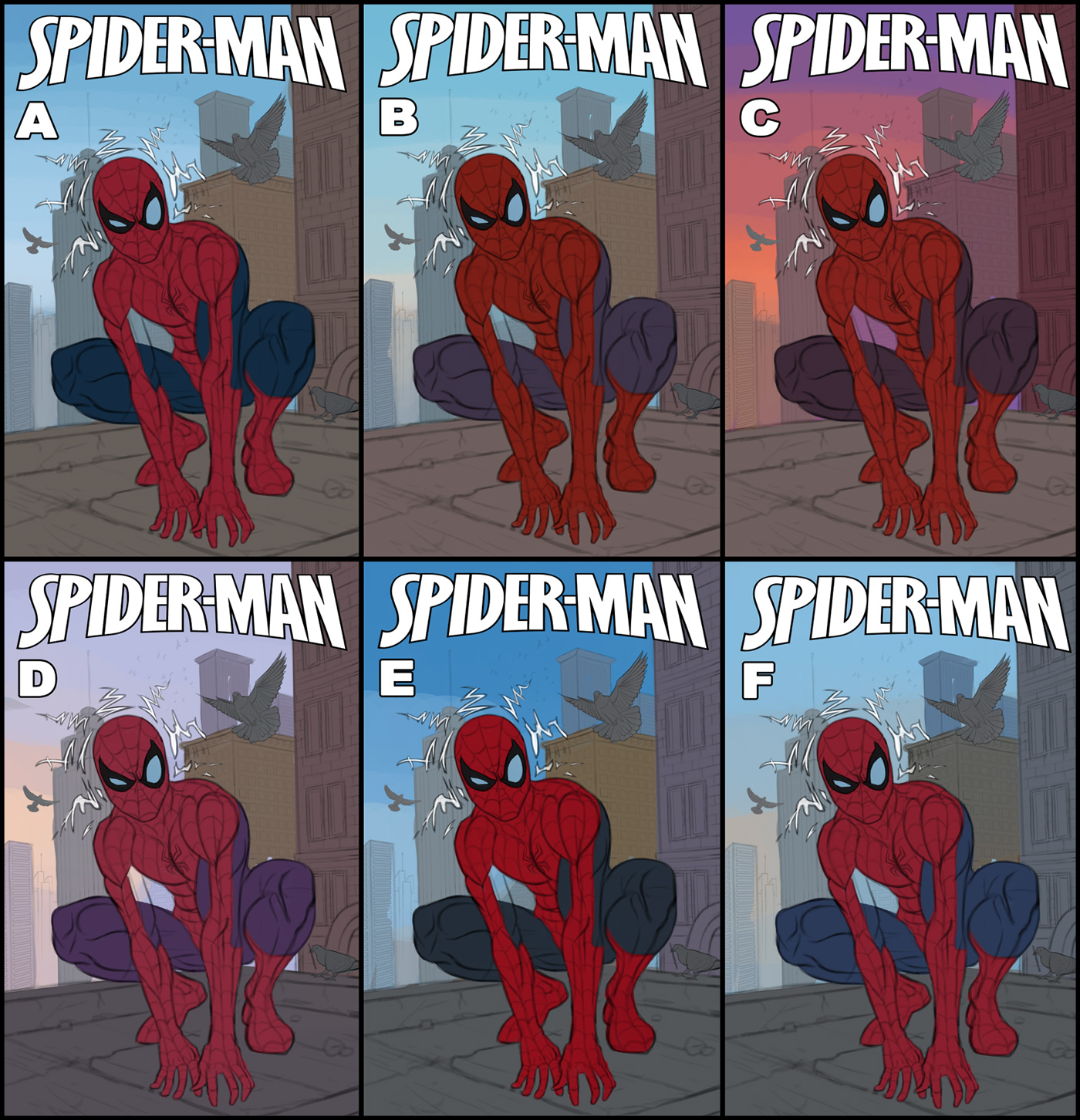
I finished up some color tests. I think most of them work quite well, but 'F' is the one that appeals to me the most... just looks more natural compared to the rest with some interesting colors. I'm open to suggestions however so please feel free to let me know what you feel works best!
RE: CGMythology's Sketchbook - OG-SAN - 01-30-2023
(01-30-2023, 01:53 AM)cgmythology Wrote: I finished up some color tests. I think most of them work quite well, but 'F' is the one that appeals to me the most... just looks more natural compared to the rest with some interesting colors. I'm open to suggestions however so please feel free to let me know what you feel works best!
I agree. I think F has a good balance of saturation and value from all of the other ones.
RE: CGMythology's Sketchbook - cgmythology - 01-30-2023
OG-SAN: Glad to hear it, F it is!!
............
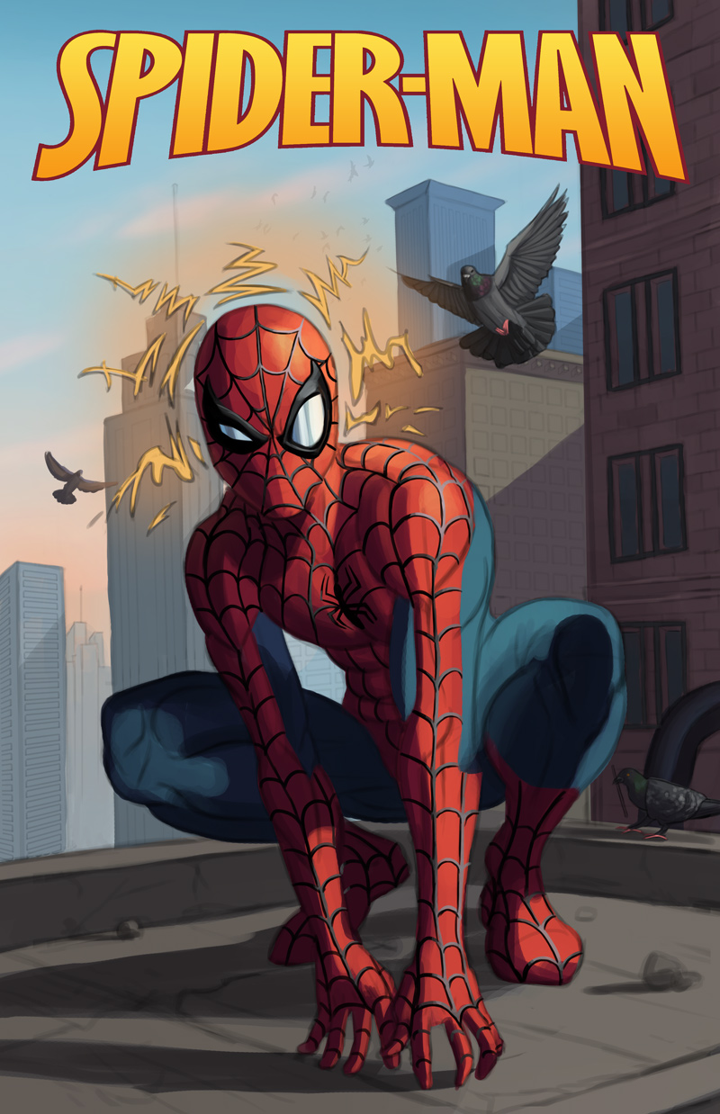
I developed 'F' further, it's come quite a way and the painting process is going very smoothly. I'll refine it further and further, should be fun bringing more details in. Here is the current progress:
RE: CGMythology's Sketchbook - Leo Ki - 02-01-2023
Bringing the cartoony eyes into a more realistic rendering has a really funny effect :) Curious to see how farther you can bring it without falling into the uncanny valley.
RE: CGMythology's Sketchbook - darktiste - 02-01-2023
I would say that there isn't enough contrast in the way you render your round shape facing away from light since is crotched he would be closer to the ground and have more light reflection but at the same time is shadow is pretty near him so the left side would be more in shadow and the right side would get more reflected light from the ground.Concrete is not a very reflective material so it would be pretty dark specially in the space between is leg and the left leg.It said that is suit is similar to spandex so i think it need to be more reflective also in the highlight.
RE: CGMythology's Sketchbook - cgmythology - 02-05-2023
Leo Ki: That's a great point! I finished the image and I feel it works pretty well, but let me know your input if you can!
darktiste: Those are great points, hopefully it works better now that it's done, please let me know!
.............
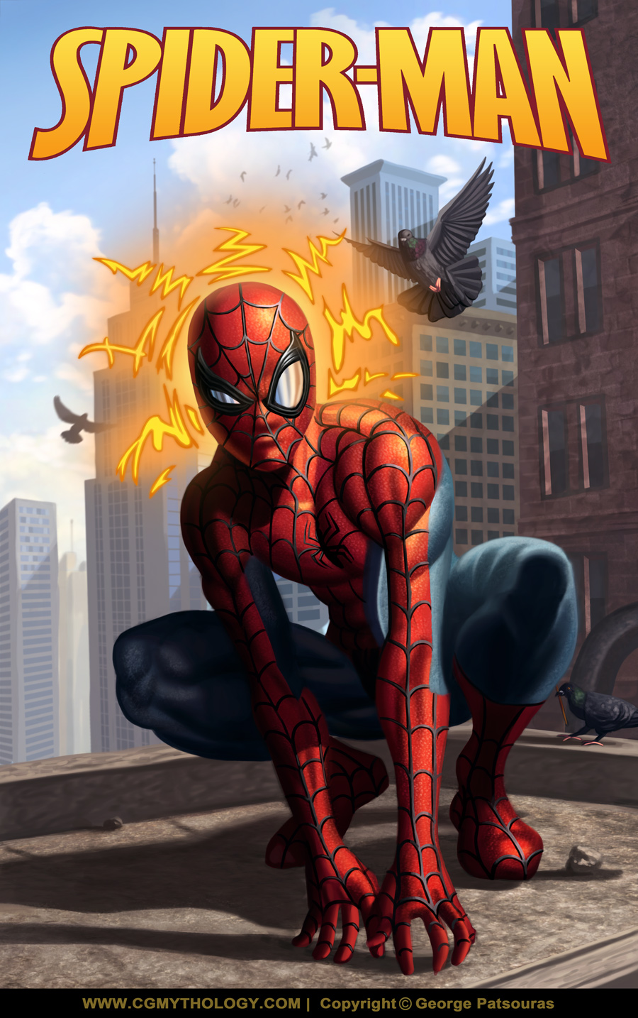
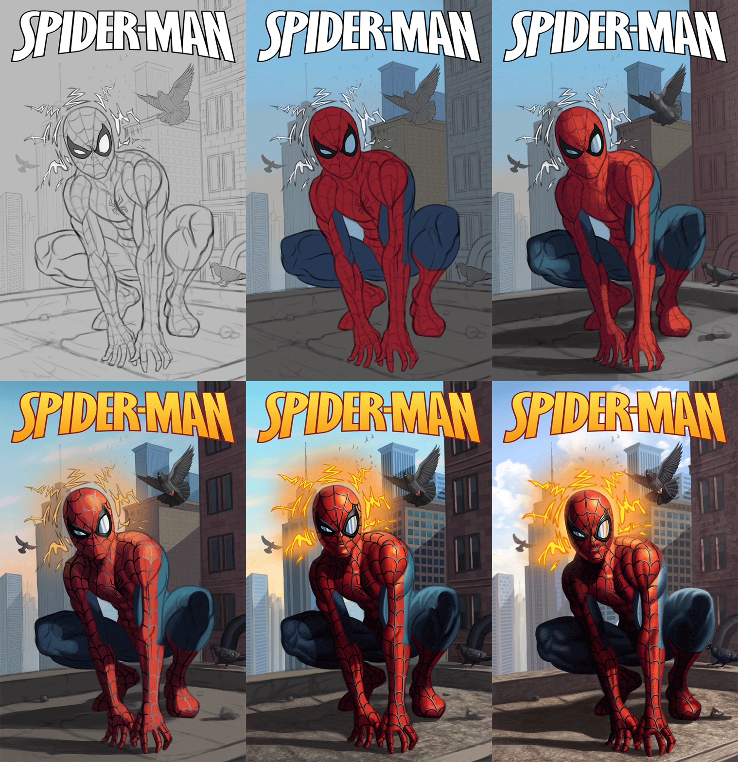
The image is finished! Below is the final followed by the steps for those interested. Of course there's still time for some tweaking if necessary, so please let me know if something looks off!
.....................
Next up I wanted to continue with the superhero theme as it really helps me practice anatomy, specifically the muscle groups which I feel I've been improving on significantly. Here is a sketch of Venom I completed, would love to hear any input before I begin work on some color tests!

RE: CGMythology's Sketchbook - darktiste - 02-05-2023
It look more like velvet for some reason did you took any reference?I think i would look somewhere like this.
Also incredible detail on the face you can feel is face being push against the thighness of the mask it such a added detail i can geek over.
Oh and it kinda now a recurring thing but occulusion shadow!!!He look like is floating an inch above the ground
RE: CGMythology's Sketchbook - cgmythology - 02-05-2023
darktiste: Yeah I looked at a lot of different references; There's a lot of options for the blue, some have darker tones, some with low saturation, high saturation, etc. I think I was afraid to push the saturation too much so it looked a bit washed out, just fixed the issue, your paintover was a huge help! Also refined the hands and shadows a bit, hopefully it's better now!
.....
Here's another update on Spider-Man, refined the blue on his costume for a more saturated look and did some refining here and there:

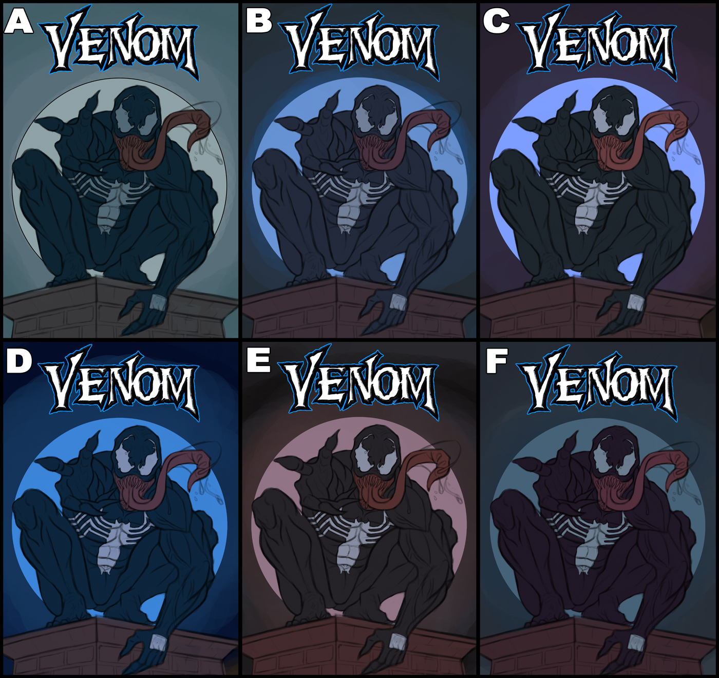
Next up I did some quick color tests for Venom. I think B and C work best (colors for B, values for C) so I'll probably combine both, but I'm open to suggestions!
RE: CGMythology's Sketchbook - darktiste - 02-05-2023
I feel like c will work better once you add a rim highlight.I am not sure if it the moon behind him in that case why is there no line art like the rest of it?The moon would make more sense to be lighter than the character.To me B is to uniform in term of Bg and character.
One other thing i would have addressed if it wasn't for the small adjustment on the other piece is the foresorten (i am not a fan of straight foreshorten) because it can be confusing at first glance.Since the pose is pretty much establish i would say planning a secondary light to try to help the hand ready against is body will help establish it as a hand and arm.Maybe like a spot light come from down below as if the police as chasing him.What behind him could be the spotlight but in this case you would need a surface from where to cast a cast shadow.But i see that he is on a cheminney so it not to hard to change it to something else but still the back wall would be to close so even those i like the idea in pratice i doubt it be possible in the current state of the drawing so i say keeping going in your direction and ignore the cast shadow part it can still be a spot light from below and the moon from behind but try not to put light from the back and front but have if any secondary at an angle.
RE: CGMythology's Sketchbook - Leo Ki - 02-06-2023
Spidey's eyes are half way down the slope to uncanny valley I'd say. It's the territory of realisticartoon, something I remember exploring when I was trying to make painterly comics but couldn't stand the lack of elasticity.
Venom's left hand (our right) looks oddly idle but that might just be what his anatomy does - I'm not familiar with the character.
RE: CGMythology's Sketchbook - cgmythology - 02-09-2023
darktiste: Thanks for your input. I decided to go with B but more in line with the values of C. I added a bit of light coming from the bottom to help make the image a bit more dynamic, great suggestion!
Leo Ki: Interesting feedback! I might revisit SpiderMan in the future and take another look. I revised his hand a bit, hopefully it looks more natural now.
.................
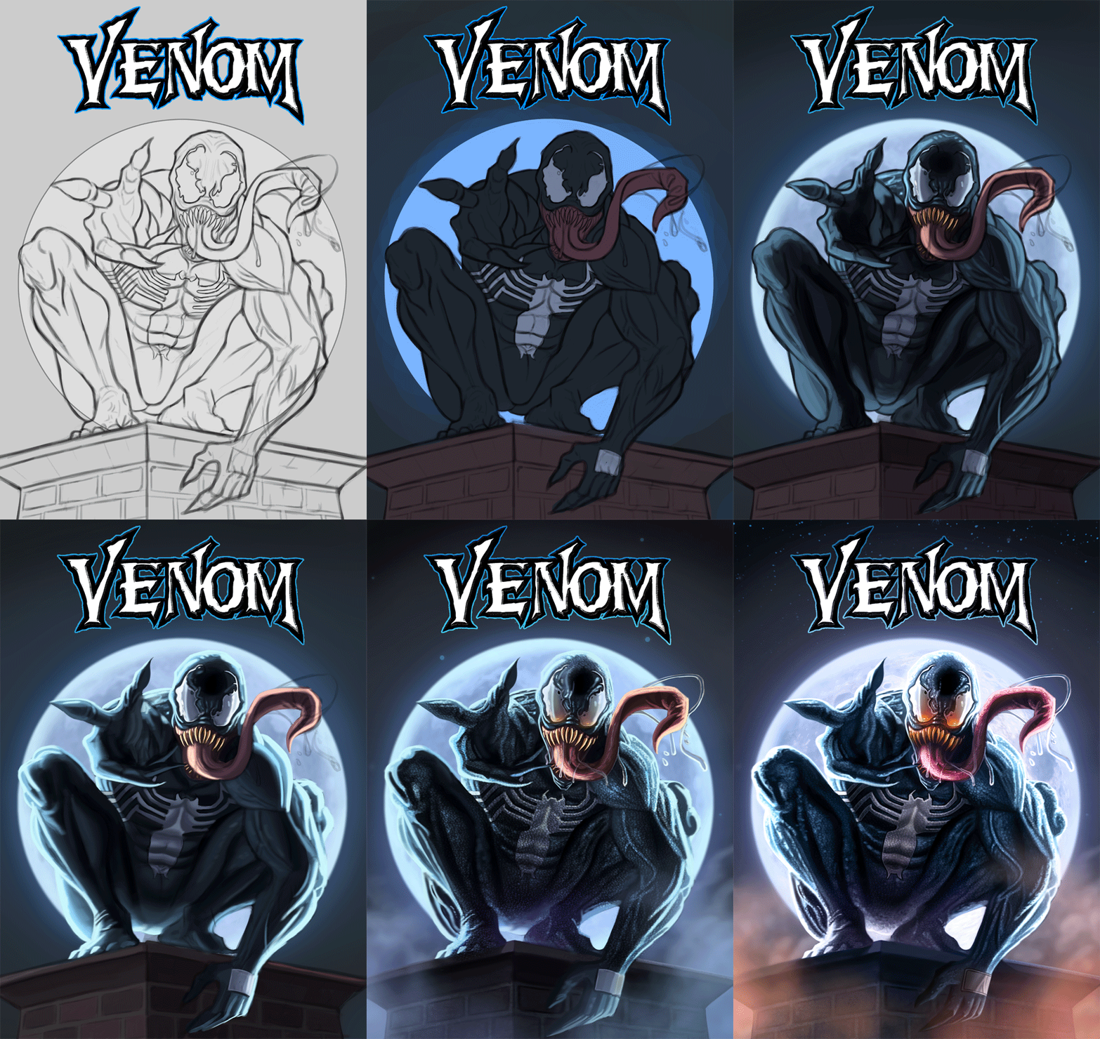
I finished up Venom, pretty happy with it. I had an electric blackout during the painting process so I lost an hour of work but I was able to resume pretty close to where I left off so it's no big deal. I feel the image works well but I'm open to feedback as always. Below is the final followed by some steps for those interested.

Next up I decided to do a fan art of God of War. Initially I thought about exploring a portrait piece of Kratos but ultimately decided to go with something a bit more in line with the feel of the game, so it was necessary to depict his son as well. I'm pretty pleased with the sketch overall, but I'd love to hear any input before proceeding with some color tests.

RE: CGMythology's Sketchbook - darktiste - 02-09-2023
When you use a secondary or even three light try to create a difference in intensity so that you can read each light as separate otherwise it look like the moon beam are coming from undearneath him .Also in the shadow i desatured the color.Also think about where there fog there more light shattering which mean less contrast and less light reach the surface.I also reduce the light intensity of the moon and add a bit of light to the lettering to make them the first read and than the rest as the scond read.
It would be very hard to find any difference at this stage but side by side you could see the difference it make in the shadow.
For the next piece kratos and the boy i think it the same issue as the other viking the axe head is out of allignment i am not doing at paint over for this one i want to see if you figure it out.
Also some of the form read as to flat i am thinking of the arm plate.It can't be this thin.Look at silhouette and look how it make a line from the plate to the elbow that just leak of proper wrapping and it wrong because it leak of thickness.Same for those belt around the arm.For this to happen they would have to be extremely thight and going in the flesh and this would create pinching in the skin.
RE: CGMythology's Sketchbook - cgmythology - 02-10-2023
darktiste: Excellent feedback as always! Love the changes you made to Venom, thank you for the paintover, very helpful. I updated and finalized Venom based on your input and those changes definitely made for a better image. I agree about the clothing and axe for the God of War image, and made the necessary changes per your input. Hopefully it's an improvement!
.................
Did some minor changes to Venom, I think I'm calling it done for now!

Next up I resumed work on God of War, updated the sketch a bit and did some quick color tests. My personal favorite is F by far, I feel it has the most interesting colors there, although I'm open to feedback! Here at the tests:

RE: CGMythology's Sketchbook - cgmythology - 02-12-2023
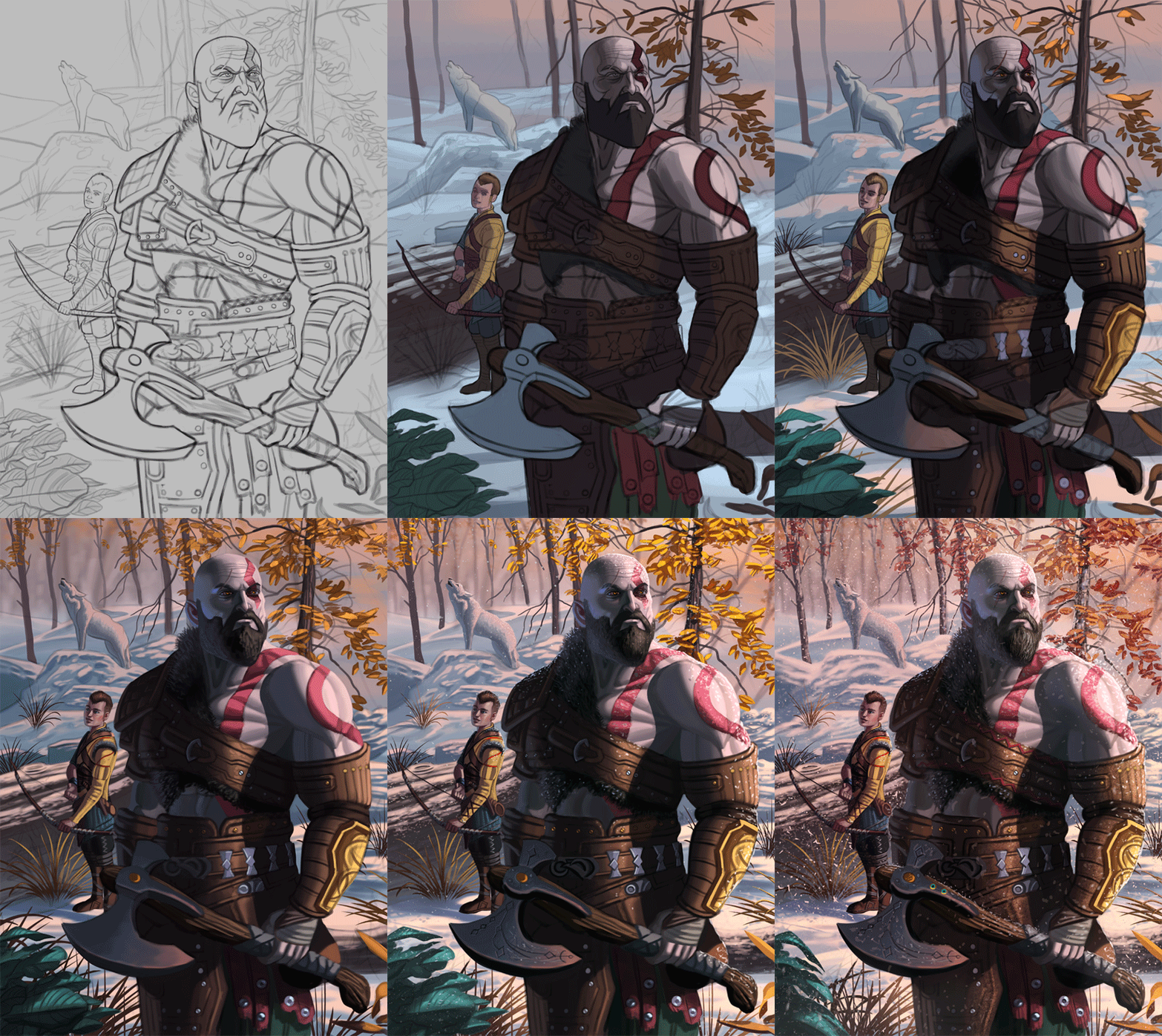
Decided to develop D, and just finished the painting process. I'm pretty satisficed with it as I feel I captured the feel of the game pretty well with this. Of course there's still time to implement any final feedback, so if something feels off please let me know! Below is the final followed by some steps for those interested.

RE: CGMythology's Sketchbook - darktiste - 02-12-2023
I think the light doesn't reflect necessary the weather still to much constrast i assume the sun is hidden behind cloud and if they are in a forest there even more cover.To much reflected light in the beard i think also. There is no consideration for the pit of the arm in term of gradation of light.
I think i also like the version before you made so much snow.This look to cold for your usual palette.
When you putted the snow you didn't really change the way contrast was handle and that show in the final i would say before that it was working like intented i would argue so i am not sure if you planned to add the snow early on in your mind or if you took a last minute decision but i don't see the change necessary to account for it.But i could be wrong the way you made the light can still occur naturally under specific condition.The problem with light is a critic doesn't know you intention and they are outside the scene so it complicate were attempt to give meaningful advise.
I like how the yellow of the leaf bring attention to krotos in the pre final version face contrary to the redish tone that blend with where should be looking first in the final version.
One thing with snow is to consider the loose of visiblity as it goes back into the distance just in case this is not something you are already actively think about it similar to fog but less it different depending on the wind condition and fog generally is more local to ground level will snow visiblity depend on many factor and snow come in different size and type powdery snow for example made visiblity worst when wind condition are high will wet snow on the other as i would call less of a problem in high wind scenario as it stay to the ground due to the humidity.
*This is not a paint over just how it look before the last big change.
RE: CGMythology's Sketchbook - cgmythology - 02-13-2023
darktiste: Great feedback! I just lowered the opacity of the snow a bit, but didn't remove it entirely as I feel it adds good detail to the image and helps with the mood and atmosphere. I agree about the yellow on the leaves look better, I changed it during the painting process because I felt they were almost too bright and detracted from the figures... but I went ahead and changed the color with the previous step, as well as keeping the values mostly as they were for a more natural look. The mist on the background is a great idea as well, makes the image more believable and gives the image more depth, so I went ahead and implemented. Thanks again for your input, always very helpful!
...................
Here's an update on the image based on the feedback I received, hope it's an improvement!

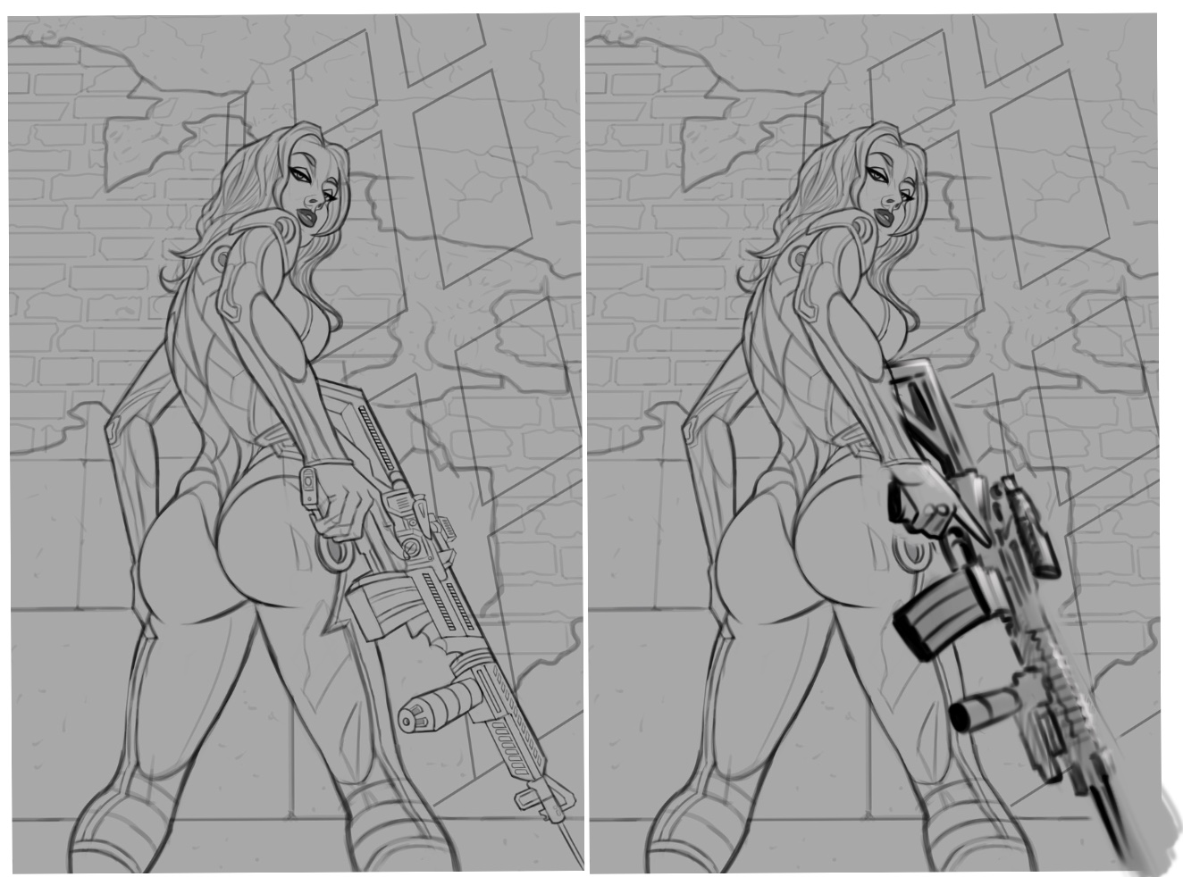
Next I began work on a new image, based on a reference photo by one Satine Zillah's reference packs. I chose a reference with a dynamic pose and lighting to challenge myself, and am very pleased with how the sketch turned out as well. I'm going for a bit of a gritty sci-fi feel with this one, which I think will be more obvious when I paint it in. Any feedback before I do what would be highly appreciated as always! Below is the sketch:

RE: CGMythology's Sketchbook - darktiste - 02-13-2023
I would add more thickness to the gun it feel rather slim and the handle is twisted compare to the direction of the gun.
RE: CGMythology's Sketchbook - CBinnsIllustration - 02-13-2023
The GOW piece looks great! The only suggestions I would have is the light interaction with his shoulder area. I kind of get the feeling for the light to cast such a hard edged heavy shadow on his shoulder the light would need to almost come from behind him. In this case I would like the see the light hitting his hip area since his arm crosses to his from the light would hit behind him a tad. I did a rough paint over for my suggestions focusing mainly on the area of the hip I would hit with some light, and how I would potentially soften the cast shadow on his chest. Of course just suggestions. I really like the piece. His expression is great and think you nailed the feel of the game for sure.

As for the new piece, the only thing I would focus on at the minute with be the weapon perspective and her interaction with it. I did a terrible paint over but this is an approach you could take to get the handle on plane with the clip and the muzzle grip. But just for a loose suggestion. Should be a cool piece when your done.
RE: CGMythology's Sketchbook - Leo Ki - 02-13-2023
(02-09-2023, 10:27 PM)cgmythology Wrote: I had an electric blackout during the painting process
Venom did it.
Your GOW piece is striking. I don't mind the illumination on the character not being totally consistent with that on the environment, it can be explained away with some magic and poetic license.
The pinup's legs confuse me a bit. I would expect a low angle foreshortening in continuation to that of the upper body but she looks like she is bending the knees. Or it is an effect of a wide angle camera lens?